 Summary: End user reporting has always been a source of frustration for both the IT department and the business users–wasting time for both sides. Learn why more companies are solving this problem with interactive reports, and which features you must look for in your interactive reports.
Often relegated to the IT department, reporting has long been frustrating for both IT and end users.
For IT departments, creating reports for end users wastes precious time. Already overworked, end user reporting just adds one more task to their full schedule. To make matters worse, because they’re regularly “fighting fires,” IT can’t always handle reporting requests immediately.
For end users, waiting around on IT for their reports creates a roadblock. They need the information quickly, and don’t have time to wait a few days for the IT department. Depending on the report, this delay creates problems ranging anywhere from a minor inconvenience to delayed decision-making.
Why use interactive reports?
So, what’s the answer? More and more, we’re seeing businesses turn to interactive reports for their users. Interactive reports give users customization options to filter, sort, and rearrange the data as needed. They let end users adjust and alter various aspects of the report without going to the IT department for every change.
Essentially, an interactive report serves as multiple reports rolled into one. A single interactive report lets end users view their data from nearly any angle, and even control which data to include–tasks that would previously require multiple reports.
The best part: It helps both sides. End users get their data instantly, and IT departments aren’t constantly bombarded with reporting requests.
The question is, what makes a good interactive report? Today, let’s explore 5 essential elements you need in any interactive report:
1. Adjustable row dimensions
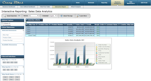
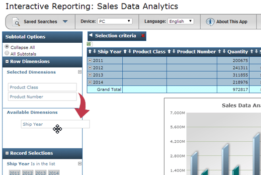
In a typical report, the end user can’t control which dimensions appear in their report, or the order in which they appear. For instance, in the example report, you’ll see that the data is organized by shipping year. In a static report, that’s unchangeable. However, in the interactive report, the end user can rearrange or remove that dimension entirely–letting them view their data from any angle they require.
2. Point-and-click record selections
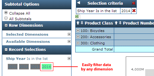
The record selection feature lets users filter their data by specific criteria. For instance, suppose the end user only wanted data from the 4th quarter of last year. Or, suppose the user only wanted to see purchase data for a single customer. Or, maybe they only want to analyze one product line. You get the idea. Record selections let users filter their data by any criteria.
3. Adjust to mobile devices
These days, you don’t know how users will access your report. Suppose a busy executive wants to analyze your report on the train-ride home. Imagine their disappointment when they realize they can’t access the report on their smartphone. These days, your reports must automatically adapt to any device.
4. Saved searching
The interactive report lets users sort and filter by any criteria imaginable. The ability to save searches is a real time-saving feature, especially for those who frequently sort and filter by the same criteria. Rather than making the same selections every time, saved searches let users store that criteria for easy access in the future.
5. Automatic drilldowns
 An interactive report gives users a broad view of their data with the option to zoom in and out as needed. The automatic drill-downs found on each row in the demo serve this purpose, starting users out with a high level view of their data and letting them drill down to the most minute details, all within the same application. On a similar note, you’ll notice the “Subtotal Options” feature on the left, which lets users collapse or expand all subtotals with just a click.
Of course, if you’d like to bring user-defined dashboards to your business, let us know. We’d be happy to explain interactive reports in greater detail, and show you how m-Power simplifies interactive report development.