This tab is divided into 4 sections: Value Font, Thresholds, Value Formats, and Colors.
Value Font Tab
This tab handles the font settings of the value displayed for each item on the graph.
The font settings for the text of the value can be modified using these fields:
Value Font
Available Fonts are Verdana, Helvetica, Arial, Times New Roman, Tahoma, and Sans-Serif. Sans-Serif will make the font be whatever the browser’s default Sans-Serif font is.
Value Font Style
This setting will make the font Normal, Bold, Italic, or both. The default “Normal” will leave the text without bold or italics.
Value Font Size
The font size can be raised or lowered here. By default it is set to 10 pt.
Value Font Color
The font color may be a 6-digit hexadecimal value or any of the 17 HTML color names. You can also click on the color wheel next to the text field to pick a color from a palette.
Show X Axis Item Values?
Yes On Top of Bar — Value appears at the top of a bar.
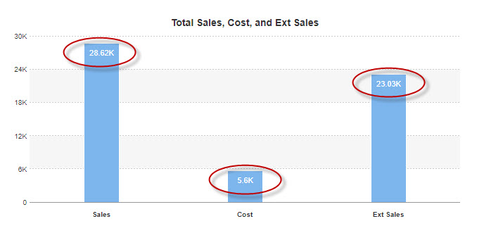
Yes, inside the bar — Values appears centered directly in the center of the bar (Shown in example).
No — Item value is not shown at all on the graph.
Threshold Tab
This tab deals with items placed into the “Others” category:
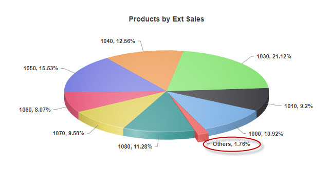
The Threshold value is a decimal percentage. If a field in the table has a value of less than the threshold’s percentage (the default is .02, or 2%) of the grand total, then it is placed into the “Others” category.
Value Formats Tab
This allows you to change the format in which the graph displays your value; it will allow you to insert commas, dollar signs, zero fields, etc. into your number. It operates similarly to the Format option in Field Settings. It is most different in that it uses # signs instead of nines to delineate fields that remain the same. Here are a few examples to show how different patterns behave.
| Database Value | Value Pattern | Display |
| 12345.678 | #,##0.00# | 12340.008 |
| 12345 | #,##0.00# | 12340.00 |
| 12345.678 | $#,### | 12345 |
| 12345 | ###.000% | 12345.000% |
The Percent Pattern is used with pie charts, and operates the same way as the Value Pattern, but deals with the percentage of the pie instead of the data value. The locations of the Percentage and Value Patterns in pie charts are governed by the 2D Pie and 3D Pie Chart Options tabs.
Colors Tab
This tab is where you set the colors for your graph and its series.
Series Colors
This section allows you to override the default colors for your series. To override these settings, change Use Defaults? to “No.” To add a color, type in either the 6-digit hexadecimal value of the color or any of the 17 HTML color names. You can also click on the color wheel next to the text field to pick a color from a palette. Then click and drag the color preview to the selected colors list.
The colors also can be rearranged by dragging them into the desired order in the selected colors list.
- Use Defaults
- Series Colors
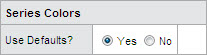
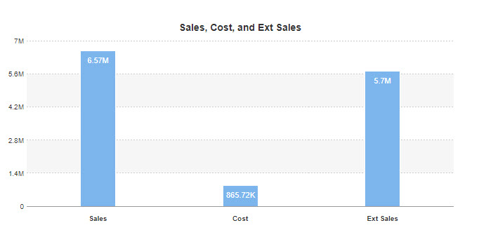
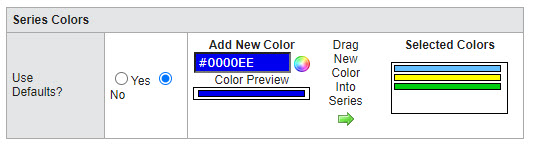
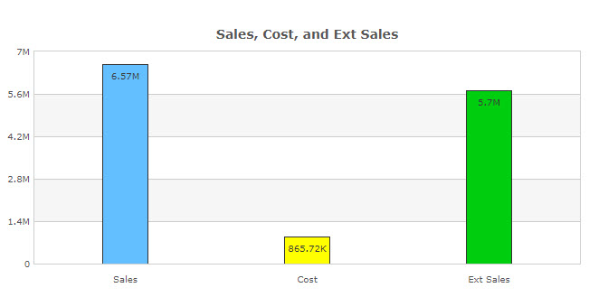
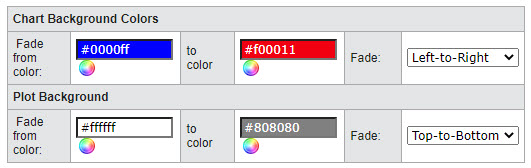
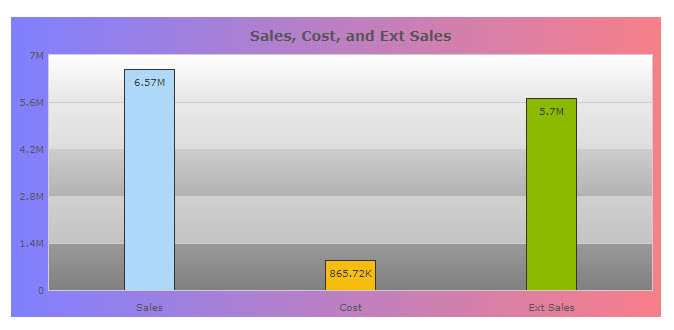
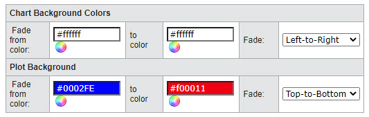
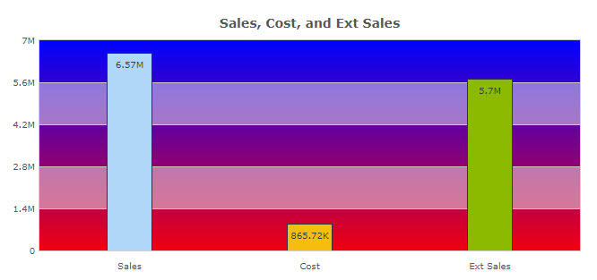
Chart and Plot Background Colors
These options will allow you to change the background of the chart and the plot:
- Chart
- Plot
The following red background color is the “Chart” section: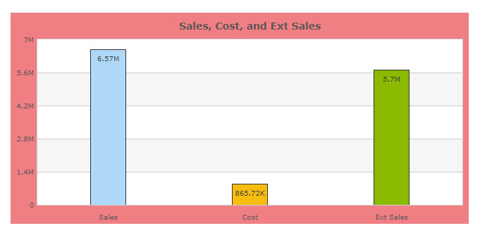
The following red background color is the “Plot” section: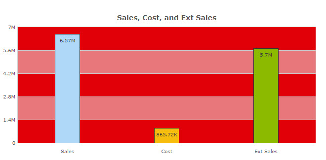
You can again type in a 6-digit hexadecimal value, the 17 HTML color names, or use the color wheel to select a color from a palette.
The background is designed to work with a color gradient, so you can blend up to two colors in your background.