Tooltip Options Tab


This tab governs the tooltip you see when you hover your mouse over a value on the graph.

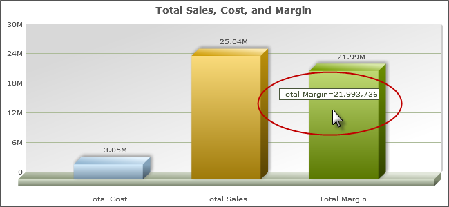
By Default, the tooltip is turned on. To turn it off, change Enable Tooltip to “No”.

Tooltip Label

This setting controls what description shows on the tooltip. It is used in stacked, clustered, and multi-line graphs to toggle between displaying label of the overall group or the label of each individual field.

Tooltip Label = Group Name

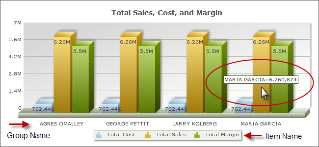
Tooltip Label = Item Name
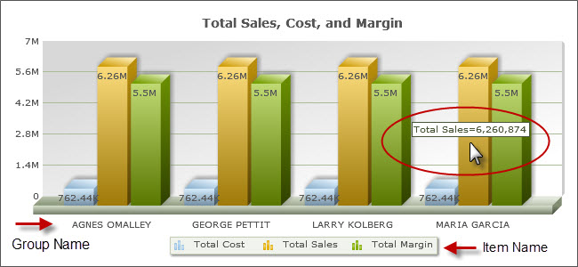
Tooltip Value and Percent Pattern

This allows you to change the format in which the tooltip displays your database field. It will allow you to insert commas, dollar signs, zero fields, etc. into your number. It operates similarly to the Format option in Field Settings. It is most different in that it uses # signs instead of nines to delineate fields that remain the same. Here are a few examples to show how different patterns behave.

Database Value Value Pattern Display
12345.678 #,##0.00# 12340.008
12345 #,##0.00# 12340.00
12345.678 $#,### 12345
12345 ###.000% 12345.000%

The Percent Pattern is used with pie charts, and operates the same way as the Value Pattern, but deals with the percentage of the pie instead of the data value. The locations of the Percentage and Value Patterns in pie charts are governed by the 2D Pie and 3D Pie Chart Options tabs.