Introduction
m-Painter is an integral part of the m-Power platform as it allows you to customize your generated content in a user-friendly, easy to use point and click interface.
The goal of this document is to present the m-Power developer with all available options within m-Painter.
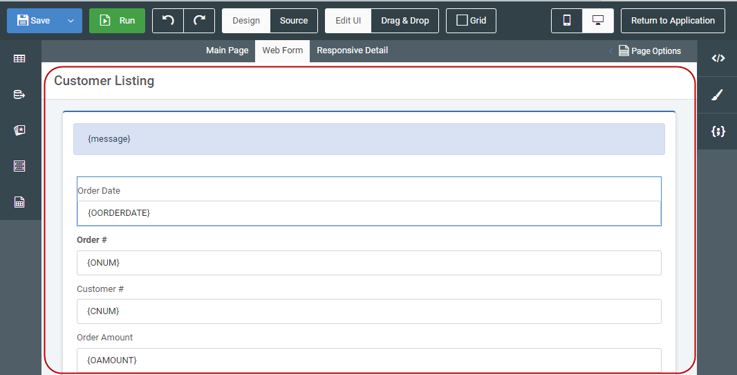
Top Panel

The top panel allows you to do a variety of options to your application, including saving, running, and setting various editing modes.
Save

Clicking this button will save any changes made to all HTML files associated with this application. Be sure to click this button prior to navigating away from m-Painter. You can also press CTRL + S to save.
In the event that someone else, or even you, may have edited this application and saved a version more recently, expect to see an error message like this appear:
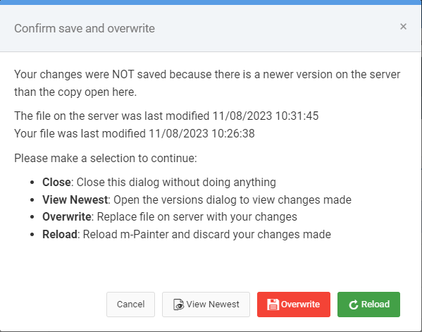
Choosing Cancel will ignore your save request.
View Newest will allow pop-up a modal window for you to see what the latest changes are.
Overwrite will replace the current version with your version.
Reload will reload your m-Painter, causing you to lose all of your changes and refreshing the most recent version for you to edit.
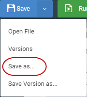
Open File
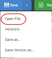
Choosing the pulldown menu within the Save button allows you to choose Open File. You can also press CTRL + O to open this dialog.
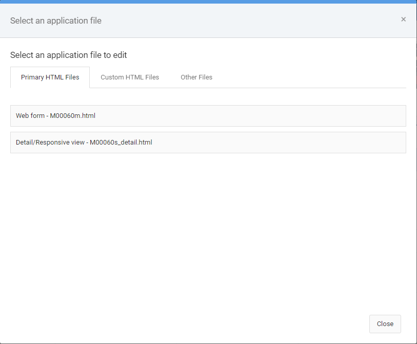
From here you can choose to open one of the following file types:
- Primary HTML Files – these are the main HTML file(s) that m-Power expects a standard application to utilize.
- Custom HTML Files – Any specific HTML files you save (via Save as) would appear here. Use cases of this option are the use of multiple HTML files as pageNames for an application.
- Other Files – All other files related to this app can be found here, including the property file, the JSON spec file, and the java source file. Most users would have no need working with these files.
Versions
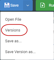
Each and every time you make a save in m-Painter, the software captures a version of this in the event you wish to go back to this change sometime in the future. Files that were auto generated due to an overwritten HTML request, will be appended with “generated by m-Power”
Learn more about restoring versions here.
Save as
In the event you wish to have multiple HTML output files for the same application (i.e. pageName solution), you would utilize the Save As option.
Learn more about pageNames here.
Save Version as
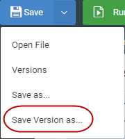
This option is useful if you would like to specifically name this version to reference in the future when using the “Versions” option. Simply type in your note here and it will be appended to the application details on the Versioning menu.
Learn more about this feature here.
Run

Clicking this button will run your last saved version of this file in a new tab. To return back to m-Painter, simply close the run-time application tab.
You can also press CTRL + E to run this application.
Undo/Redo

CTRL + Z (undo) and CTRL + Y (Redo) will let you move through any changes you have made that you would like to adjust. Undo/Redo is only available for current changes. In other words, you cannot undo/redo changes made during a previous editing session (consider using versioning instead).
Design/Source
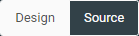
Allows you to toggle back and forth between the graphical editor and an HTML editor.
Learn more about Source mode here.
Drag & Drop
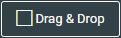
If clicked, m-Painter will no longer add, edit, or delete elements. However, you are able to click, drag, and move elements around the page.
Learn more about Drag & Drop functionality here.
Layout
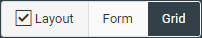
When layout is selected, a toggle switch will appear, allowing the user to decide to be in either “Form Layout” mode or “Grid Layout” mode. In either case, activating the grid option makes the green navigation hover available, allowing you to create, remove, and resize elements on the page. (Click here for more information about the green hover menu).
Generally speaking, the Form Layout mode is used when wanting to drag and drop to rearrange inputs on a form. Grid Layout mode, on the other hand, is generally used for wanting to adjust the layout of elements outside the form, such as splitting an area of the screen in half to allow space for new elements on the page.
Learn more about Grid functionality here.
Learn more about Grid Layout vs Form Layout here.
Mobile / PC View

Allows you to toggle back and forth to see how your application would render on a PC or mobile device at runtime.
Return to Application
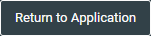
Use this button to return to the specifications of this application. If you have any unsaved changes, m-Painter will prompt you to save before allowing you to navigate away.
Main Page/Web Form/Responsive Detail Tab
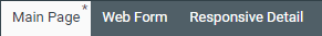
Depending on your template type, you will see slightly different options here. This option allows you to effortlessly move between editing the different primary HTML files available to your application. You do not need to save changes made in between navigating these files.
If there is an asterisk (*) after the file name, it means that file has been changed but has not yet been saved (see above for example).
Page Options
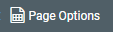
Clicking this button brings open a sub-menu allowing you to remove HTML and revert your application back to various levels of code. Including:
Replace with Original
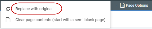
As the name suggests, this option will revert your HTML to the latest stock version available. In other words, all custom HTML changes will be removed and the latest fresh version of HTML that has been compiled will be used instead.
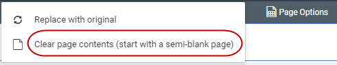
Clear page contents
This option allows developers to remove most of the HTML’s code, leaving only the basic HTML structure. This is helpful in the event you wanted to heavily customize your application and discard the built-in functionality.
Filters

If your application has a “Filters” area, clicking this checkbox will toggle it on and off within m-Painter.
Element Panel
The element panel, available on the right side of m-Painter, is a dynamic area that allows you to work with whichever element you have selected within the main editing panel. Depending on which element you have selected, different element options will be available for use.
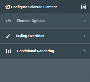
Element Options
The options on display in this section depend on what element you have selected in the main panel. You’ll note the label below “Element Options” indicates what HTML element is currently selected. Different elements have different options available.
Input Options
Convert Input to…
Useful to convert a basic input box into something more user friendly for your end-user. No matter which option you pick you will first need to select where the data will be coming from. Available options include:
Data Model — If you choose a data model, be sure to indicate within the Field settings which field will be the list value and which will be the list description.
m-Power Application — If you choose, m-Power application, you will be able to select a retrieval as a data source, so long as it was built as a Option List template.
Query Current App — If chosen, allows you to query the current application to determine a distinct list. This option is disallowed in maintainers. It is also encouraged to not use this approach if you have a particularly large data set, as the performance of the dropdown decreases as the amount of data increases.
Quicklists — Best designed for simple options where data is unlikely to change and building an external dropdown list would be excessive (An example here would be the options Yes and No).
Learn more about Quick Lists here.
Can convert to the following Input Types:
Dropdown list — Creates a basic dropdown list. If you want to force the user to select a value, remove the “Select a value” text from the Blank option text option.
Radio Buttons –– Similar to a dropdown box in that only one value can be chosen. The difference is that all options are shown on the screen.
Checkboxes — Allows multiple values to be checked per field.
Comboboxes – Allows user to be able to type ahead to enter a given value.
Textarea — This allows your user to see and enter much more data than one what would traditionally be allowed in an input box.
Learn more about Option Lists here.
Calendar Picker
Useful when working with dates. Be sure to specify the proper date format for your needs. The Max days in the past/future restrict what the user can select from the calendar picker.
Click here to learn more about Calendar Pickers.
Input Properties
Available only for input boxes, allows you to modify a variety of options about this specific input box. If you are looking to enable signature capture, click the “Signature” box at the bottom of the screen to convert this input to accept Signature capture.
Learn more about input properties here.
Learn more about signature capture here.
Edit Option List
Only available if you have selected an option list. Allows you to modify your option list.
Ajax Input Helpers
Three AJAX options allow your user to interact with the server without having to refresh the page: Type-Ahead Suggestion, Cascading Dropdown List, Return Data to Input.
Learn more about AJAX Helpers here.
Lookup and Return Input Data
Allows your user to open a separate retrieval in a pop up modal window, and “return data” from that page to your current form.
Learn more about this feature here.
Text/Field Options
Smartlink
Utilize this feature to link one application to another, via a hyperlink.
Learn more about Smartlinks here.
Key/Value Lookup
This feature allows you to automatically pass the selected value (the key value) to an external retrieval. Based on the value passed, all fields associated with that row would be available to be returned to your current application.
Learn more about this feature here.
General Options
Edit HTML
In the event you need to work with the HTML, this option will allow you to work with the highlighted HTML element, rather than with the entire source.
Learn more about this feature here.
Hide/Show Element
Toggles the element between visible and hidden at run-time.
Replace Element With…
Allows you to load a specific element from your original HTML file. Helpful to revert a specific change, or even load in a new feature without having to overwrite your entire HTML.
Click here to learn more about this feature.
Report Options
Toggle Report Level
Allows you to hide/show output level(s) at runtime. Useful in the event you want to stop users from toggling a particular report level at runtime.
Toggle Selected Report Output
Allows you to hide/show specific report outputs. Useful in the event you want to stop users from exporting to Excel or PDF, for example.
Output Format
Useful if you would like to change an output format. Say for instance, you wanted to change the Excel output to CSV.
Data Field to Report Level
Available only when your current element is a field. Allows you to change the location of where your data is coming from (Choose Non-Totaled) if you want m-Power to not total values at the sub-total and grand total levels.
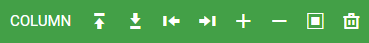
Table Element Options
Merge Cell Right
Merges the currently selected cell with the cell directly to the right of it. All content in the merged cell is removed.
Merge All Cells
All cells in the currently selected row are merged. All content, except for that of the highlighted element is removed.
+ Column Left
Adds one column to the left of the selected cell. This will also add the necessary cells for any other applicable row (such as column headings).
+ Column Right
Adds one column to the right of the selected cell. This will also add the necessary cells for any other applicable row.
Select Data Table
Available when any table element is selected, clicking this button will automatically highlight the parent table.
Styling Overrides
In general, styling elements directly should be your last option. Instead, it is preferred to set your element styles at the dictionary level. The main benefit to this approach is that should you want to repeat certain styling across more than one application, the CSS rules would already be in place. That being said, you are open to add the following element level CSS rules to change how they appear with in the application.
Class & Style Attributes
Classes need to be space separated. Styles should use traditional element syntax. For instance width:600px;
Margin
Use the build in margin options, or, if specifying your own, be sure to denote your setting with the proper unit of measure. For instance, 5px. Margin controls how much space is between this element and surrounding elements.
Padding
Use the build in padding options, or, if specifying your own, be sure to denote your setting with the proper unit of measure. For instance, 5px. Padding controls how much space is added between the selected element and it’s container’s border.
Display
Options include, inline, inline-block, and block.
Height/Width
Be sure to specify a proper unit of measure. For instance 100px.
Background Color
Chose one of the preselected colors or click the button on the right to open a color wheel.
Font
Specify the font-type, whether it is bolded or not as well as the color.
Border
Specify border type, thickness, and color of border around the selected element.
Border Radius
Useful if you would like to have rounded corners around an element. For instance, around an input box.
Align Self (float)
Control the alignment of the entire selected element.
Align Text (text-align)
Control the alignment of the text within the selected element.
Align Children (Flex)
Control the alignment (vertical and horizontal) of elements within an element.
Shadow
Select either small, medium, or large to set the size of the shadow for the selected element.
Conditional Rendering
The idea of conditional rendering allows you to add logic to your presentation layer without having to resort to a client-side scripting language.
Learn more about conditional rendering here.
Set Text
Based on a field value, show text on a page.
Styling (Color Coding)
Based on a value set specific styling rules. Often this is used to color code cells based on field values.
Learn more about this feature here.
CSS Classes
Based on a value set a CSS class.
Remove if…
On page load, this option checks to see if a value, at page load, exists. If so, the corresponding element will be removed.
Hide when…
On change, this logic will hide the selected element on the page once a user sets a value to a certain value or blank. Often this is used to hide an input element based off of another input’s value.
Show when…
On change, this logic will show the selected element on the page once a user sets a value to a certain value or blank. Often this is used to show an input element based off of another input’s value.
Toggle on Click
This feature is used to hide/show an element when a user clicks on an element (usually a button).
Conditional Element
In the event you wish to add more than one condition to an element, choose this option. For instance, if you wanted to change the background color of the element AND the text, you wouldn’t be able to do both of those things with the other conditional options but you could do the Conditional Element option and then set those background color and text yourself in m-Painter
Component Panel
The component panel can be found on the left side of your m-Painter window. If you would like the left side to always be maximized, click the pin icon. To reduce its size, press the ‘X’. When minimized, simply hovering over the left side will temporarily maximize the space.
The component window allows m-Painter users to add a variety of features to the presentation layer of your application.
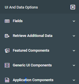
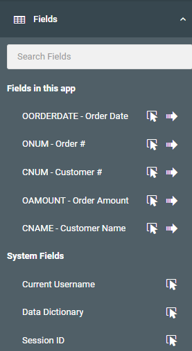
Fields
You can always add a field substitution to the current location of your cursor by clicking on the cursor icon directly next to the field you would like to add. Clicking the arrow, by contrast, will append this field as a new column, complete with appropriate column heading, to the end of your main data table.
Retrieve Additional Data
All features in this area focus on using ancillary applications to bring back data into your current application.
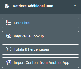
Data Lists
Useful if you wish to join your application out to a separate application to bring in additional data. First off click in the cell you wish to return data. Then click the Data List feature, map your application. Once you make the connection, go back into that cell and return to the Fields list. Here you should now see all fields from your linked application, available to include into your chosen cell.
To learn more about Data Lists, please see here.
Key/Value Lookup
This feature is helpful if you want to replace an existing field on the screen with a value being returned from another application. An example of this might be to show a status name on screen, rather than just the status code.
Learn more about this feature here.
Totals & Percentages
This feature will retrieve a single grand total value from a report or data model and insert it into the location you have selected in the page
Learn more about this feature here.
Import Content from Another App
This feature allows you to include HTML content from another application
Learn more about importing here.
Featured Components
These HTML features allow you to place a variety of HTML elements within the page. These items are listed as “Featured” as they enhance the user experience.
Learn more about the Featured Components here.
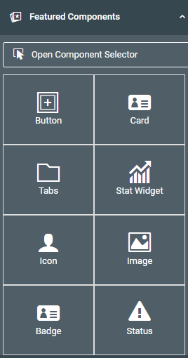
Button
Adds a clickable element to the page. You can then make the button a Smartlink or use it with conditional rendering to have items show/hide based on if the button is clicked.
Card
A container with a colorful heading. If you wish to put the current content into a card, click on it and select the blue square within the main edit window and follow the prompts.
Tabs
A multi tab container. If you wish to put the current content into a tab, click on it and select the blue square within the main edit window. To add more tabs, click on the tab itself, then select “Add tab” from the right-side menu.
Stat Widget
Useful for making bold dashboard entries. Add it to your application, then use substitutions to put live values into your application. All styling and icons are automatically presented for you.
Icon
A variety of Font Awesome icons available to add to your application. You can style this element to change its size, color, etc.
Image
If you want to add an image to your application, use this screen to point m-Painter to the path of your image.
Badge
Used to add emphasis to text or a number on the page. Often used as a form of “Notification Badge”.
Learn more about Notification Badges here.
Status
Statues are tied to workflow objects within Maintenance applications. However, adding a status field allows you to utilize status workflows built within other applications.
Click here to learn more about the Status feature.
Data List
In the event you removed your main data table, and wish to use a different UI layout, choose this option.
Learn more about this feature here.
Generic UI Components
These are basic HTML components that have been put on a menu to allow you to easily add them to your page, without having to go into the HTML code.
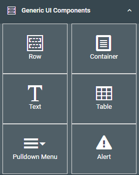
Row/Column
Inserts a blank Bootstrap row and column at the current cursor position. This is useful when working with the layout of the page.
Container
Inserts a blank div at the current cursor position.
Text
Inserts a wrapped span element at the cursor position and allows you to change the placeholder text after inserting.
Pulldown Menu
Insert a pulldown menu which allows you to configure multiple hyperlinks within a single element.
Learn more about Pulldown Menus here.
Table
Adds a table to the cursor position. Once the default table is inserted, select the table and use the Element Panel to merge cells or add columns.
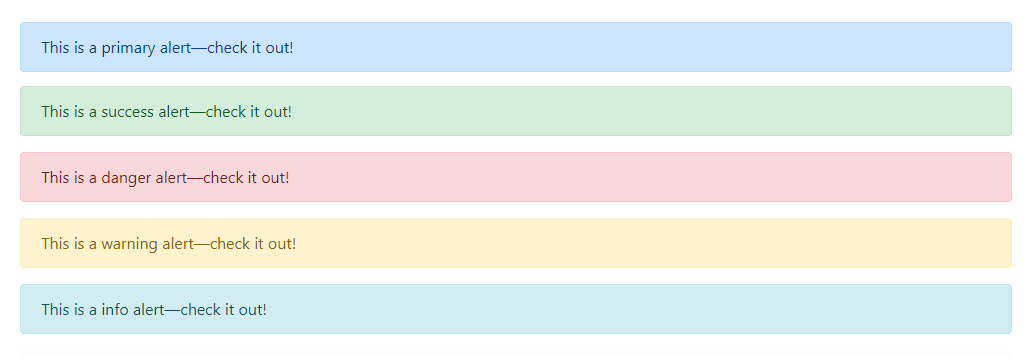
Alert
Provide contextual feedback messages for typical user actions with a handful of available styling options. After inserting the alert element, select the element and change the style from the right-side “Alert Style” option.
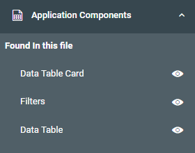
Application Components
Applications have several areas (prompt pages filters, total levels, data tables, etc). This area can help you quickly navigate to the area you would like to work with. Additionally, in the event you “Clear Page Contents” from the Page Options menu, this option lets you add entire sections back into your page via the pointer icon.
Editing Panel
This is where you will spend most of your time editing your application. Based on what you click on in this panel, different options will be available to you within the right side menu. There is no right-click context menu. In an effort to ensure maximum visibility for various options, no right click context menu is used.
Blue Menu (selected element)
When you click within any element, a blue menu will appear. You can click again to hide it if necessary.

Quick edit – Depending on the element type, a quick edit option will be available to you allowing you to modify the selected element without having to go to the right panel.
Up arrow – this lets you go the parent item of the currently selected element.
Box – This lets you wrap the selected element inside of a card, tab, or simple DIV element.
Trash – Removes the current element. m-Painter is smart enough to remove the entire column if the current selected element is a table cell.
Label – Indicates what element you have selected.
Green Menu (hovered element)
When the grid option is checked, any element hovered on will show a green menu. You can remove this green menu by hovering off of the element or simply unchecking the grid option.
Label – Indicates what element you have hovered on.
Insert row above – Adds a row directly above the current selected element.
Insert row below – Adds a row directly after the current selected element.
Insert column to the left – Adds a column directly before the current selected element.
Insert column to the right – Adds a column directly after the current selected element.
Increase column width – Available on non-table elements – this allows the container to use more space of the 12 available columns on the page.
Decrease column width – Available on non-table elements – this allows the container to use less space of the 12 available columns on the page.
Wrap element in container – Available on non-table elements – allows you to wrap the selected element into a card, tab, or plain DIV.
Removes content – Removes selected content from page.