Overview
m-Power’s built-in dashboarding utility is perfect for providing at-a-glance views of key performance indicators relevant to a particular objective or business process. Developers can create dashboards for their end-users by adding various existing m-Power applications or Data Explorer Saved Designs to the dashboard. The dashboard utility allows for layout customization and configurable filters that can be applied to any applications within the dashboard. Once dashboards are made, they can be public or private and shared to other users.
This documentation will cover creating a new m-Power dashboard, adding and configuring content on the dashboard, creating runtime Filters, and additionally demonstrate various options for layout customization.
Creating a Dashboard

To create a new dashboard, select ‘Explorer’ in the blue header bar from the m-Power interface. This will bring up a listing of all configured dashboards for the current data dictionary.

To add a dashboard to this list, click the ‘Create New Dashboard’.

Enter a name and description. The ‘Public’ setting, if checked will allow the dashboard to be viewable by all other m-Power users. Otherwise, if let unchecked the dashboard will be private meaning only the user profile who created it will have the ability to view and edit this dashboard.
Adding Content to the Dashboard
Run the dashboard after creating it by pressing the green arrow. The next image will show the default layout of a new dashboard.

By default, the dashboard has four blank squares to which are to be replaced by any applications or DX Saved Designs of the developer’s choosing. Pressing the ‘+’ icon will begin the process of adding content to the dashboard.
Before adding content, the option of choosing either an existing m-Power application (Retrievals and Reports) or a Data Explorer Chart/Report will be given. Note that only developers will be able to add m-Power applications to a dashboard. End-users who execute a dashboard at runtime will only be given the option to add Data Explorer Chart/Reports to a dashboard if licensed to use m-Power’s Data Explorer.

Adding an existing m-Power Application
If ‘Existing m-Power Application’ is selected, a list of Retrievals and Reports in the current dictionary will be presented. Dashboards may also utilize Retrievals and Reports from other data dictionaries simultaneously.

Once an application is selected, the Configure Select Application screen will provide the option to change the displayed title of the dashboard application being added, and optionally configure any additional URL parameters to pass to the application. URL parameters can most notably control the output of the application in the dashboard and filter the data returned. For example, if desiring to utilize just the graph portion of an m-Power Report, toggle the parameter help and select Contents –> graph –> 1. On –> ‘Append Parameter’ (Example shown below).

Notice m-Power will automatically add the appropriate parameter (in this case ‘graph=1’) to the URL parameters box. Repeat this process for any additional parameters that are desired for this application. For m-Power developers with a strong understanding of URL parameters, note that any valid application parameters may be manually typed and configured in this box directly.

Once ‘Save Dashboard Item’ is selected, the application will be added to the dashboard.

Adding a Data Explorer (DX) Design
Alternatively if adding a chart or report from m-Power’s Data Explorer (DX) to a dashboard, this route will prompt the user to explore an assigned Data Model and create a saved design to then add to the dashboard.

Once the design has been created to the user’s liking, pressing the orange button ‘Save and Return to Dashboard’ (shown in the top left corner of Figure 10). From here, select the existing dashboard to add this design to (or optionally create a new dashboard):

Use your cursor to highlight the appropriate square where the DX Design will be placed:

And then click to simply add the design to the dashboard. As the message shows at the bottom of the screen in Figure 13, the dashboard is saved automatically as content is added.

Once applications or designs are added to the dashboard, a developer may always edit the existing content or remove it entirely. Expand the pulldown menu (gear icon) in the top-right corner of the content to accomplish this.

- Edit – If the content is an m-Power application, this will take the developer right back to configuring the name and URL parameters for the application. Otherwise if the content is a DX Design, the ‘Edit’ option will take the developer back to exploring and editing the Saved Design.
- Maximize (Minimize) – If looking to examine a particular graph or report more closely, this option will maximize the selected content in the current dashboard view.
- Remove Content – Use to remove the selected application or design.
Adding Runtime Filters
Developers who create dashboards can optionally add in runtime filters to a dashboard that allow the end-user to filter any desired applications or DX Designs which have been added to the dashboard. First, click the configuration button (red gear) in the top right corner of the screen. This will open a slide out menu. Then press ‘Create Filter’.

In the subsequent Dashboard Filter screen that pops up, use the ‘Configuration’ tab to provide the new filter a name and select whether the Data Type of the filter will be ‘Alpha/Numeric’ or a true date. Other options in this window include specifying if the filter should accept a single value, multiple values, or a range of values (Input Type). Also presented is the option to configure the filter style (Input Style) and choose whether it will be a text input, a dropdown list, slider, among other choices. In this example, my filter for Customer Number will accept a single value, and use a dropdown list.

Note that for Input Style, utilizing the ‘Select List’, ‘Radio Buttons’, or ‘Text w/ Lookup’ will require using a pre-built External Option List Retrieval application (‘Get data from an option list’) or creating a static list of values (‘Create a value list ‘).
Once the filter is configured, press ‘Next: Add Listeners”.
The ‘Listeners’ tab will tell the dashboard which m-Power applications or DX Designs that have been added to the dashboard should respond to the filter. For each app/design that will respond to the filter, press ‘Add Listener’ and from the ‘Map Filter to Item Field’ dropdown that appears select the field in the application or design that corresponds to the appopriate field to filter on.

Once finished, press ‘Save Dashboard Filter’. The dashboard filter(s) will by default appear at the top-right of the screen. After selecting a value to filter on, pressing ‘Apply Filters’ will reload any applications/designs on the dashboard with this filter selection. Visually, a user can immediately see each actively filtered window in the dashboard with the current filter value displayed (highlighted in yellow).

Customizing the Dashboard Layout
Once applications or DX designs are added to a dashboard, there are a few customizations options available to control the presentation and layout of the dashboard.
Removing/Adding Squares
Refer to Figure 19. Adding additional squares (A) or removing unused squares (B) in a dashboard.

Enlarging/Shrinking Squares
Any squares in the dashboard may be resized vertically or horizontally to adjust the width or height of your content. In the bottom right corner of any dashboard square, click and hold the resizeable handle shown here:

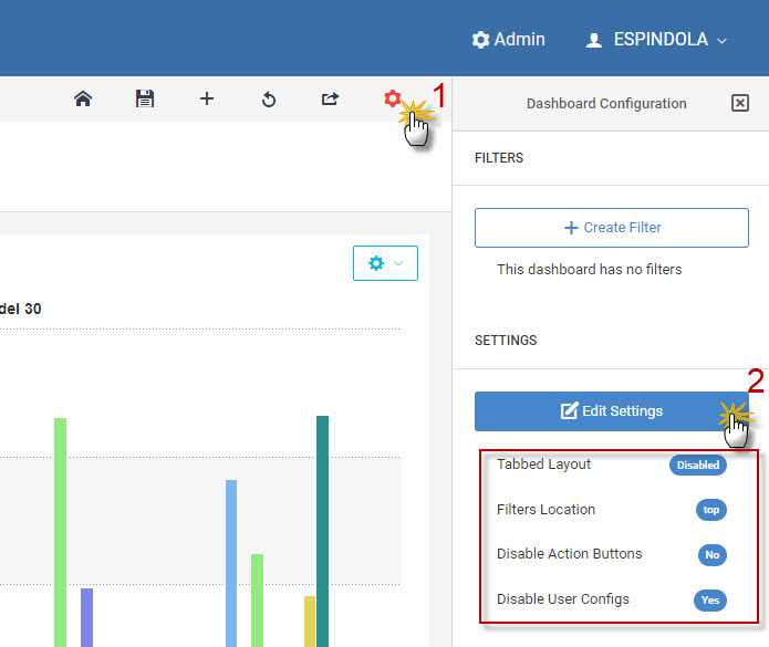
Dashboard Settings
Within the dashboard, various additional settings can be configured to simplify the UI, change filter behavior, and disable/enable user configurations. Refer to Figure 20 below.
- Tabbed Layout – If additional dashboard “Tabs” are desired, this can be turned on. This will allow the developer to add new tabs to the dashboard and expand the amount of applications and/or DX designs that can be placed on the dashboard.
- Filters Location – Choose where the dashboard filters (if any) will display on the dashboard for the end-user when ran. Current options include top or left.
- Disable dashboard action buttons – If set to ‘Yes’, this will hide all the black-colored buttons above the dashboard window when the dashboard is seen by the end-user. Useful if a simpler UI for the user is desired.
- Set Disable User Configuration Options – If set to ‘Yes’, this will remove the ability for adding new content to the dashboard layout. Useful when the developer wants to fix the dashboard layout for the end-user.
Promoting the Dashboard to Production
When promoting Dashboards to production the following lists out the necessary file(s) required to be promoted:
| File | Location | Description |
|---|---|---|
| DDdxdashboard-vue.json | /m-power/mrcjava/mrcdb | List of all Dashboards within the data dictionary |
This file may be manually copied to the production directory on the m-Power server, or alternatively can be promoted via m-Power’s Promote to Production Utility (see next section).
Adding Dashboard Files to the Promote to Production utility
The ‘DDdxdashboard-vue.json’ file will not be listed in the Promote to Production utility by default, but may be added to utility manually in Admin -> Promote to Production -> Other Files -> Add New File. The values to be entered are as follows:
- File Name: DDdxdashboard-vue.json
- Description: DD Dashboards
- Path: mrcdb
- Type: json
Adding a Dashboard to a Menu
Just like m-Power applications, dashboards may be added as a link on the end-user’s main menu via Admin -> Menu & Security -> Menu Options. Here’s how:
- Go to Explorer -> Launch Dashboarding (green button).
- Find the dashboard in the “Dashboards” section and press the run button.
- Copy the entire URL shown in the browser for the dashboard, starting with “/mrcjava“
- Go to Admin -> Menu & Security -> Menu Options
- Paste the copied URL from Step 3 into the “URL” input box.
- Manually enter in a unique Menu Option ID, and fill out any other options as needed.