Overview
The Interface and Build Settings within m-Power allows you to control default application options and settings within your data dictionary. Most importantly, this section allows you to control the Template style (Bootstrap, Sky, or Retro) that is used in your dictionary. Please note that some of the options here only apply to Bootstrap templates.
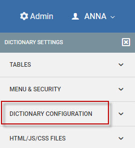
To navigate to the Interface and Build Settings screen please go to “Admin” -> “Dictionary Configuration” -> “Interface and Build Settings”.
Upon opening Interface and Build Setting screen you will have a handful of tabs with various options which are discussed below:
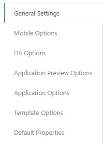
General Settings
mrc Editor Theme– The theme used by the mrc Editor. When in m-Painter and viewing the source, this property is what allows you to customize the background and text colors applied to the source. You can view all the available themes here.
DB Options
Alpha Type (Oracle databases only) — Within Oracle database connections, developers can control what type alphanumeric fields are created as (either char or varchar). This property applies to simple table creation as well as creating summary tables. This property is noteworthy as joining between a char and varchar field is not fully supported.
Application Preview Options
Enable App Preview — During an m-Power application build, developers have the ability to preview what the application will look like prior to compile. To help reduce load on the database, system administrators can set the default behavior of applications to not generate a preview. This setting applies to all applications within the current Data Dictionary. This value can be overridden by developers at the application level.
Calendar Data Pattern (Bootstrap templates only) — If utilizing a numeric date within your Calendar template, you will need to ensure the format of your date matches the value listed here. If not, your data will not properly render within the Application Preview window.
Preview Max Rows #1 — During an m-Power application build, developers have the ability to preview what the application will look like prior to compile. To help reduce load on the database, not all of the records are loaded. Instead, the developer can choose 1 of 5 pre-loaded “maximum” number of records to include. The amount defined for this parameter sets the smallest amount available for a developer to return to the Preview window. Default is 10.
Preview Max Rows #2 — The amount defined for this parameter sets the 2nd (of 5) maximum values available for a developer to return to the Preview window. Default is 100.
Preview Max Rows #3 — The amount defined for this parameter sets the 3rd (of 5) maximum values available for a developer to return to the Preview window. Default is 500.d
Preview Max Rows #4 — The amount defined for this parameter sets the 4th (of 5) maximum values available for a developer to return to the Preview window. Default is 1000.
Preview Max Rows #5 — The amount defined for this parameter sets the largest amount available for a developer to return to the Preview window. Default is 5000.
Application Options
Default Search Type — Grid based templates, such as the Multiple Record and Display/Maintain templates (as well as the Bootstrap templates Multiple Data List and Display and Maintain Rows) support searching/filtering. This option controls the default configuration for the search functionality. Developers have the opportunity to override this setting at the application level. More on these options can be found here.
Summary Suffix — This value lets you append a default value on all tables created via Summary files. This value can be modified at the application level.
Template Style — m-Power supports various default template styles. Use this feature to select the version that works best for this Data Dictionary. Note that this property should only be adjusted in newly created dictionaries.
Enable Mobile Responsive Design — m-Power applications support both adaptive and responsive. Adaptive design allows a separate presentation layer to be displayed based on the device. Responsive, alternatively, will redraw existing elements to better fit/utilize the current screen space. This feature specifically enables the Responsive design. Once activated, you will need to recompile any applications that you require to be responsive. You will also need to overwrite the existing HTML presentation layer.
PDF Renderer Version — Choose which render your m-Power reports should use when creating PDF files. Note that to use the JavaScript Enabled renderer, you must have this installed. More information can be found here.
Hash Password — If this Data Dictionary is using MD/SHA security, specify the type here. After doing so, the “Manage Application Users” screen (Admin Menu -> Application & Menu Security) will automatically encrypt any passwords entered via the method specified within this property.
Control Joining Behavior — By default, m-Power will only allow you to join tables together on common fields or where field synonyms have been previously defined. However, developers can override this behavior at the Data Dictionary level and allow m-Power to join tables together on all fields. This option is only intended for m-Power developers who have a strong understanding of their database’s field mapping. This property will be applied for all applications within this Data Dictionary.
Name of the Postgresql Database for this Dictionary — For customers using a PostgreSQL database, this property allows you to specify the name of which PostgresSQL database you would like to work with for this dictionary.
m-Painter Version – Use to set which version of m-Painter new applications in the current dictionary will use by default. Version 2 is the newest iteration of m-Painter.
Template Options
Textarea Field Length Threshold — Field length at which a textarea will be output instead of a text input.
Add shading to form labels — Use only with Form Orientation set to -Label left of Input- . Puts a shaded background on form labels.
Additional Table Classes — Add additional table classes to control the default look and feel of data tables.
Form Input Sizing — Determines how to size form inputs. The default is to use the width of the element that contains the input. Using the field length will apply a size to the input similar to the max length of the field.
Form Label-Input Orientation — Determines where the field input label will be located relative to the text input. Options are provided to put the label on top of the input or to the left side of the input.
Default Properties
This section allows you to create default properties to be applied to new applications within your dictionary. After you have selected the Application Type (Retrieval, Report, Summary, Maintainer) and the subsequent template, you may select the property applicable to that template that you would like to edit. Note adding a new default property will only affect newly created applications.