Overview
Recently I worked on a project that used the Google Maps API functionality for a Bootstrap theme application. Because my application would be utilized on different devices with variable screen resolutions (smartphones, tablets, or PCs) I wanted to implement some custom CSS to make my map truly be responsive, allowing my map to scale itself automatically based on the screen size the user was viewing the map on. While my example below is a Multiple Row Data List retrieval template, any m-Power application that has the Google Maps functionality added to it from m-Painter will apply.
Implementation
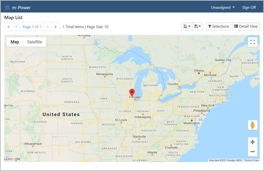
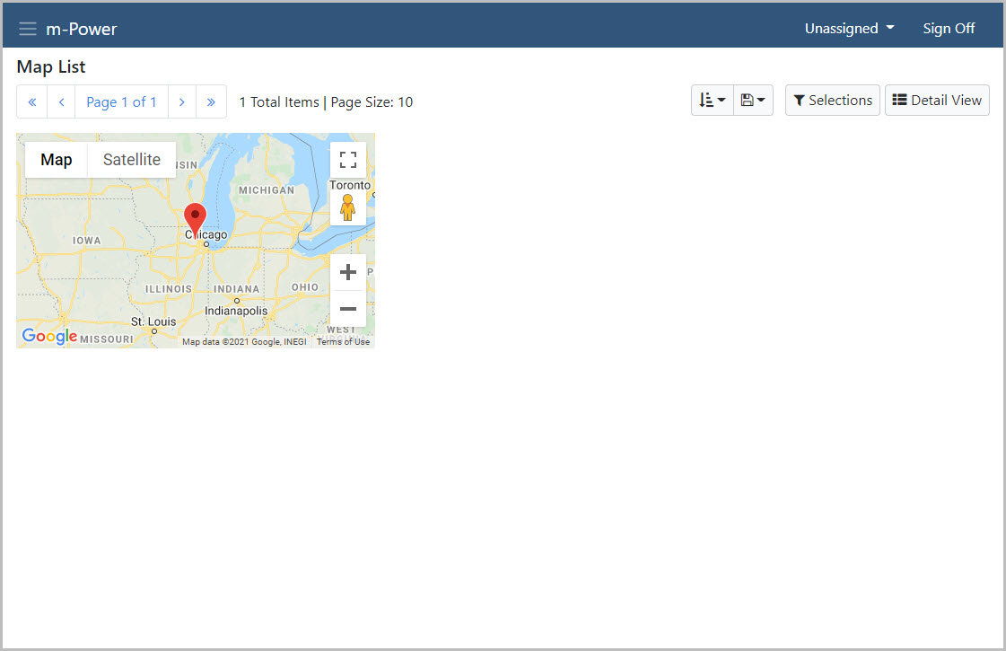
From m-Painter, I’ve inserted my Google Map and left the default width and height (in pixels).
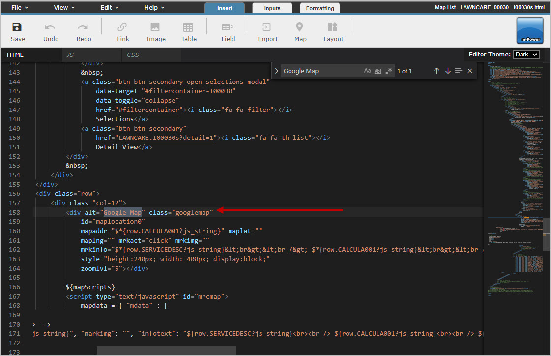
In m-Painter, I’ll toggle to my HTML source and using the ‘Find’ option in the Edit menu search for ‘Google Map’. That should take me to this code as shown below:
I’ll make the following changes (highlighted in red).
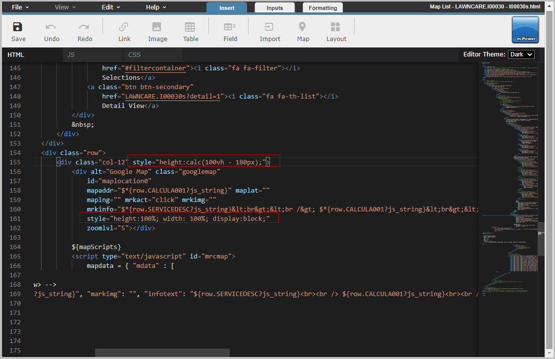
Notice the style="height:calc(100vh - 180px);"
This inline CSS uses a calculation that tells the map to take up the full height of the user’s viewport (100vh) and subtracts 180 pixels. The 180 pixels I have used to provide some separation between the map and the very bottom of the screen (which is especially useful if you have content in your application footer).
The end result: