
Overview
The ability to create Widgets in the m-Power development platform has always been one of the most popular options when it comes to improving the layout, presentation, and user-interaction of your applications. In m-Power’s Sky theme applications, m-Painter’s Widget Panel presented developers the ability to create grid, tabbed, and accordion widgets.
Now that m-Power has evolved to utilize the responsive and modern Bootstrap framework as the default application style, I wanted to show fellow m-Power developers how they can create similar “Widgets” in their Bootstrap themed applications.
I want to preface the following information by explaining some terminology that you’ll see frequently referenced within this document.
- Widget – In the m-Power community, this is often a blanket term used to reference any HTML element(s) that enhance end-user functionality and interaction within a web application.
- Bootstrap – While many developers in m-Power already know their newer applications visually are Bootstrap themed, it’s important to simply know that Bootstrap as a whole is a front-end framework used to create modern websites and responsive web applications. Inherently the Bootstrap library includes numerous HTML and CSS templates for UI elements such as buttons, tabs, alerts (and more) that can be used within your m-Power applications. All examples that follow utilize Bootstrap Components.
Navs
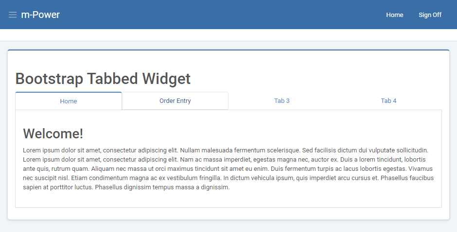
A Nav component in Bootstrap allows you to create tabbable panes of content as shown in Figure 1. One of the most obvious benefits of this is the ability to organize information, as well as neatly display a lot of content on a single page due to the innate nature of always showing the contents of a single tab at any given moment. These ‘Nav’ components can be inserted right from m-Painter using the Element Window:
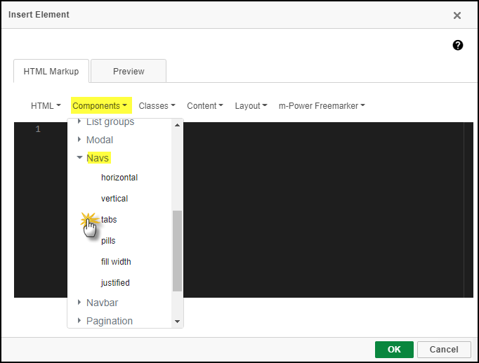
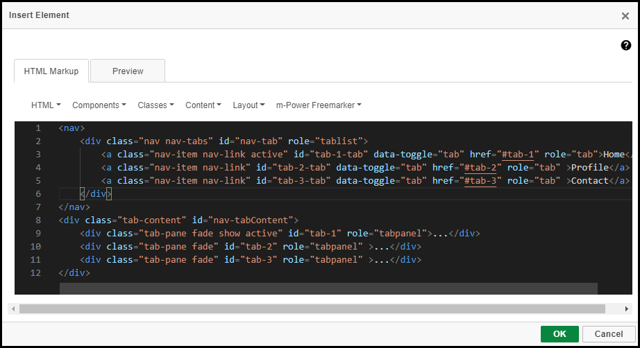
m-Painter will insert the necessary HTML source code for you; no edits are necessary.
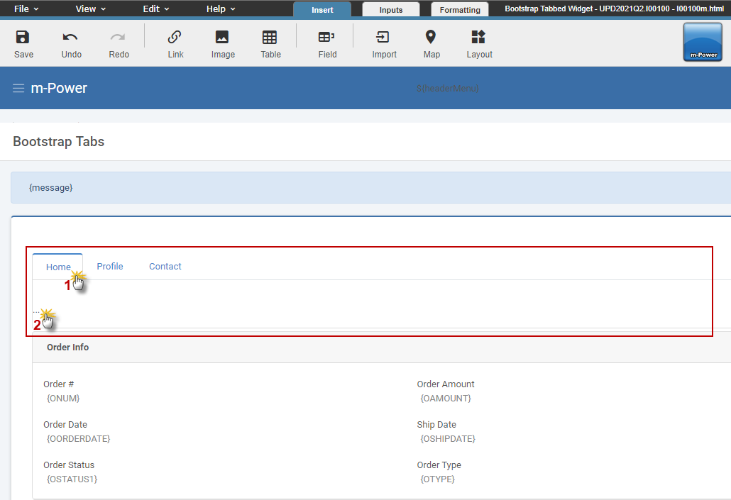
Simply press ‘Ok’. In the m-Painter WYSIWYG editor inserting your content into the tabs is easy. Click on the appropriate tab heading for the tab you want to edit. Place your cursor where the dots ‘…’ are within the tab; here is where you will replace the dots with your desired content.
There’s a few ways to get your content into the tab:
- Typing free text directly into the tab.
- Using the m-Painter toolbar to insert a Table, Map, etc.
- Using the Element Window to insert a new element or cut and paste existing m-Painter element into the tab.