
Overview
Many developers who have used the graphing tool in m-Power’s report templates know that the plugin used for rendering the graphs is FusionCharts Suite XT, a JavaScript charting library.
Anything that FusionCharts can do, m-Power can do as well. While we ship the more commonly used graph templates as a part of the graphing wizard in m-Painter (ex. 2D/3D Bar Chart, 2D/3D Pie, etc.) you can use other chart templates that are shipped with FusionCharts library, even if they are not a selectable chart type within the graphing wizard in m-Painter. This tech blog posts aims to show more experienced m-Power developers just how they may implement a non-standard chart into their m-Power report.
Step 1 – View FusionCharts documentation
The first chart type I will make in my Regular Report example will be a FusionCharts Bullet Chart, as shown below:
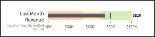
Bullet Charts are ideal alternatives to a gauge or meter chart. Depending on the chart type you are looking to display in your report, various attributes will be needed in order for the chart to properly render. Please visit the FusionCharts site here to find the chart you are interested in utilizing.
For this example, this is the documentation I will be referencing: https://www.fusioncharts.com/dev/chart-guide/standard-charts/bullet-graphs.
Step 2 – Edit HTML Source
By default, the graph will render between these two comments in the HTML source of your report application: <-- Begin Graph Image --> and <-- End Graph Image -->. All the code between these two lines will need to be removed and replaced with the following jQuery script, which will load my FusionCharts bullet chart:
<!-- <#if page.run != 0> -->
<script type="text/javascript">
jQuery(function() {
  checkLib('FusionCharts', 'FusionCharts', function() {
     var myChart = new FusionCharts( "/mrcjava/FusionCharts/vBullet.swf",
                     "test", "300", "400", "0" );
     myChart.setJSONData(
    {
    "chart": {
        "theme": "mrc",
        "lowerLimit": "0",
        "subCaptionFontSize": "11",
        "upperLimit": "120",
        "caption": "Last Month Revenue",
        "subcaption": "Actual vs Target (Bakersfield Central)",
        "numberPrefix": "$",
        "numberSuffix": "K",
        "chartBottomMargin": "25"
    },
    "colorRange": {
        "color": [
            {
                "minValue": "0",
                "maxValue": "1000000000",
                "code": "#e44a00",
                "alpha": "25"
            },
            {
                "minValue": "1000000000",
                "maxValue": "1500000000",
                "code": "#f8bd19",
                "alpha": "25"
            },
            {
                "minValue": "1500000000",
                "maxValue": "2000000000",
                "code": "#6baa01",
                "alpha": "25"
            }
        ]
    },
    "value": "${grandTotal.MTDSALES_o?c}",
    "target": "${grandTotal.CALCULA001_o?c}"
}
	);
     myChart.render("chart-container");
  });
});
</script>
<div id="chart-container"></div>
<!--</#if>-->
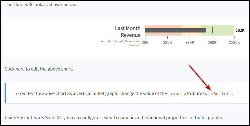
Please see these important notes about the above script:
var myChart = new FusionCharts( "/mrcjava/FusionCharts/vBullet.swf", "test", "300", "400", "0" );- The chart type is determined by the
vBullet.swfvalue, which here is specific to a vertical bullet chart. For example, a horizontal bullet chart instead is utilized by changing this value tohBullet.swf. The documentation from FusionCharts will indicate the necessary “type” attribute that should be utilized to reference the right chart type. - The
300and400values represent the height and width (in pixels), respectively of your chart. Percentages may be used instead of pixels, if desired.
- The chart type is determined by the
"value": "${grandTotal.MTDSALES_o?html}"- This is the chart value to plot. In this example, I am plotting my MTDSALES field from the grand total level of the report.
"target": "${grandTotal.CALCULA001_o?html}"- This is the target line in the graph. Like the “value” attribute, it can support any Freemarker variable from the report or a hardcoded value.
<div id="chart-container"></div>- This <div> container is where the chart will render.
Step 3 – Add/Remove chart attributes
Depending on the chart type you are looking to implement, various properties in the above code will need to be added or removed in order for the FusionChart object to successfully render. The FusionCharts documentation should be referenced in order to find the custom chart type you are working with, and view the necessary properties required to render the chart:
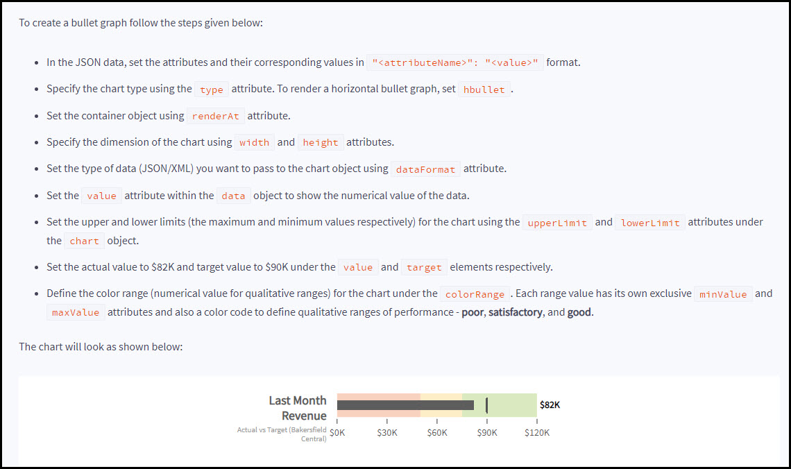
For instance, the Bullet Chart utilizes the "colorRange" property to define the different color ranges for the Bullet chart. Other non-gauge chart types will not utilize this property, so this entire section may be omitted from the jQuery script.
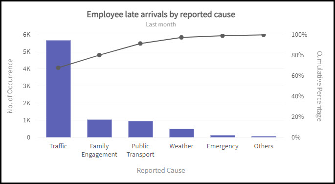
Alternate Example: Pareto Chart
Pareto charts combine a bar chart with a line graph to help visualize the most important issues or pitfalls in any kind of process flow.
The Bullet chart in the previous section is an example that graphs a single value from the report grand total level. However, when utilizing other charts in FusionCharts that are multi-value charts, such as a Pareto chart, these charts will often need to loop through a subtotal level of the report and print each totaled value within the graph. The jQuery script in these cases will need to include the report template’s Freemarker looping logic in order to loop through the entire dataset. This looping logic starts and is contained within these comments in your report’s HTML source:
<!-- <#list report as section> -->
and
<!-- </#list> -->
Using the following as an example, here is an m-Power summary report side-by-side with a Pareto chart:
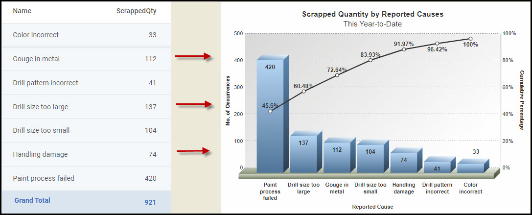
What follows is the accompanying jQuery script for the chart produced in Figure 5 above. Highlighted within the code is the Freemarker loop list logic that was copied from the report’s HTML source and is utilized with the FusionCharts "data" section:
<!-- <#if page.run != 0> -->
<script type="text/javascript">
jQuery(function() {
  checkLib('FusionCharts', 'FusionCharts', function() {
     var myChart = new FusionCharts( "/mrcjava/FusionCharts/pareto3d.swf",
                     "test", "300", "400", "0" );
     myChart.setJSONData(
    {
    "chart": {
       "theme": "mrc",
       "caption": "Scrapped Quantity by Reported Causes",
       "subCaption": "This Year-to-Date",
       "xAxisName": "Reported Cause",
       "pYAxisName": "No. of Occurrences",
       "sYAxisname": "Cumulative Percentage",
       "showHoverEffect": "1",
       "showValues": "1",
       "placeValuesInside": "1",
       "valueFontBold":"1",
    },
    "data": [
<!-- <#list report as section> -->
      <!-- <#assign lastRow = section.lastDetail> -->
      <!-- <#if section.subtotalsc.size() gt 0> -->
      <!-- <#assign subTotal1 = section.subtotalsc[1]> -->
      <!-- </#if> -->        {
         "label": "${lastRow.name__X2}",
         "value": "${subTotal1.scrappedQty_o?c}",
       },
<!-- </#list> -->
]
    }
	);
     myChart.render("chart-container");
  });
});
</script>
<div id="chart-container"></div>
<!-- </#if> -->
Editor’s Note
The information here and example is utilizing a non-standard “custom” chart. If you would like mrc’s assistance with configuring your own custom charts, please contact support@mrc-productivity.com to discuss consulting services.