How often?
According to the online marketing institute, the problems caused by a poorly designed interface are substantial. The numbers indicate that:
The fact is, usability is becoming an essential aspect of web application development. User expectations have changed. Modern end users expect to pick up a web app and understand how it works. Confusing interfaces will only frustrate users and drive them away.
However, many developers build applications which do just that. They unwittingly make development mistakes that hurt their web application’s usability. In doing so, they accidentally alienate their users.
What are these mistakes? In what ways do developers accidentally create interfaces that frustrate their users? We posed those questions to a few experts in the area of usability, and have compiled their feedback below. Here are 7 development mistakes that kill web application usability:
“Most usability mistakes on the web involve developers forgetting that people don’t want to have to struggle to figure out how to use the interface,” explains Steven Swimmer, Web and Digital Strategy consultant at Swimmer Media. “Things that may seem obvious to a developer are not at all obvious to users. Unless your odd interface adds utility, then it’s not worth doing. If there is an odd interface that adds some utility but is misunderstood by users, you need to provide some integrated means of showing people how to use the app.”
The desire to create something “new and innovative” can become one of the biggest stumbling blocks for developers. Delivering a unique user experience, or new approaches to common functions, is more likely to confuse users than impress them. Most users won’t bother figuring out how your great new interface works, or will simply become frustrated when a seemingly common function doesn’t behave as expected. Here’s one great example:
“Users expect that commands will be the same from site to site or app to app,” says Ian Lamont, author of Twitter In 30 Minutes, Google Drive & Docs In 30 Minutes, and Dropbox In 30 Minutes. “But it doesn’t always work that way. Take Dropbox. I tell users that deleting a file in Dropbox is like trying to kill a vampire. You may think you’re deleting something by selecting a file and clicking the “Delete” key, or dragging it into the trash on your desktop. The file isn’t dead yet. The only way to drive a stake through its heart is to log on to Dropbox.com, use the “Show Deleted Files” option, and then select “Permanently Delete”. Sound complicated? Absolutely. Dropbox has reasons for setting it up this way, but it’s not intuitive, and leaves a lot of users frustrated or vulnerable.”
When a user makes a mistake, or attempts an unauthorized action, what happens? Do they receive a confusing error message, or an error message with clear advice on how to resolve the issue? In my experience, it’s typically the former. Most error messages mean nothing to the user, and provide no guidance as to the user’s next steps. The result: frustration.
“Poorly written or ambiguous error messages can be frustrating to users,” explains David Ciccarelli, CEO and co-founder Voices.com. “Don’t give the users an error number and code that means nothing to them. Instead, say “Sorry, that didn’t work. Try this instead’.”
One of the most common ways developers annoy their users: They accidentally turn their applications into scavenger hunts. They place navigation elements, or essential buttons, on different places across screens…which frustrates users to no end.
“Changing where an element is located from page to page or screen to screen will cause your users to hunt for a feature,” explains Ciccarelli. “I once used an enterprise application that had the main navigational tabs change order depending on which part of the app I was in. Terribly frustrated, we ended up terminating our contract only to switch to a competitor who is often praised for good usability.”
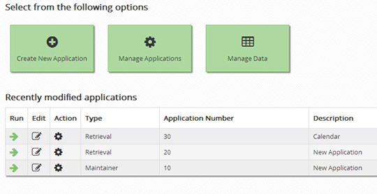
Your application must provide the user with a clear path. Take the screenshot below, for example. When a user logs in, the application delivers three clear options. Sure, the application is capable of many more tasks, but adding all of those options will only complicate the process for the user. Don’t focus on the application’s capabilities. Focus on the user’s goals.
“While the user should be in control of the experience, too many competing options can make decisions difficult,” explains Caroline de Gruchy, an experienced web designer. “The options on a page should be mutually exclusive. I had a client who wanted three different calls to action leading to 3 very similar pages, leading back to the same information afterwards. How was the client to decide where to go? Clicking 3 separate pages that tell you the same thing wastes my time and shows no respect.”
One of the big complaints surrounding the healthcare.gov fiasco was the registration process. Users were forced to complete a lengthy registration process (that frequently failed) before they could see available healthcare plans. This is a usability no-no. If you must ask for user information before granting access, keep that info to a minimum. Lengthy registration processes will only drive away potential customers.
“Some designers/developers like to have 10 pages for a new registration,” says Jeanine Swatton, an engineer – iOS and Ruby on Rails Developer – who teaches iOS development at Silicon Valley University and UCSC Extension. “Don’t they realize that after the 2nd page, they lose the potential customer? Keep it simple – a one click sign up process asking minimal information. Allow users to add their profile later.”
Another point on this topic: Make sure you tell the user just how much time the registration process will require. Nobody wants to get started on a registration process, only to realize later that the registration form is 10 pages long and requires a half hour of their time.
“Because your visitors might be using a keyboard and mouse with a widescreen monitor or a smartphone with a small touch screen, you need to design your UI with both users in mind,” says Noah Nehlich, owner of Structure Studios. “Small text links can be very hard to click successfully on a mobile device, and might drive people away in frustration when they can’t reach the information they need.”
This is an issue on two levels. First, clickable areas must be as big as they appear. What does that mean? The image below highlights this issue.
You’ll notice that what appears to be a clickable button is actually a small text link inside a box. Clicking the button itself will do nothing…unless the user clicks the text. Imagine how frustrated your users will become when they repeatedly click an apparent button that doesn’t actually do anything.
Secondly, creating small clickable areas (as described above) can prove frustrating for the growing number of mobile users. These days, you must build an application that functions well on any device…which calls for links and buttons that are easily clickable on a touchscreen. Brian Maggi, Director of Product Marketing at Sencha shares a good piece of advice for making web apps usable on a mobile device:
“Design for a single thumb,” he says. “This means making UI hit zones big enough for the thumb, the fattest finger. Make related things closer in proximity too, because it’s also the shortest.”
I’m seeing a problem crop up more and more: When cloud-based software companies redesign their interface, they blame negative user feedback on a “fear of change.” While that does happen, it’s a dangerous approach to user feedback. Sometimes, interface redesigns remove features that users loved, or complicate common actions. While many users do dislike change, don’t automatically group all complaints in that bucket.
“I get the sense that some developers and UX designers are not thinking about the needs of their users when they try to follow minimalist interface ideals that seem to be the rage in San Francisco and Silicon Valley,” says Lamont. “Not everyone wants that. I think minimalist interfaces actually create more clicks and more frustration for users when the apps have a lot of functions or features. People also don’t like it when software companies make a radical change to an interface. Microsoft was criticized when it switched Office to the ribbon interface. Now a lot of Web software companies are feeling the heat.”
“I have documented one case involving Hootsuite, a popular Twitter client that recently changed a critical UX element that infuriated many paying customers. The company blamed customers’ “Fear of change” as the reason for the outcry, instead of acknowledging that the UX change had been poorly thought out in terms of its most dedicated users.”
What do you think? Would you add anything to this list? If so, feel free to share in the comments.
What is a database front-end? As a basic definition, it's a web interface that lets…
With IBM pulling the plug on Db2 Web Query, many customers are stuck looking for…
If your business had a choice between an off-the-shelf CRM system and a CRM that's…
Summary: As technology evolves at breakneck speed, it brings new opportunities and challenges to web…
In a surprising move, IBM just pulled the plug on Db2 Web Query for i.…
By now, you’ve probably heard all about the benefits of low-code development tools. They let…