
Recently I was able to use m-Power’s new industry standard Bootstrap templates for a customer project. The goal of the project was to modernize their online shopping portal and make the site mobile friendly. These objectives served as a perfect fit for the new Bootstrap themed templates. While building the project, I found myself repeatedly relying on a handful of the Bootstrap features and I wanted to share those with the m-Power community. Here are five (of many) basic bootstrap features:
1. The Responsive Grid System
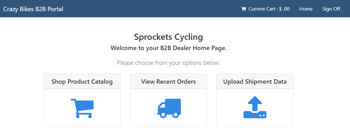
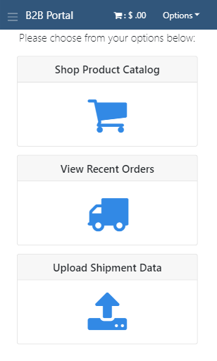
Bootstrap’s built-in responsiveness is extremely easy to grasp. The framework will attempt to maximize the screen size of the device being used. I often found the need to control the size of my elements depending on the screen size and would use different combinations of the column sizing to achieve that control. It may be common to see the following:
<div class="row">
<div class="col-md-10 col-xl-8"></div>
</div>
The above code would render differently based on the device type (click to enlarge):
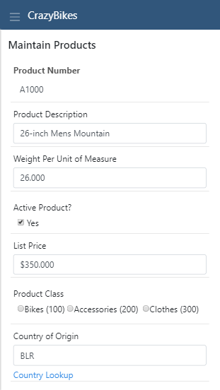
Extra Small (col-*) — Smartphones in portrait mode (<576px). This is the default and no size prefix is needed. When not specified, the width will default to the full 12 columns. Because I did not specify a column size, my element would use the full screen width on a smartphone.
Small (col-sm-*) — Smartphones in landscape mode (≥576px). Bootstrap responsiveness assumes a greater-than-or-equal-to approach when using column sizes. Because I did not specify a width for this size, small (sm) screens (landscape smartphones) would inherit the previously set width (the default 12 columns).
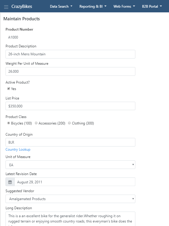
Medium (col-md-*) — Tablets in portrait mode (≥768px). Setting the column size to 10 for medium (md) devices would take up 10-of-12 sections.
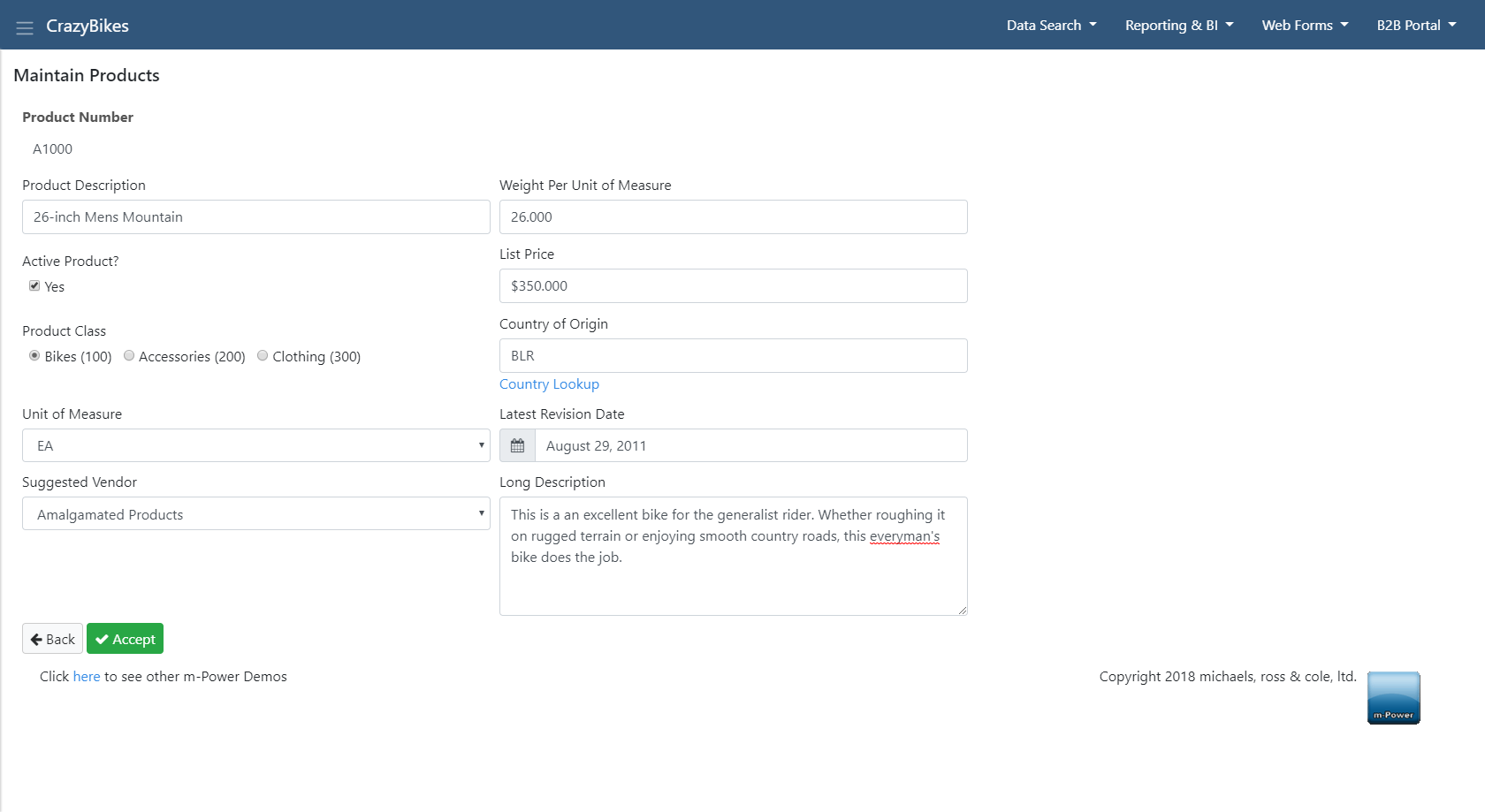
Large (col-lg-*) — Tablets in landscape mode (≥992px). Because I did not specify a size for large (lg) screens, the width will inherit the size from the previously set width (10 columns from medium).
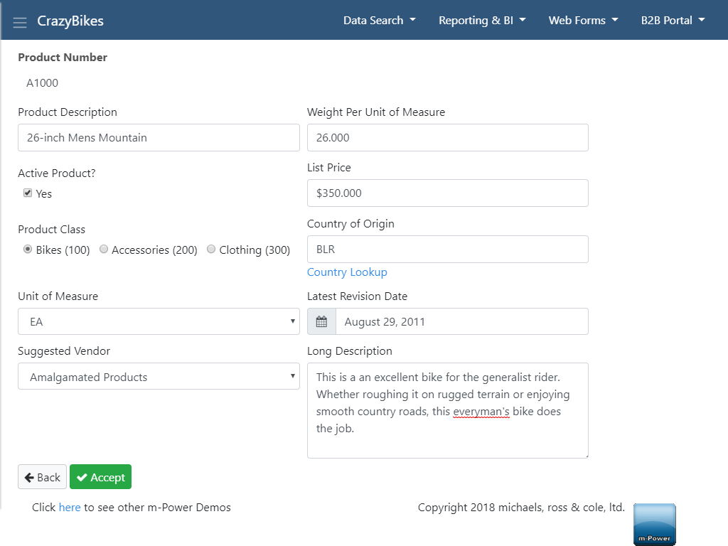
Extra Large (col-xl-*) — Desktops/Laptops (≥1200px). Setting the column size to 8 for extra large (xl) devices will use 8-of-12 sections.
Please visit the Bootstrap documentation about the Grid System for more details.
2. Spacing
While the Bootstrap templates come pre-styled, many of my new elements benefited from custom spacing. Bootstrap’s easy spacing classes for margin and padding made this a breeze.
Because most smartphone devices will have elements stack vertically you may want extra spacing on xs screen sizes, but no spacing on all other sizes.
Therefore, you may use the following:
<div class="mb-3 mb-sm-0"></div>The ‘mb-3’ class results in a bottom (b) margin (m) of 3. The ‘mb-sm-0’ class will have no bottom margin on screen widths small and up.
Notice, the ‘mb-3’ class does not specify a width size as no specification implies the default xs (smarthphone portrait) size. Also remember the responsive breakpoints assume a greater-than-or-equal-to relationship which is why I only need to specify the ‘sm’ size in the ‘mb-sm-0’ class. This means all devices above xs will have no bottom margin.
Please visit the Bootstrap documentation for more details regarding spacing classes.
3. Justifying and Aligning Content
Going right along with managing the spacing of my custom elements, I frequently needed to equally align my elements. Bootstrap made this possible by utilizing flexbox. Along with ‘d-flex’, the class ‘justify-content-center’, will automatically push the child elements to equal distances inside their container. By using the following code, I was able to equally justify the instruction text and the button of each row. Just as easy is the ability to vertically align the elements in each row with ‘align-items-*’.
<div class="d-flex justify-content-between align-items-center">></div>
Please visit the Bootstrap documentation over the Justify Content and Align Items utilities for more details.
4. Hiding and Displaying
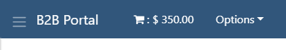
Another example of working with responsive breakpoints is the ability to conditionally display or hide elements based on screen size. Because you want to maximize your screen space, often you’ll hide elements on smaller devices and display them on larger screens. One instance I used this was the shopping cart amount in the header.

There is not enough horizontal room on the header if I kept the ‘Current Cart’ text. As you can see below, the element would wrap.
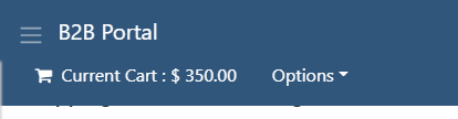
Adding this code will hide the text on xs device widths and display on screen sizes medium and up.
<div class="d-none d-md-inline">Current Cart</div>The class ‘d-none’ will be read as do not display on xs devices, whereas ‘d-md-inline’ will display the element inline on screen sizes medium and greater.
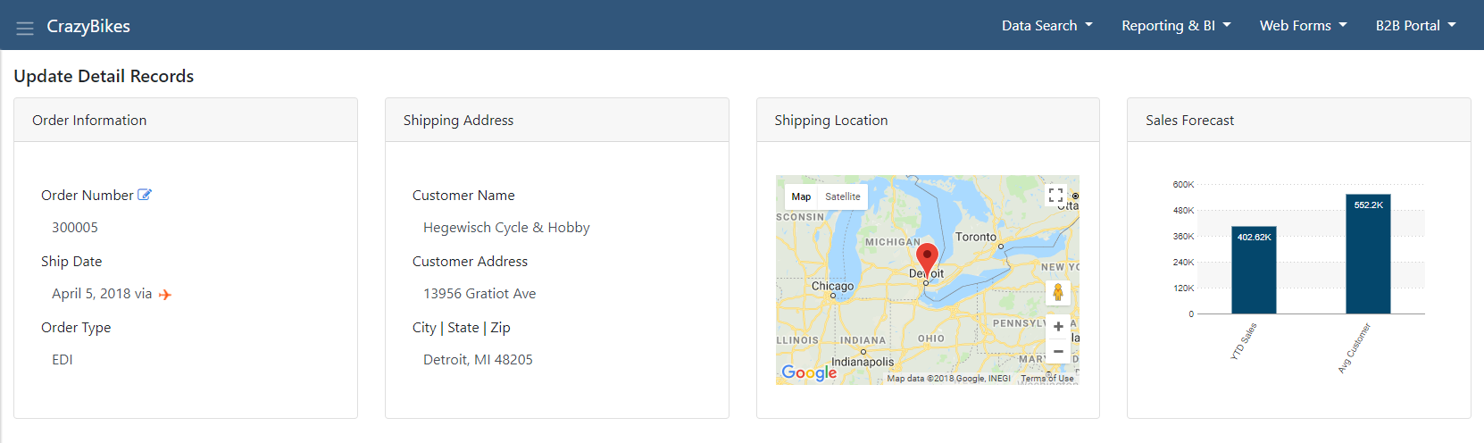
Notice I used the same method for other aspects of the header. The banner text on the left displays differently on a smartphone as well as the ‘Home’ and ‘Sign Off’ links on the right-side.
Please visit the Bootstrap documentation for more details regarding Displaying Elements for more details.
5. Card Panels
The card component is a simple, built-in method of organizing your data into elegant containers. Cards are a great way of separating unique data groups onto the page.
m-Power has two approaches of inserting cards: Via the Form Layout mode or the HTML toolbar of the ‘insert element’ feature in m-Painter.
Please visit the Bootstrap documentation for more details regarding Card Components.
And many more…
The above are just a handful of the many Bootstrap features available. You can read the full Bootstrap documentation for all other built-in Bootstrap classes. Additionally, there are countless other online tutorials and videos discussing Bootstrap. One simple and basic crash course can be found on this free 10 part guide on getting started with Bootstrap.
Please feel free to let us know of your favorite Bootstrap features and/or tutorials.
Thanks for your good information. It was very helpful article..