Overview
The descriptions tab allows you to change the labels of various parts of your graph. This screen will look very different depending on your graph type, the number of field selections you have, and the level of detail from which you are pulling.
Some of the common graph types will be shown, in particular how the Descriptions tab of the graph properties will look, depending on the graph selected.
Bar/Column Graphs
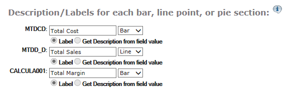
For each of the fields that will show up on the graph, you will be able to specify a label. By default, m-Painter will use the Field Description given in Field Settings.
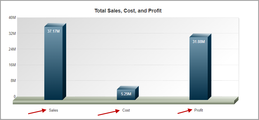
However, there are times that you may not be interested in a “static” label value, as Figure 2 shows.
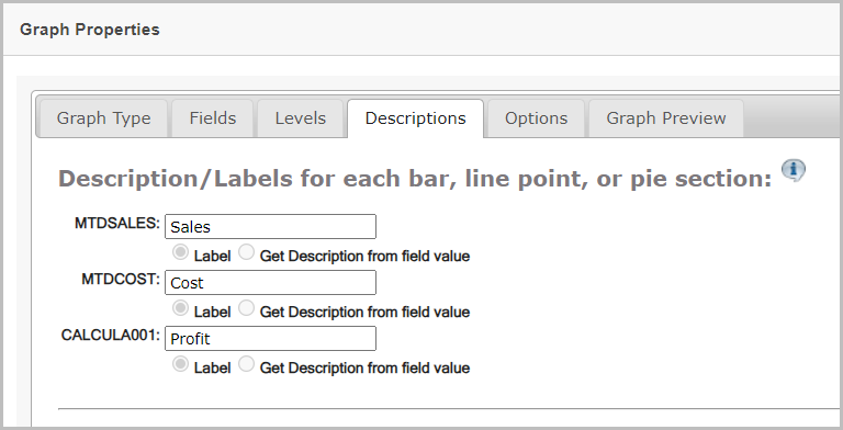
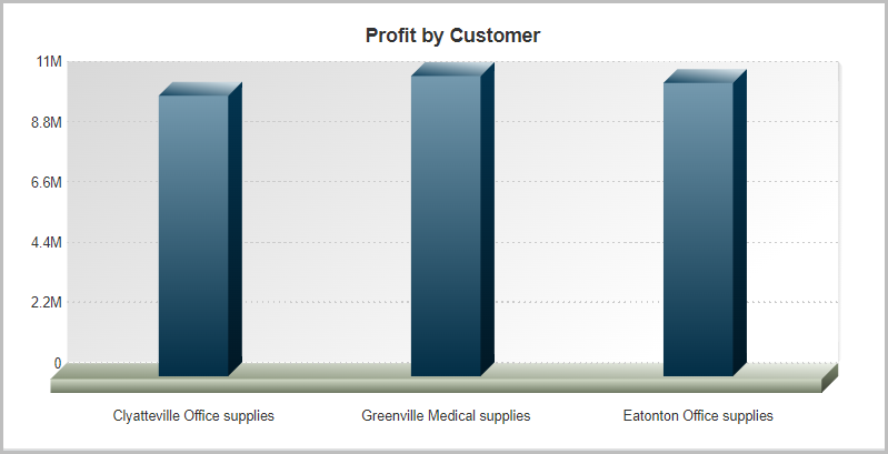
Instead, you can specify to use the “Get Description from field value” (see Figure 4). This option is often used for getting the descriptions in your graph when you have specified a “Subtotal” level for data collection, such as the 3D Bar graph from Figure 3 shows:
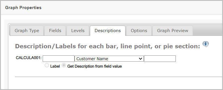
As seen above, the dropdown box in the middle allows you to select a database field to use as a label.
That value can have a prefix and a suffix added to it with the text boxes on the left and right of the dropdown box. No additional spaces are inserted in between prefixes/suffixes and the field value, so if the prefix is “Product Number” and the value in your table is “A1000”, the label will be “Product NumberA1000”. To make the label, “Product Number A1000”, make sure to add in the space in your prefix so it is “Product Number “.
Clustered, Stacked, and Multi Line graphs
Clustered and stacked bar charts, will have additional options when it comes to setting descriptions.
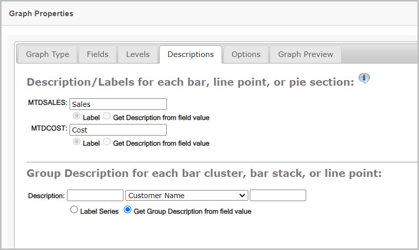
Using Figure 6 as a reference:
- The top half of the screen is for the label on the individual chart fields (the bars). These labels will be on the legend and on the tooltip (show when hovered on the bar) if the label is set to “Item Value”.
- The bottom half of the screen identifies the label to be applied for each group in the above graph. In Figure 5, each group is specifically a cluster, identified by a customer name.
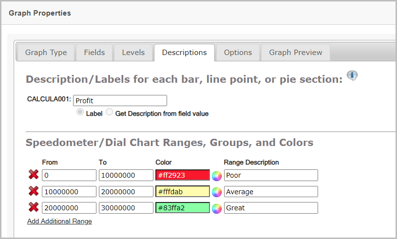
Gauge Type Graphs
When a gauge type chart (speedometer, gauge, LED gauge, thermometer, or cylinder chart) is selected, the following screen is shown:
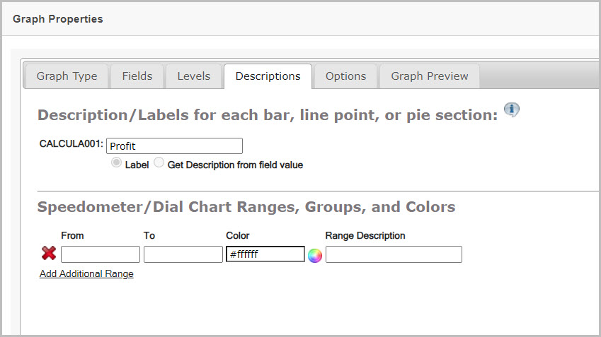
Using Figure 7 as a reference:
- The label in the top section (labeled Description/Labels for each bar, line, point, or pie section….) describes the field value you are using in the gauge graph. This label value is inherited automatically from the field selected back in the Fields tab of the graphing wizard.
- The bottom section (labeled Speedometer/Dial Chart Ranges, Groups, and Colors….) is where you identify the colored ranges of your graph.
- The From and To fields are numeric ranges, and define the length of the current range. Do not input any characters such as dollar signs ($) or commas (,) when entering your numbers.
- The next field is the Color, which can be free typed as a 6-digit hexadecimal value. Alternatively, you can also click on the color wheel next to the field and select a color from a palette.
- The Range Description is used to describe that range and will not appear on the graph.
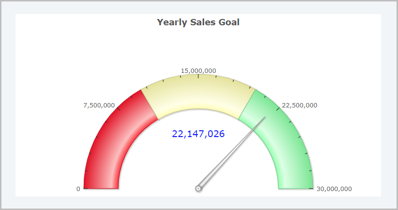
The following two images show the Descriptions tab of a speedometer graph, and the graph output.
Combination Charts
When creating a combination chart, m-Painter lets you decide how you would like to plot each element. The available options are: Bar, Line, or Area. Simply select the option that is most appropriate for your graph.