Overview
Stacked Bar Charts are useful tools when your data falls into similar groups. For instance, if you wanted to see the number of trucks leaving & arriving at a client you could simply group the data by client. However, in an order to conserve space, you could simply stack both values atop one another by using the Stacked Bar Chart graph.
The steps outlined below will demonstrate how this is done.
Getting Started
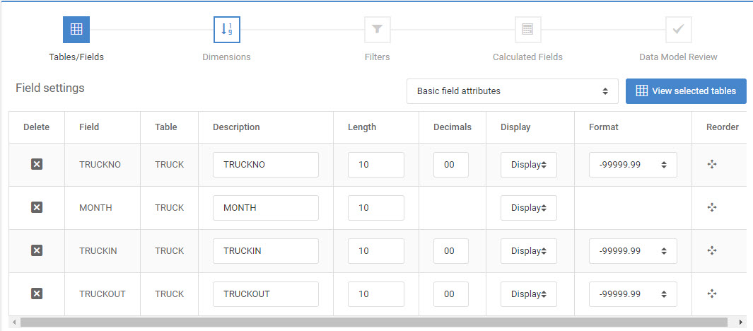
For the example below, we will be displaying truck activity, over 12 months, by “stacking” the drop-offs and pickups.
As you can see from this screenshot, we have four total fields:
Graph Properties
After selecting a Report template, build the application and enter m-Painter.
Right-click on the graph and select “Graph Properties”. Select the “3D Stacked Bar” graph on the first tab.

On the “Fields” tab, select “TRUCKIN” & “TRUCKOUT”.

On the “Levels” tab, select “Detail Level”.

On the “Descriptions” tab, enter “Trucks In” for field “TRUCKIN” and “Trucks Out” for field “TRUCKOUT”.
Lastly, specify the field “MONTH” as the “Group Description” value. Think of the “Group Description” value as the field that will make this graph unique.

Click “OK”.
Runtime Usage
Save your application. At runtime, you graph will look like this:
