Welcome to mrc’s graphing interface. The interface is divided into tabs that allow you to customize various parts of your graph. This tab, the graph type tab allows you to pick which kind of graph you want to use to visualize your data. You’ll notice there are 5 types of graphs: Bar, Line, Combination, Pie, and Other.
Bar Graphs
Bar Graphs can be categorized a few different ways. First, there are 2D and 3D bar charts. The difference between these two graph types is purely visual, but each is useful in different ways. 2D bar graphs are easier to read when there are a large number of bars. Negative numbers also look better on 2D bar graphs. 3D bar graphs do well when numbers are positive and the number of bars is smaller. They are more aesthetically pleasing, but can start to look cluttered when the bars get smaller. The more pronounced differences come between Standard Bar charts, and Grouped (Clustered and Stacked) Bar Charts.
Standard Bar Charts
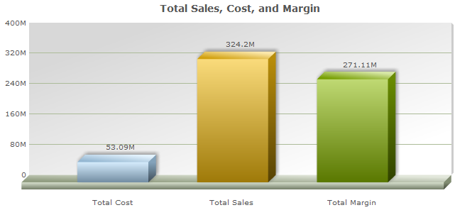
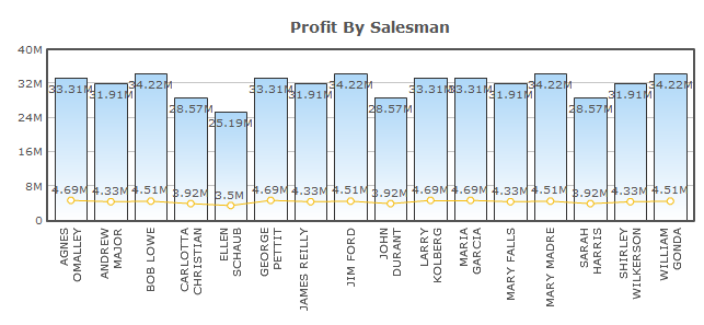
Standard bar charts are extremely versatile, and probably the most common charts used in m-Power. They can be used at the grand total, subtotal, or detail levels.
At Grand Total levels, one or more fields can be displayed on a chart. An example of when you might use it at the grand total level is to show the total sales, cost, and profit margin for a given year:
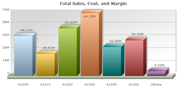
When used at subtotal or detail levels, only one field may be selected. This is useful for looking at things like total sales for each product number:
Grouped Bar Charts
Grouped graphs always use multiple fields at a subtotal or detail level. They are designed to show groups of fields for each row. There are two types of grouped bar charts: Clustered and Stacked.
Clustered Bar Charts
Clustered Bar Charts are useful for showing groups of data that are unrelated in the sense that they don’t add up to a larger value that you want to show. Field values are grouped together but unlike stacked charts, they aren’t combined vertically. An example might be graphing the total amount of items sold, total amount of items in inventory, and total sales in dollars for each product.
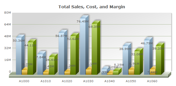
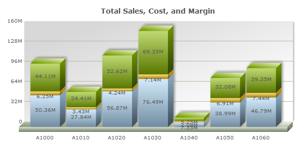
Stacked Bar Charts
Stacked Bar Charts are best used when you want to show groups of data that add up to a larger number. For example, you could use them to show total cost and margin for each product number. They would stack up to show total sales:
Line Graphs
Line Graphs are most commonly used to show trends. The two types of line charts are Single Line and Multiple Line.
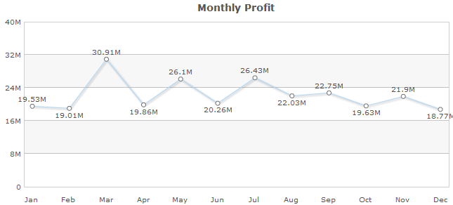
Single Line Graph
Single line graphs mostly work at subtotal and detail rows with one value, however they may also work at grand total rows with multiple values. A very common use for a line graph would be to show total sales by month or year:
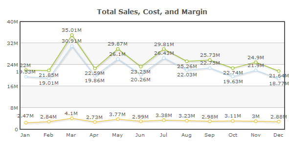
Multiple Line Graph
Multiple Line Graphs are always used at either subtotal or detail levels and contain multiple fields. They are used to show trends of multiple values. An example would be to show total sales in dollars and total sales quantity:
Combination Graphs
Combination Graphs allow you to combine two graphs into one. The two merged graphs can either be a Bar, Line, or Area-type graph. Combination graphs mostly work at the subtotal and detail level, but may also work at the grand total level with multiple values.
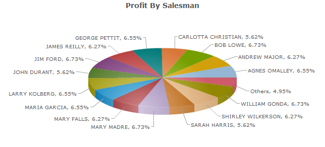
Pie Graphs
Pie Charts are great for showing data as a percentage of a total. The difference between 2D and 3D is only stylistic. 2D charts are simpler and data is more visually accurate because it isn’t tilted, while 3D charts are more aesthetically pleasing. Pie Charts are designed for use over one field, and as such are utilized at sub-total levels.
One example of a pie chart would be to show total profit per salesperson:
Other Graphs
There are seven other graphs, and these can be broken up into two different groups. The first group consists of graphs that will only graph a single value, while the second group consists of graphs that can graph multiple values..
Single Value Graphs
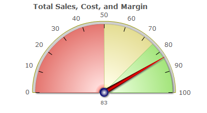
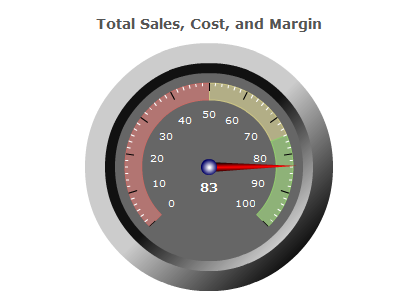
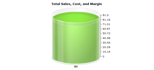
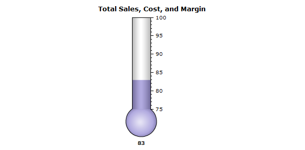
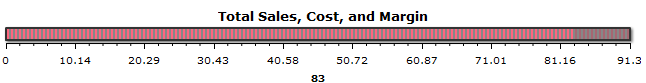
Graphs that can only be created over a single value include the Gauge, Dial Chart, Cylinder, Thermometer, and LED Gauge graphs. Since these can only be a single value, these graphs must be created over the grand-total level. The graphs below have been created over the same exact data, which represents sales as a percentage of profit.
Gauge
Dial
Cylinder
Thermometer
LED Gauge
Multiple Value Graphs
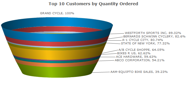
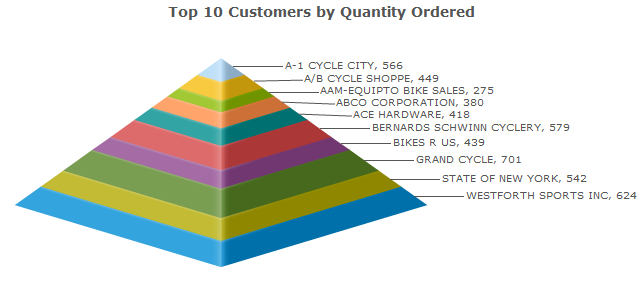
There are two multiple value graphs in the other category: funnel and pyramid. This logic for this type of graph closely mirrors the pie-type graph logic. As such, these graphs display multiple values for the same field, and are used at sub-total levels. These graphs are nearly identical, except in that their shapes are reversed.
Pyramid
Funnel