Overview
A common UI component found in all types of software is some type of notifications badge that displays to user a number, indicative of the number of items that require their attention. A few examples include mobile applications, banking system, or customer portals, where one is frequently alerted to any outstanding messages or actions that are awaiting attention or action.
This documentation will cover creating a similar type of functionality in m-Power.
Implementation
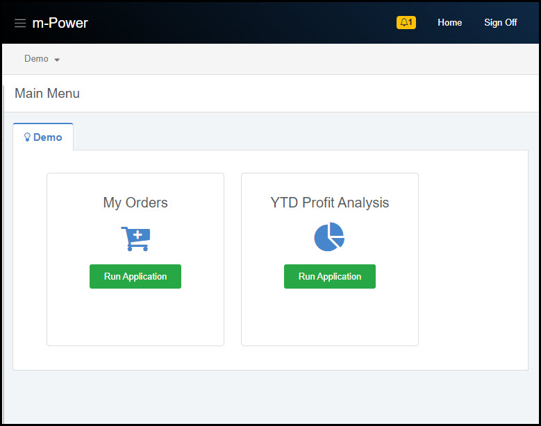
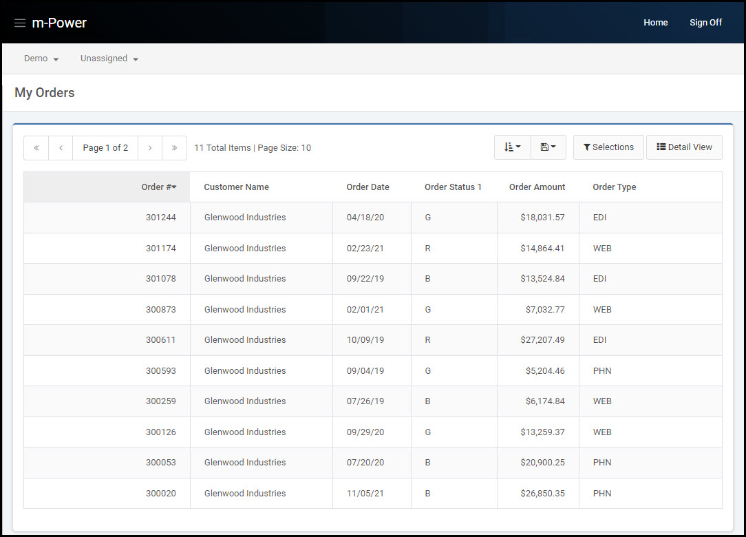
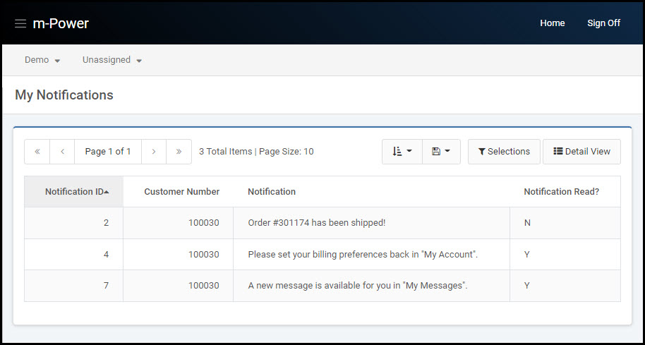
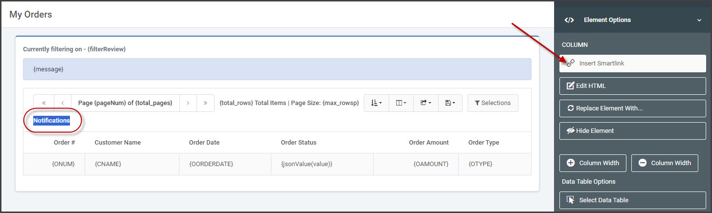
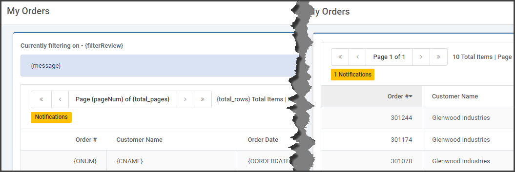
The image below (Figure 1) contains a Multiple Row Data List retrieval that displays an end-user’s orders. The end goal will be to display a notification badge above the table output to notify the user how many un-read notifications they have. The notifications will pull from a different database table, which is also built over a retrieval template (Figure 2).
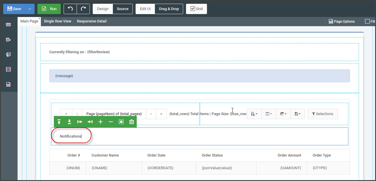
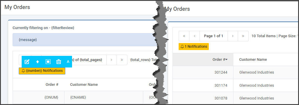
In the Orders Retrieval, the m-Painter editor will be utilized to insert the notification badge. Place the cursor at the desired badge location and type the desired text.
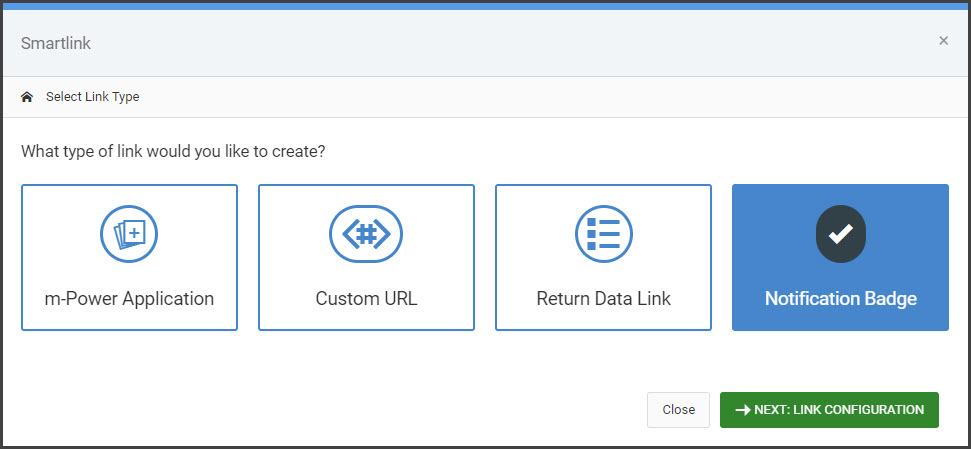
Highlight the text and from the right-side Element Panel, select “Insert Smartlink”. Choose the “Notification Badge” link type.
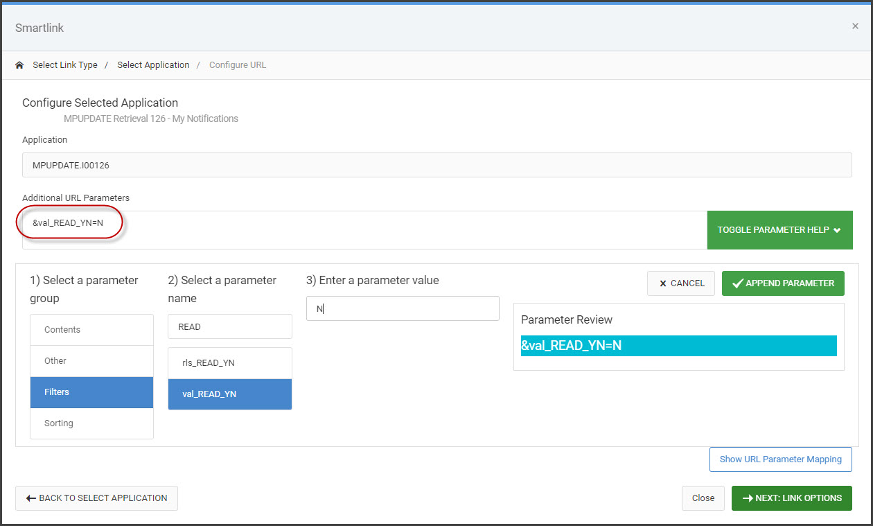
Next, select the application that contains the records you wish to serve as the notification count. Once the application has been selected, you have the option of mapping fields from the parent app to the notification app or any other additional parameters to filter the results.
In my example, I only want to report the number of unread notifications. Therefore, I will pass the parameter val_READ_YN=N to the url.
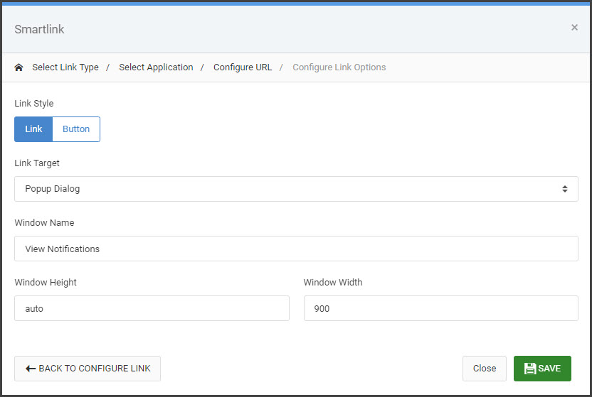
Click “Next” to choose the Link Style and Target.
By default, the number of notifications will always display as the first piece of text in the badge.
If you would like to change the location of the notification count, place your cursor in the badge at the desired location and type {{number}} in the badge directly. This logic will replace {{number}} with the number of returned notifications at runtime instead of the default behavior, which is to append the number to the beginning. Additionally, you may add icons if desired.
At runtime, an AJAX call is automatically made to the configured link URL to return only a row count. This is what provides the number of notifications. Clicking on the badge/button will link out to the notifications retrieval.
Global Notifications
The above section will implement the notification badge into any one application of choice. However, for notifications that are global and not application-specific, it may be helpful to display this notification badge in the dictionary header, that way the notification is visible on every application page the user goes to within the data dictionary.
To do this, copy the entire HTML code associated to the notification badge from the application it was inserted in. This code will be encompassed between two anchor (<a></a>) tags, as shown in the following example block:
<a class="mrc-notifications badge badge-warning" href="UPD2022Q2.I00401s?slnk=1&READ_YN=N"><i class="fa fa-bell-o"></i>{{number}}</a>Open the dictionary Header/Footer HTML section from the Admin menu of the m-Power interface. To neatly display the notification badge in the header, wrap the code above within a <li class="nav-item"></li> tag, as shown here:
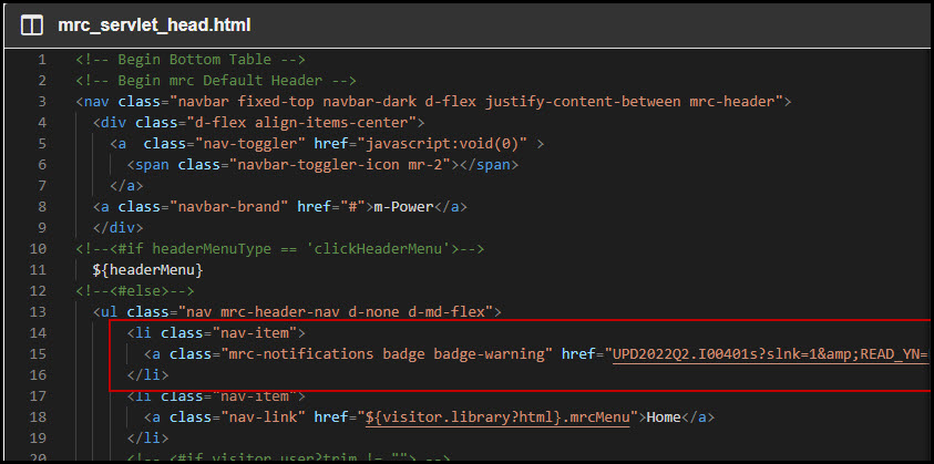
Code from Figure 7:
<li class="nav-item">
<a class="mrc-notifications badge badge-warning"
href="UPD2022Q2.I00401s?slnk=1&READ_YN=N"><i class="fa fa-bell-o"></i>{{number}}
</a>
</li>At runtime, the notification badge will display next to the “Home” link.