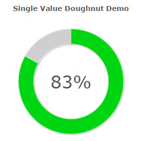
Users and Executives alike often request graphical data that can illustrate business trends and other KPIs. The Single Value Doughnut Chart (shown above) is a graph that can meet such a need.
Before beginning, understand that this chart will only graph one value (usually from the Grand Total level).
Implementation
Create a Report that has a single computed value, available at the Grand Total level. Once this has been accomplished, build your report and enter m-Painter.
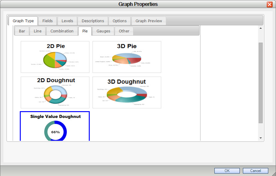
Select the Single Value Doughnut chart from the “Pie” tab within the “Graph Type” tab.
Navigate to the “Fields” tab and ensure that only one field is selected in the “Selected Fields” area.
Navigate to the “Levels” tab and ensure that the “Grand Total Level” is selected.
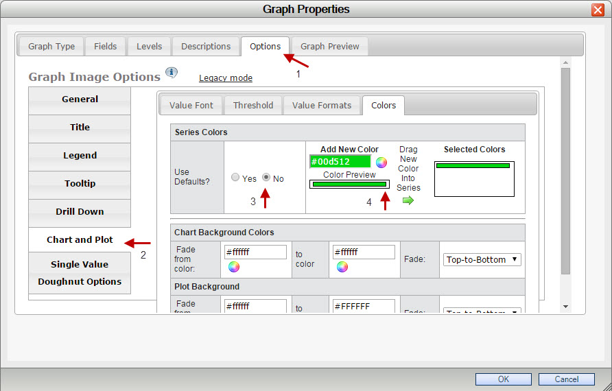
Optionally, if you wish to control the color of your Doughnut chart, navigate to the “Options” tab and select “Chart and Plot”. From here, select “Colors”, and set “Use Defaults?” to No. Finally, select your color and drag it into the “Selected Colors” area.
After accepting and saving your changes, your graph will resemble the following: