Overview
A speedometer graph is a great tool to help visualize percentages, as well as other fixed-range amounts for end users. They can also be color coded (see below), so that certain ranges are categorized with different colors. Speedometers can even be used to graph multiple sets of data, with multiple needles pointing to your data. However, for this tutorial, we will focus on a single set of data.
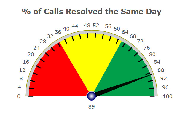
Below is an example of a speedometer where the data is a percentage (perfect for a pre-defined range from 0 to 100) of how many calls are resolved the same day. As the data fluctuates, so does the needle.
Graph Properties
Setting up the speedometer is simple and will only take a few minutes.
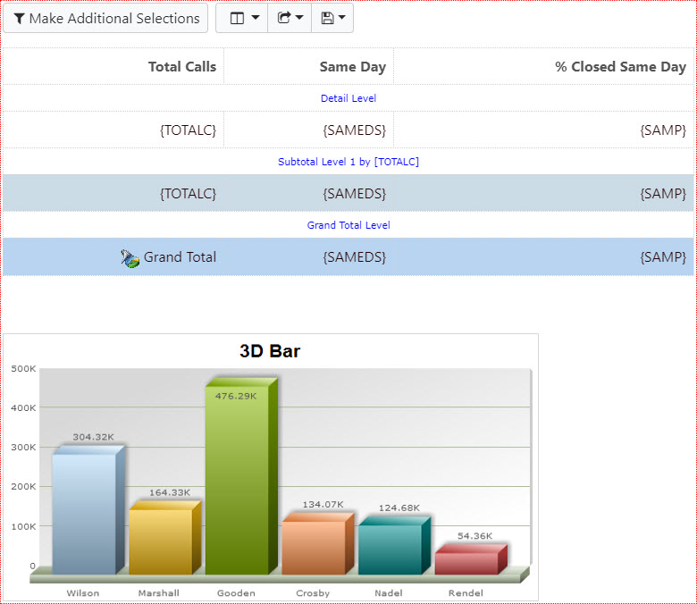
Generate, build, and compile a report as usual. Be sure to select the Report with Graph template.
Open m-Painter. You should see a screen similar to this:
- Right-click on the bar graph and select “Graph Properties”.
- Select “Gauge” from the “Gauges” tab.
- Click the “Fields” tab and drag the appropriate field to the right side.
- Click the “Levels” tab and select the “Grand Total Level”.
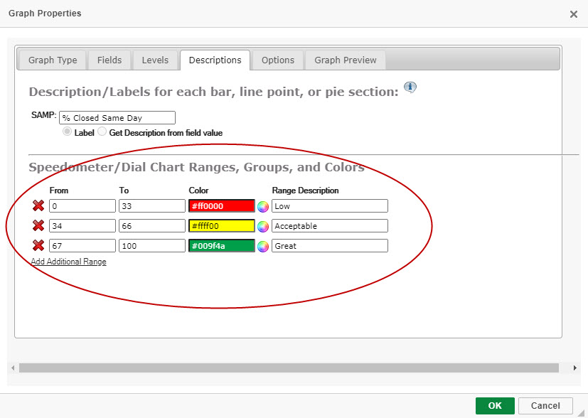
Optional: Under the “Descriptions” tab, you can set ranges and color code each range.
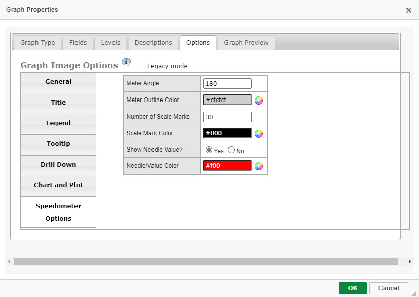
Under the “Options” tab, there is a section titled “Speedometer Options”. Here you can alter Speedometer-specific options such as the needle color, amongst other properties.
- Click “OK” & save.
Runtime Usage
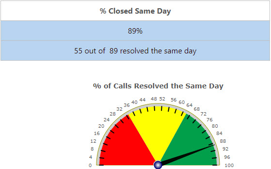
At run-time, you will see a graph similar to this: