The Report Designer template is a great choice when building most reports that require only common UI customizations. Within its own report UI editor, this template allows developers to quickly customize many report features like report prompts (drop down lists, lookups, radios, etc), table cell contents, conditional color coding, smartlinks, hide and show dimensions, and even the overall report layout (standard, drilldown, pivot, ranking, chart). The editor even contains an integrated chart wizard. Because m-Painter/HTML-output is not used with this template, developers are never prompted to overwrite the HTML on re-build and changes made in the designer are never overwritten. Reports built with the Report Designer template contain most of the same run-time features found in other report templates like saved searches, export to pdf/excel, smartlinking, scheduling, and emailing.
How it Works
The build process for the Report Designer is the exact same as any other report application you can create in m-Power. Developers still need to select fields, dimensions, and optionally filters and calculations. The key differences are seen by the developer after creating their report.
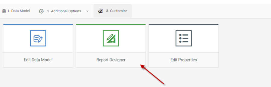
Notice that the standard “Edit UI (m-Painter)” button has been replaced with “Report Designer”
Using the Report Designer (Dimensions/Filter)
By default, any Dimensions/Filters will be controlled via a left hand panel.
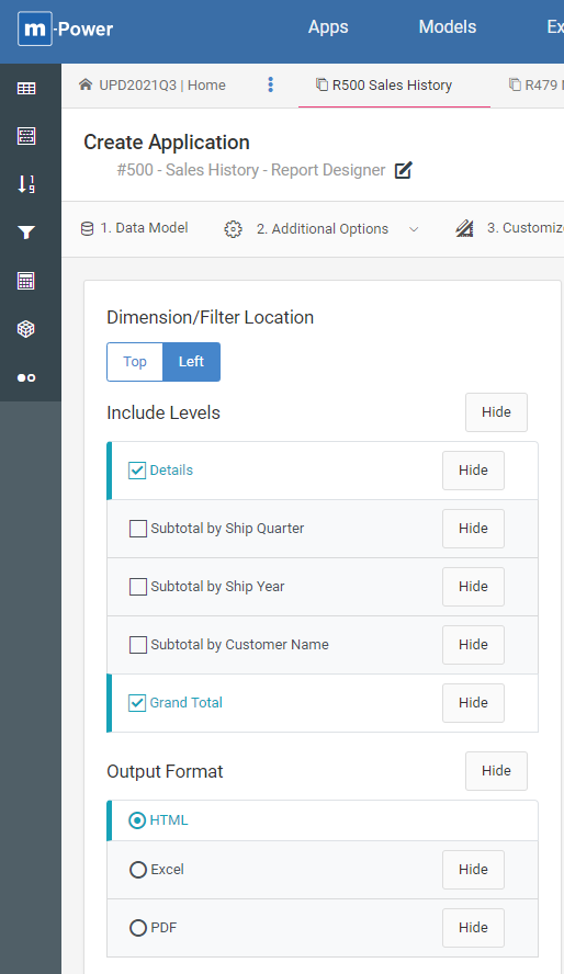
As a developer you can interact with these options, and the change will immediately be available for any end-user — no saving required.
Dimensions/Filter Location
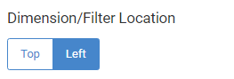
As a developer you can choose whether your end-user will see Dimensions and Filters options to the left of their data table (default) or above their data table. End users do not have the ability to change this option.
Include Levels
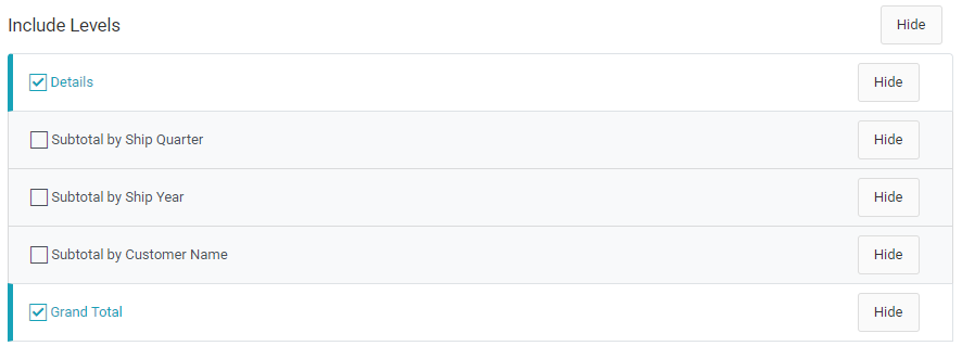
The levels selected on a report control which data is returned at runtime. As a developer, you have the ability to change which levels will be enabled by default. Simply click on the checkbox to change the status for each level. End-users can change this at runtime, so long as the option is not hidden.
You can also hide a particular level so the end-user cannot change the checkbox value at runtime by clicking on “Hide” for the particular level. If you would prefer they not see any level options at all, click the “Hide” button to the right of the “Include Levels” label.
Output Format
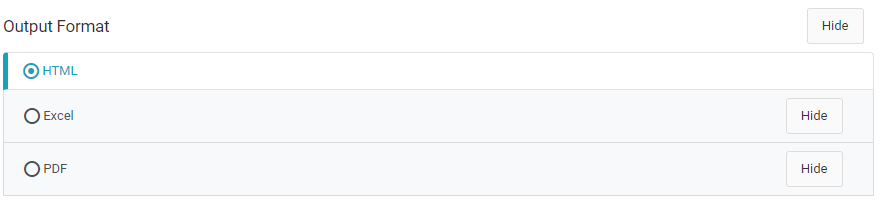
The output format controls how your data is delivered to the end-user. The default format is HTML. However, you can change the default value by clicking one of the other radio buttons. Similar to the above, you can hide any output formats you wish the user not be able to access at runtime, as well as hiding the entire output format area altogether by clicking on the “Hide” button next to the “Output Format” label.
Report Selections
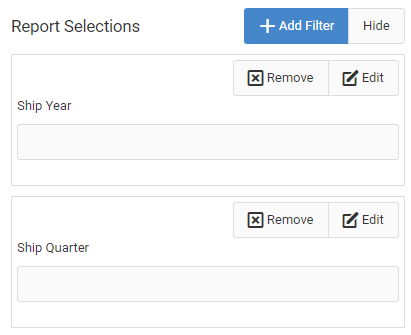
If you have selected any runtime filters, they will be listed here. Globally, you can choose to Add another filter directly from the report designer as well as hide the entire Report Selections area.
You can also choose to remove individual report selections here.
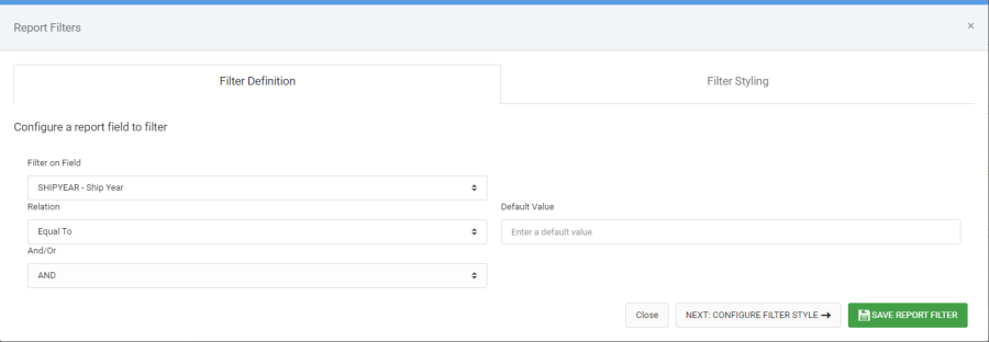
Finally, you can Edit your Report Selections:
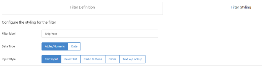
Utilize the Filter Styling tab to add helpers, such as a calendar picker, dropdown list, dependent dropdown list, radio buttons, slider, or a Text Lookup.
Rows Per Page
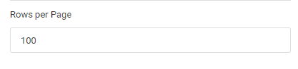
This value, defaulted to 100, controls how many rows per page the end-user will see. You, as a developer, can set the default value for this property but the end-user can modify this value to a number of his or her choosing. Reports where the number of rows exceed the maximum rows per page will include a pagination bar to move through subsequent pages of data.
Using the Report Designer (Table Output)
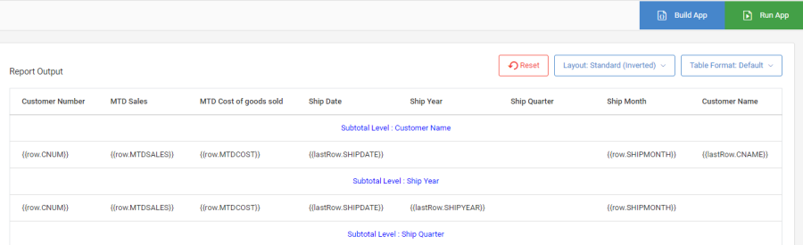
The right side of the report designer allows you, as developer, to tweak the output of your report
Build App/Run App
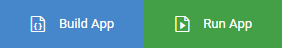
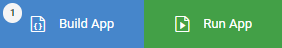
This bar is similar to that of regular reports, with these two notable exceptions:
- You will never be prompted to overwrite your HTML. The report designer always remembers any customizations you made to the report and is able to work in future changes without losing your work.
- There is a status badge displayed on the Build App button letting you know when you need to click the “Build App” button. Often this is needed because you’ve made a change to the app that requires the back end code to be regenerated to load your change. You can hover over the build button and it will tell you what has changed since the last time you clicked “Build App”.
Button Bar

This button bar is only made accessible to the developer.
Reset Button
This button, when pressed, will trigger a warning message alerting you to the fact that you have requested that you wish to reset your data output customizations. Confirming this request will revert all table customizations back to when they were initially created.
Layout
This button allows developers to choose from 7 report layout options, including:
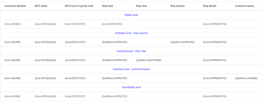
- Standard – This is your typical report layout, where the detail level is listed above all subtotal levels.
- Standard (Inverted) – As the name suggests, the levels in this layout are inverted, with the first dimension first, followed by all other dimensions, then detail and finally grand total.
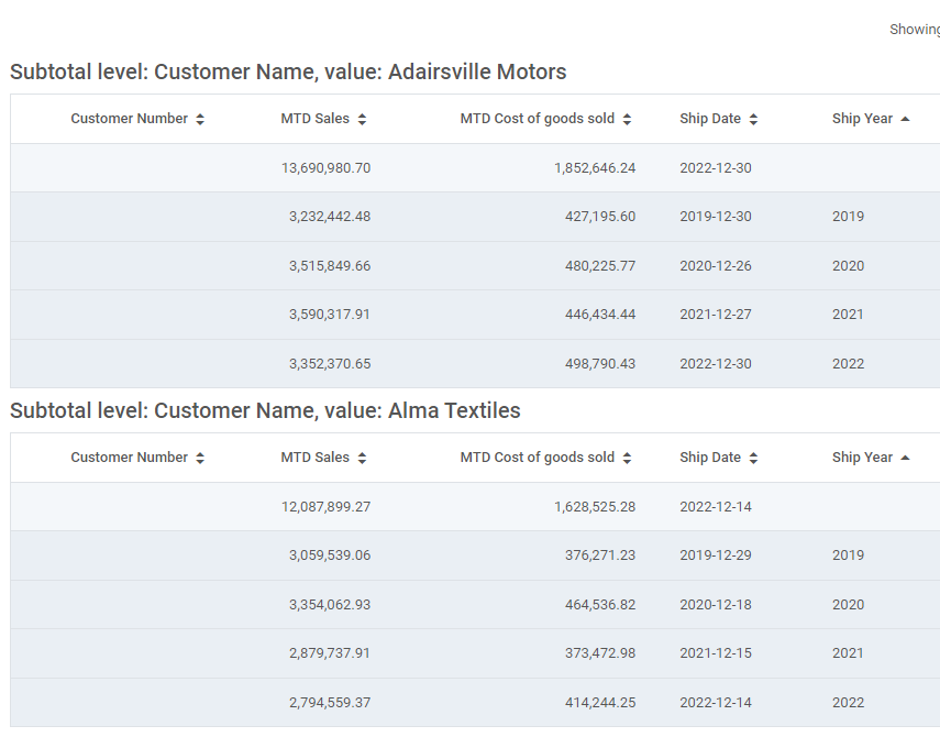
- Standard (Break by Level) – Based on the highest dimension chosen, create a new table with a proper heading each time that dimension changes.
- Interactive Drill-downs – Modeled after the Interactive Report, this layout lets users drill into subsequent data levels, based on chosen dimensions (Developers and users have the ability to interact with these dimensions).
- Pivot – Modeled after the Pivot table, this layout lets users change both their row and column dimensions. Developers also have the ability to interact with the output layer via Report Designer.
- Ranking – Modeled after the Ranking report, end users can run the ultimate ad-hoc report, choosing to see X rows of data based on certain dimension fields
- Chart – Developers can even create charts within the Report Designer, useful for adding to dashboards.
Table Format
Developers can control how the output of their report looks with these options:
- Default — Traditional, standard m-Power look and feel. Subtotal rows have different colors (as does Grand total). No vertical borders between cells.
- Default, Grid Borders — Same as above, except there are vertical borders between the cells.
- Bordered – No background colors — All rows have a white background, but there is still a horizontal border between rows.
- No Borders, No Colors — As the same suggests, all rows have a white background with no horizontal border between rows.
Report Output
In this area, you can manipulate the output of the report in the following ways:
Format Cell
Left click on the cell you wish to edit, then click Format Cell.
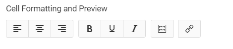
Here you can change the alignment of your data, add bold, underline, and or italic. You can also add a field to this cell. Finally, the final button on the screen allows you to add a smartlink to the text in the cell.
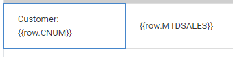
You can also add free text to a cell by simply typing in the Cell Editor text area. Similarly, you can also remove text or fields from the cell by removing them from the cell editor. When done, click Save Cell Formatting.
Conditional Formatting
Use this button to conditionally change the font color, background color, font size, and/or boldness of the text based on field values. This is often helpful if you wish to highlight a certain key value for your end user.
Merge Cell Right
In the event you wish a cell to “take over” the next adjacent cell, use this feature.
Other Key Report Designer Elements
- If you wish to change column headings or reorder columns, simply navigate back to the Tables/Fields screen in the interface and make your changes there. No need to click the “Build” button.
- Anytime you make a change to a cell in the report designer, m-Power will draw a light blue box around that cell to notify developers that a change was made. The end-user will not see this blue box.
- In the event you require total level calculations (typically seen in percentages), please select a calculation type of “Total-level/Margin” in the interface. This instructs the report designer to handle this expression not as an aggregate function but instead to run the expression based on the sub-total/grand total values.
- Generated Report Designer reports can be utilized just like any other standard m-Power report. For instance, they can be included:
- In other apps via imports
- On Dashboards
- Via email through the messaging and scheduled tasks