m-Power templates do a lot to make beautiful web applications right “out of the box”. To compliment this, many developers take these aesthetics further by restructuring the page to maximize screen sizes real estate as well as page flow efficiency. However, restructuring the page layout typically requires going into the HTML source code. Often times this is a daunting task for the average m-Power developer. However, m-Painter allows you to control the layout exclusively within the graphical interface.
Enabling the Form Layout
Click the “Layout” checkbox to begin. Doing so will then automatically enable the “Form” layout.
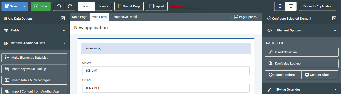
Green Hover Menu
From here, you can utilize the green hover menu to modify the layout of your page.

- Up arrow — Inserts a row above your selected row
- Down arrow — Inserts a row below your selected row
- Left arrow — Insert a column to the left of your selected element
- Right arrow — Insert a column to the right of your selected element
- Plus icon — Increases the size of the selected element. Keep in mind your page is organized by 12 columns. This means that, by adjusting the size of the columns, you are instructing m-Power to take up some of those 12 available columns.
- Minus icon — Decreases the size of the selected element.
- Box icon — Wraps the selected element in a container.
- Trash icon — Removes the selected icon.
Form Label Orientation
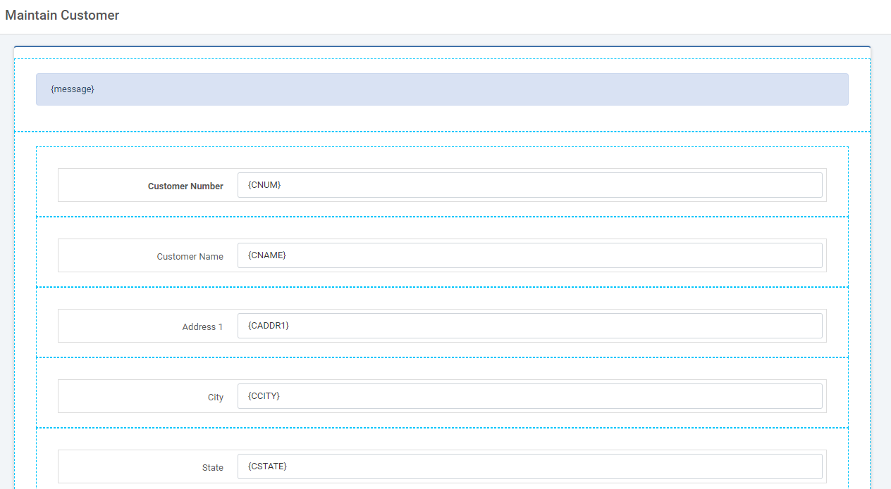
By default, the form is generated vertically with the field label above the input.
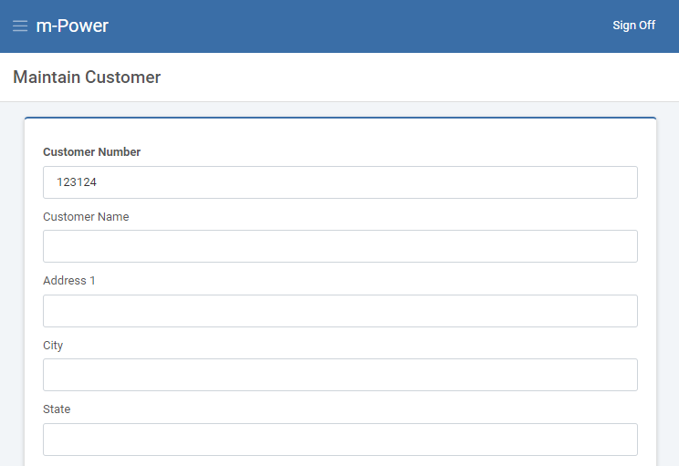
There are two methods of changing the orientation to horizontal which will move the field label(s) to the left of the input(s).
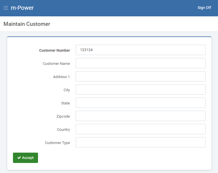
Full Form Orientation
Once Form Layout has been enabled, the right-side Element Panel will have an option to “Toggle Form Orientation (Horizonal).
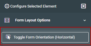
Clicking this button will move all field labels to the left of the inputs.
You may toggle the form between vertical and horizontal as needed.
Form Group Orientation
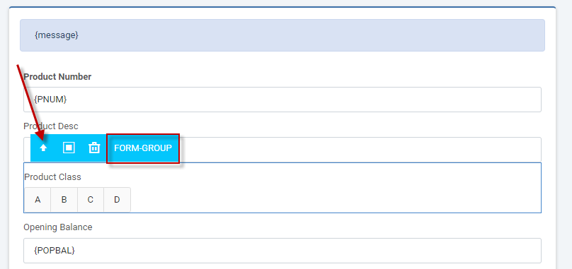
Alternatively, you can choose to only have specific fields with a horizontal orientation (Field label to the left of the input).
Select the field input in question. Use the blue navigation menu to ensure you have the form-group highlighted.
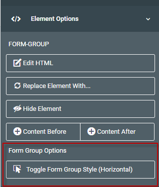
Once the form-group is highlighted, click the button to “Toggle Form Group Style (Horizontal)” from the right-side Element Panel.
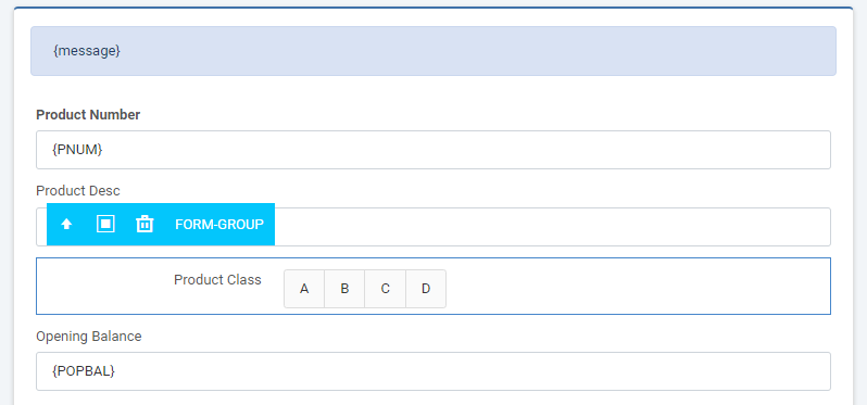
Toggling the form-group style to horizontal will move the field label to the left of the input.
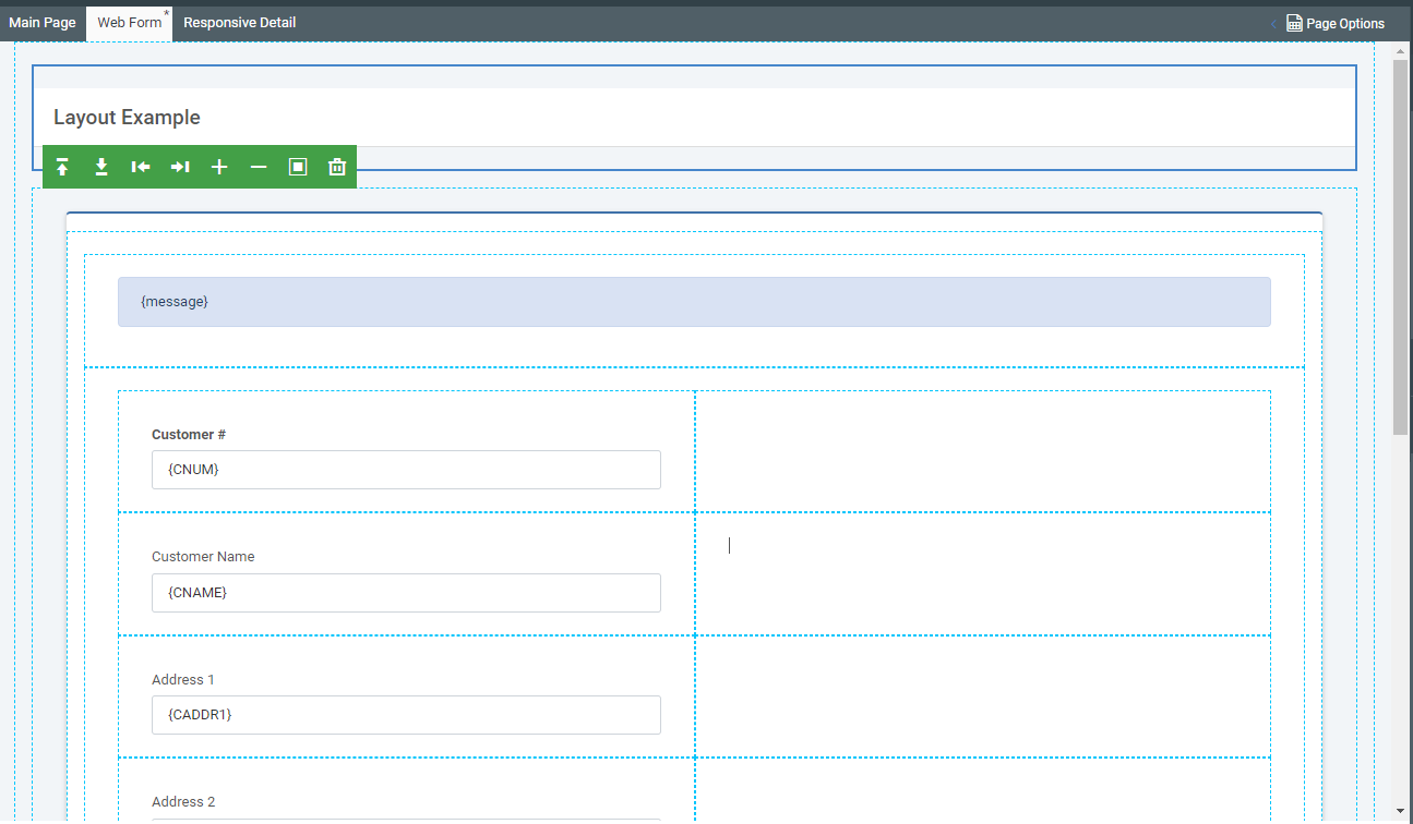
Real World Example
As you already know, when you build a maintainer form, m-Power creates each input on its own row. For this example, lets say you want to make better use of the space by placing 2 inputs in one row. We will, also wrap all content into a nice card to improve the aesthetics.
Open m-Painter and navigate to the Web Form Layout. Click “Layout.” Both the “Form” mode and “Drag & Drop” should now be activated.
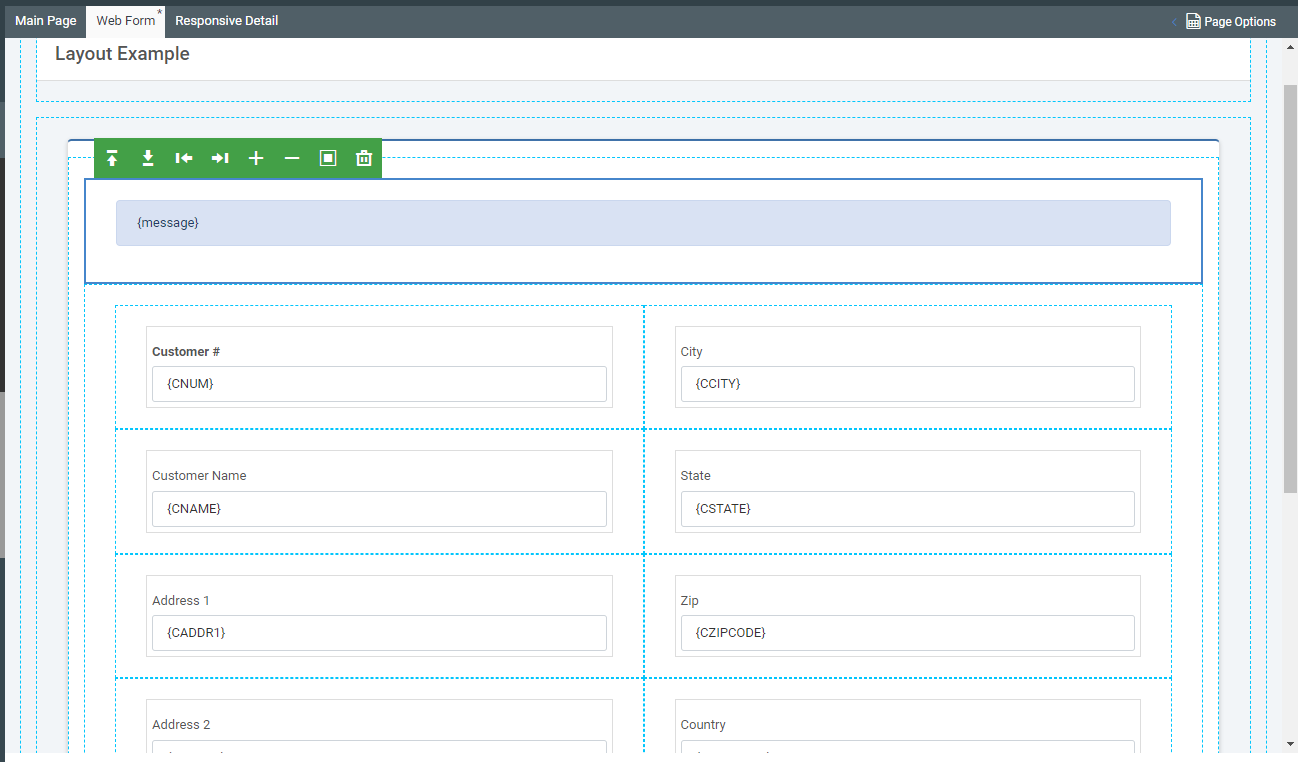
Hover over your first 4 input boxes and click the right arrow. Your page should now look like this:
Next, click and drag some inputs from down below into the empty cells on the right.
Scroll down and hover over the empty rows. Click on the trash can for each of them to remove these now unneeded rows.
Finally, hover over the box that is just outside your main input section.
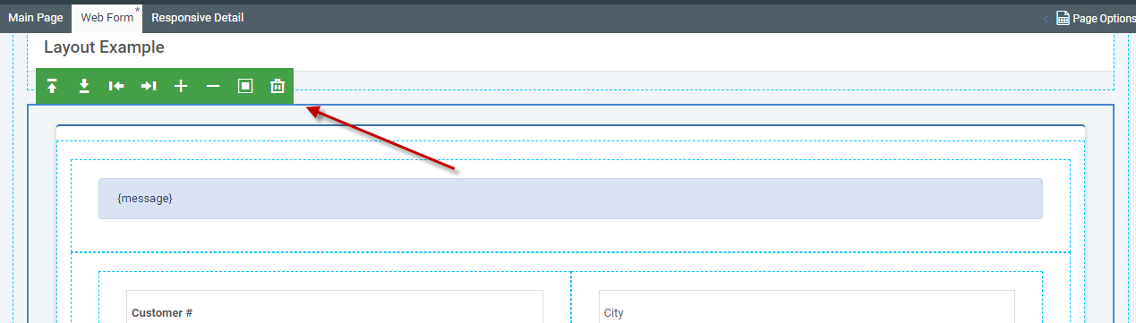
Once selected, click the box icon. Select Card, then select the card of your choosing. I’ll choose the success header. Click the “Edit UI” button to allow editing individual elements. Change the text of Success Header to read Customer Info. Save. Your page should now resemble this.