Overview
There are many form input helpers built directly into m-Painter. These features assist with varying degrees of form functionality such as setting a max number of characters allowed, the input type and making fields read-only or required. Additionally, these helpers can assist with basic end-user direction by adding placeholders, help text, or descriptive icons.
Left-click on an input in m-Painter and select “Input Properties” from the Element Panel.
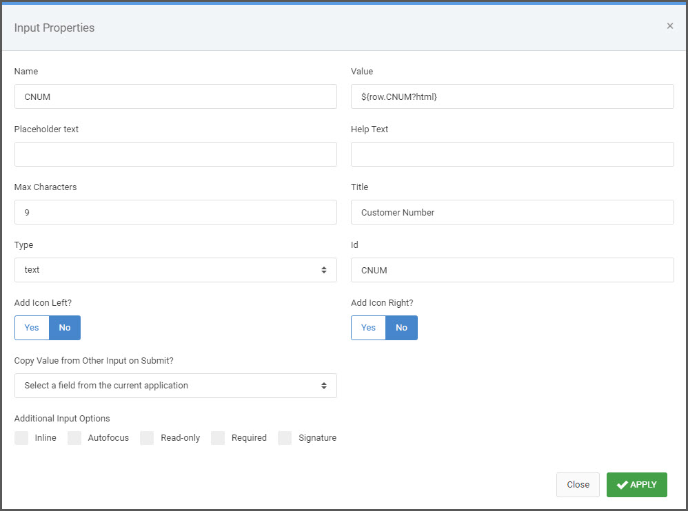
Name
Controls the value of the HTML “Name” attribute.
Value
Controls the value of the HTML “Value” attribute.
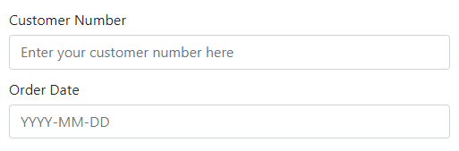
Placeholder Text
The text entered here is displayed in the input field when the page is loaded. This can serve as a short hint to the expected value of the input field.
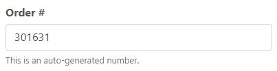
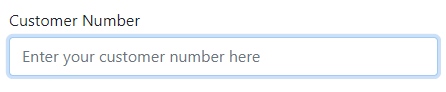
Help Text
The text entered here is displayed in a muted style below the input and can serve as a short description to the expected value of the input field.
Max Characters
Sets the number of maximum characters allowed in the input field.
Title
The title attribute specifies extra information about the input and is most often shown as a tooltip text when the mouse hovers over the input.
Type
Sets the HTML input type. Available options are:
- Text — Default. Defines a single-line text input field. Characters can be alpha or numeric.
- Number — Defines a number field. This input type forces the user to enter numeric values.
- Password — Defines a password field where the characters entered are masked.
- Date/Datetime — Defines a date/datetime input field. Note that m-Power templates will automatically use a datepicker widget for true date field inputs. For non-true date fields, mrc suggests using the m-Painter date picker.
- Time — Defines a control for entering a time. Supporting browsers have this type designed to let users easily enter a time (hours and minutes, and optionally seconds).
- Range — Defines a control for entering a number whose exact value is not important. A slider control is default. Further details about this input type can be found here.
- Email — Defines a field for an email address. Supporting browsers have basic client-side validation built in to require at least an ‘@’ symbol in the value. Further details about the built-in validation can be found here.
Id
Controls the value of the HTML id attribute.
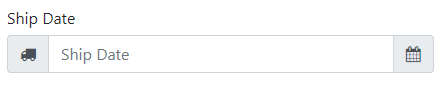
Add Icon Left/Right
Selecting ‘Yes’ for either option will add a placeholder Font Awesome icon to the left or right of the input. After saving the Input Properties window, you may left-click the icon and from the Element Panel, select “Edit Icon” to change the Font Awesome icon to your choosing.
Copy Value From Other Input
When the form is submitted, the value from the selected field in the dropdown will be written to the current input field sight unseen.
Inline
Sets the field’s label and input box on a single line as opposed to vertically.
Default (block styling):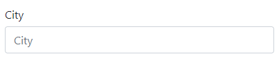
Inline styling:
Autofocus
If checked, this field will be automatically selected when the page loads. Only use one autofocus field per page.
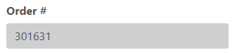
Read-Only
Sets the input field as not-editable by adding the “readonly’ HTML attribute.
Required
Forces the input field as required by adding the ‘required’ HTML attribute.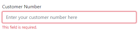
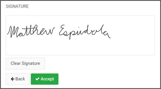
Signature
Transforms the input into a signature box where an end-user can scribe a signature to be stored in the database.
Click here to learn more about implementing Signature Capture.