General Information
The m-Power graphing library supports graphing options that are Flash powered (or JavaScript, if Flash is unavailable) and offer a wide variety of graphing options for the developer to consider. Click here to see some of the graphs that are available to be created via the m-Power platform.
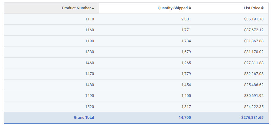
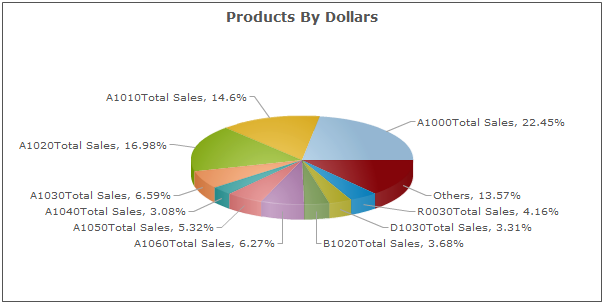
Graphs add visual detail and style to reports, as well as improving functionality. m-Power offers a graphing interface for ease of use during the graph-design process. In this example, we will be working over three fields in the order detail file: Product Number, Quantity Shipped, and Price. Detail rows have been removed, and we’re subtotaling by product number so we see the total quantity and sales for each product. Our table looks like this:
When you open up graph properties in m-Painter, you’ll immediately see a change.
You are now working in a tabbed interface that will help walk you through making your graphs. m-Power’s new interface has been designed to make designing graphs much more straightforward and less confusing.
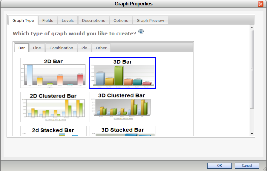
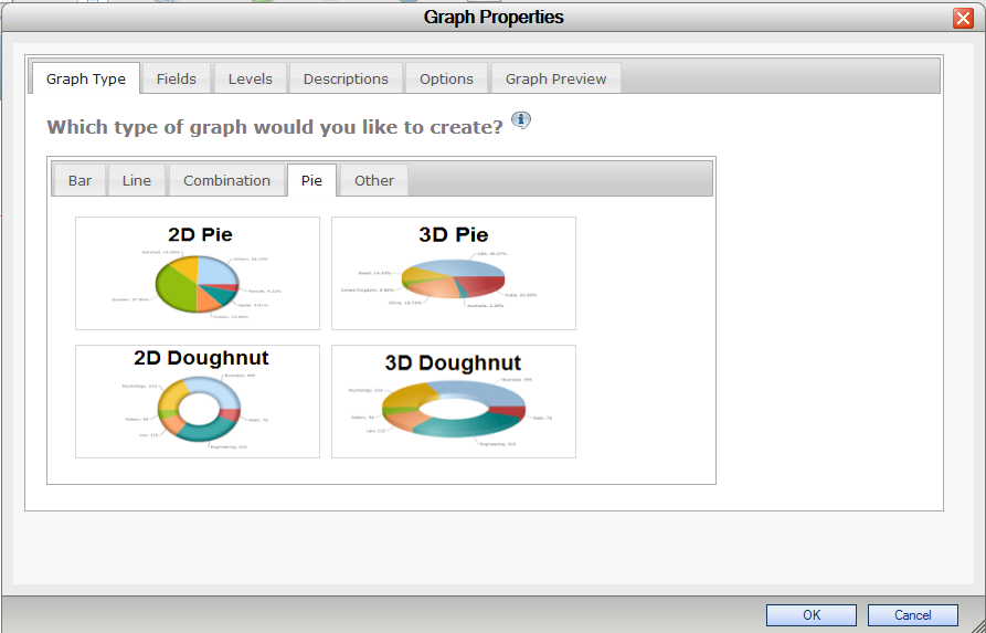
In the “Graph Type” tab you select which graph you want to use. Graphs are grouped by category: Bar, Line, Combination, Pie, and Other. In this example, we will make a 3D Pie chart that will show total sales by product number, so we’ll go to the “Pie” tab and select the “3D Pie” chart.
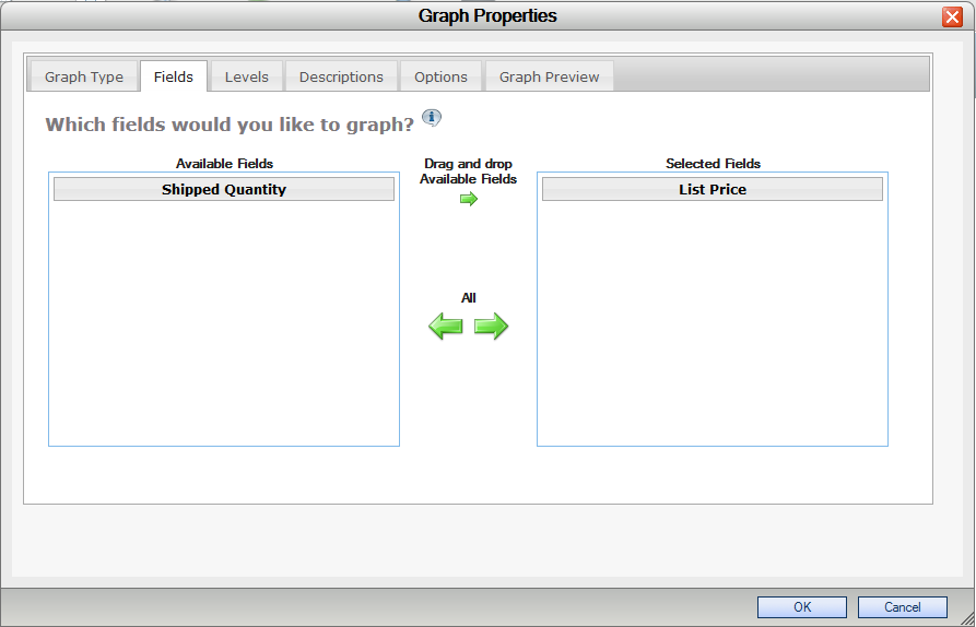
We can now move to the “Fields” tab. The default “Selected Fields” are “Shipped Quantity” and “List Price”. We only want to show price, so we’ll drag and drop “Shipped Quantity” back over to “Available Fields” so it doesn’t display on the chart.
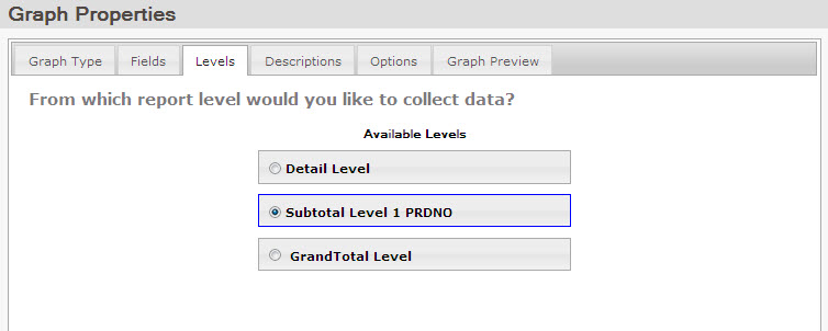
If we click over to the “Levels” tab, we can select the level of detail we want your graph to show. In our case, we are looking for the total sales amount of each product number. These amounts appear on Subtotal Row 1, so we will select “Subtotal Level 1 PRDNO” as our report level.
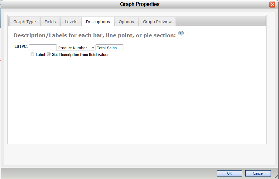
We can now move onto the “Descriptions” tab. Here, we can change the labels for our pie sections. You have the option to either type in a static label, select a field from the table to use, or you can do both, which is what we will do here. We’re going to use a field from the table (“Product Number”), and suffix it with “Total”. If we were just graphing a grand total row and wanted a completely static field, we would select the “Label” option, and type in our field description, such as “Total Sales”.
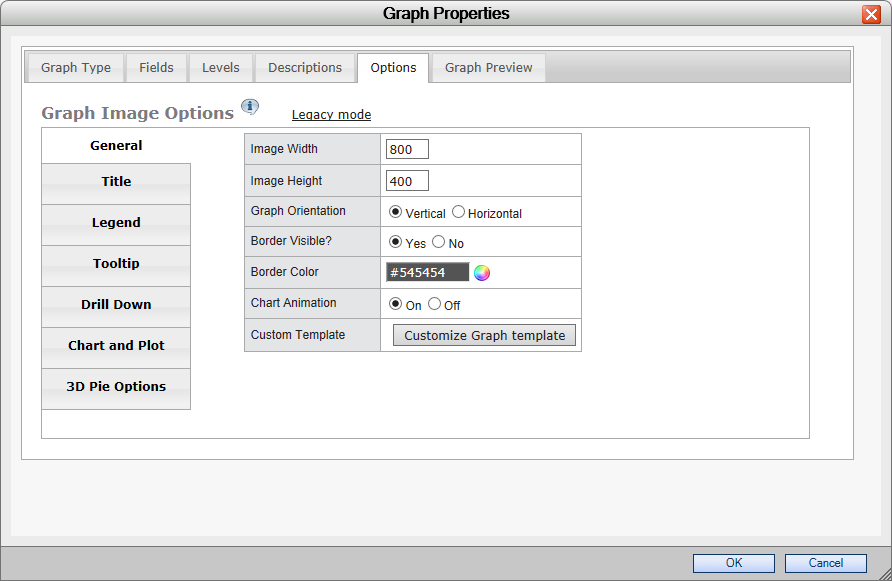
We’ll now go to the “Options” tab.
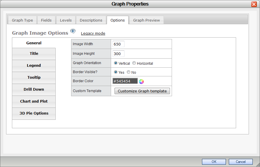
Here we can customize the look and feel of our graph. There are tabs all the way down the side with different categories of options to change. Lets leave these alone for a moment and see what our graph looks like.
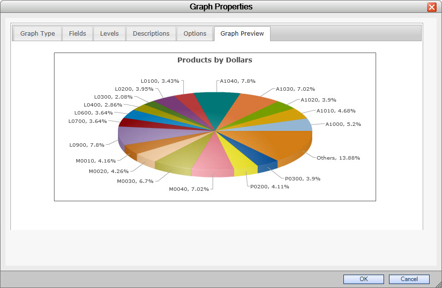
The last feature in the graphing interface is the “Graph Preview” tab. We can preview the graph without having to save and run our report. The “Graph Preview” tab allows you to obtain instant feedback on what your changes will look like in real time without having to run your report.
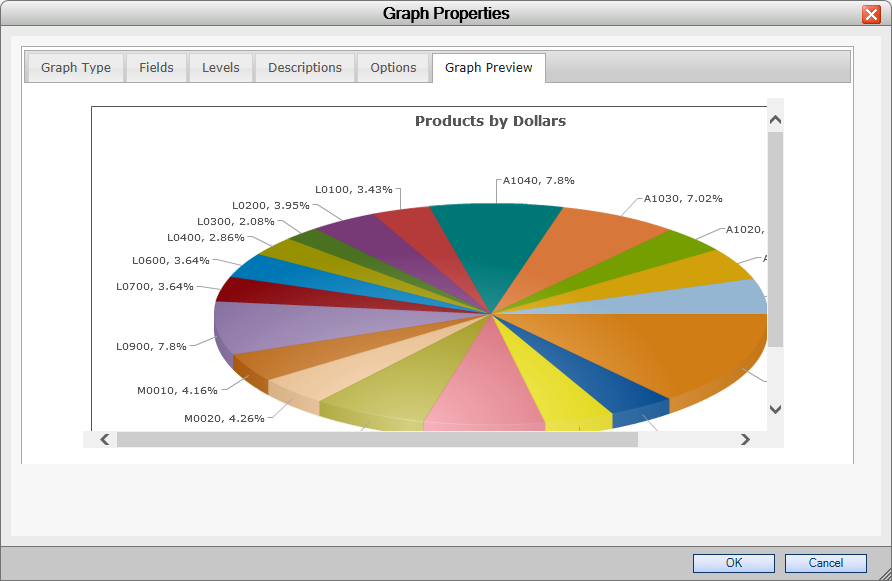
In our preview, since our labels have two lines on them and because we have so many products, we’ll need to make our pie chart bigger to be able to see our totals, so we’ll go back to our “Options” tab and move to the “General” section. Here, we’ll make our graph 800 pixels wide and 400 pixels long. That should compensate for our larger labels.
And if we look at the “Graph Preview”, sure enough, it does.
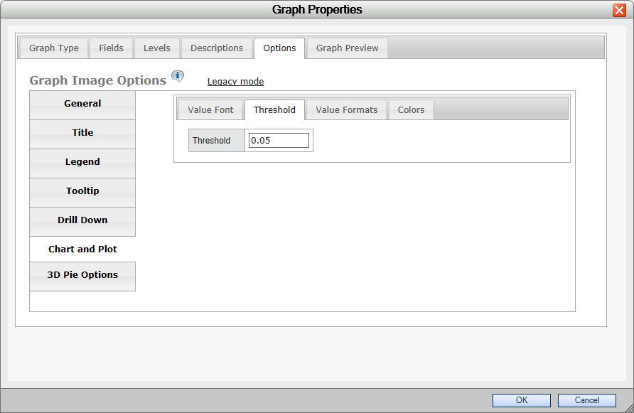
On the other hand, such a big graph might be too big for some users. We can bring the graph back down to its old size and change the threshold instead. The “Threshold” is a setting that filters smaller amounts into an “Others” category. If the threshold is raised, more fields will be placed into the “Others” category and won’t display on the screen.
Back in the “Options” tab, we’ll return our width to 600 and our height to 300, and then switch to the “Chart and Plot” section. In there, we’ll pick the “Threshold” tab. The default threshold is 2%, meaning that if an amount is less than 2% of the grand total, it gets placed into the “Others” category. Let’s raise that value from .02 to .05.
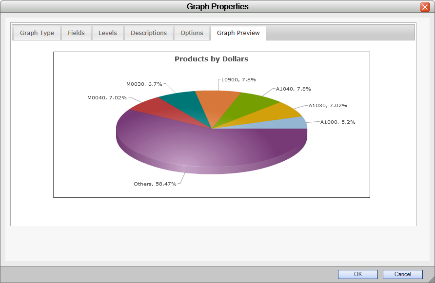
That seems to have taken enough out to show everything in a readable format in the “Graph Preview”.
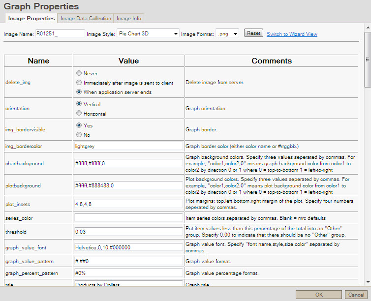
For developers who feel more comfortable with the a text based interface, you can switch to text mode by clicking on the “Legacy Mode” link directly to the right of the “Graph Image Options” text.
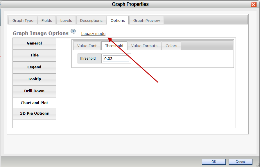
If you click on it, you’ll be presented with a warning. Note: Flipping between legacy mode and wizard mode will lose any changes made to the graph properties if they haven’t been saved by clicking OK on the lower right hand side of the “Graph Properties” screen. If you’ve made changes that you haven’t saved and want to, click “Cancel” on the warning and save. Then open up graph properties and click on legacy mode again. This time, click “OK” when the warning comes up and you’ll be brought to the previous interface.
Now that we’ve finished customizing our graph, we can run it. Here it is in a browser window when we run the report:
Converting Between Graph Libraries
Upgrading Existing Graphs
To convert your existing jFreecharts to use Fusion graphing logic, please do the following:
- Recompile the application and choose to overwrite the Application Properties.
- Open m-Painter, go into source view. Find the code “</head>”. Directly before this, add the following code:
<script src="/mrcjava/FusionCharts/FusionCharts.js"></script> - Open m-Painter, and open Graph Properties. Select the appropriate Fusion chart, and then save this. The application is now set to work with Fusion charts.
Changing Graph Libraries
Some customers may choose to continue utilizing jFreecharts as their graphing library. To convert your graphs to do this, open application properties and navigate to the graph tab. Change the graphLibrary property to be set to “jFreeChart” and click accept. Next, open m-Painter, and open Graph Properties. Select the appropriate jFreechart, and then save this. The application is now set to work with jFreecharts.
In the event you wish to revert back to Fusion Charts, simply reverse the above instructions.
Learn more about
Graph Type Tab
Fields Tab
Levels Tab
Descriptions Tab
Options Tab
General Tab
Title Tab
Legend Tab
Tooltip Tab
Drilldown Tab
Chart/Plot Tab
To review information on how to create graphs via the jFreeChart library, which is now deprecated, please click here.