Customizing Input Fields with m-Painter
Click here to access current documentation for this feature.
There are many form input helpers built directly into m-Painter. These features assist with varying degrees of form functionality such as setting a max number of characters allowed, the input type and making fields read-only or required. Additionally, these helpers can assist with basic end-user direction by adding placeholders, help text, or descriptive icons.
Note: This article is specific to Bootstrap templates only.
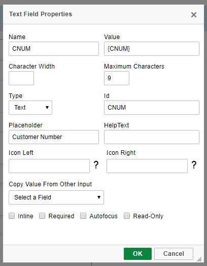
Name
Controls the value of the HTML Name attribute.
Caution: Changing this value may result in your form not submitting correctly. mrc recommends againstValue
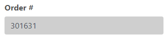
Controls the value of the HTML Value attribute.
Caution: Changing this value may result in your form not submitting correctly. mrc recommends against modifying this value.
Character Width
Sky theme only. Sets the width of the input field in number of characters.
Maximum Characters
Sets the number of maximum characters allowed in the input field.
Type
Sets the HTML input type. Available options are:
- Text — Default. Defines a single-line text input field. Characters can be alpha or numeric.
- Password — Defines a password field where the characters entered are masked.
- Number — Defines a number field. This input type forces the user to enter numeric values.
- Date/Datetime — Defines a date/datetime input field. Note that m-Power templates will automatically use a datepicker widget for true date field inputs. For non-true date fields, mrc suggests using the m-Painter date picker.
- Time — Defines a control for entering a time. Supporting browsers have this type designed to let users easily enter a time (hours and minutes, and optionally seconds).
- Range — Defines a control for entering a number whose exact value is not important. A slider control is default. Further details about this input type can be found here.
- Search — Text fields designed for the user to enter search queries into. These are functionally identical to text inputs, but may be styled differently by the user agent.
- Email — Defines a field for an email address. Supporting browsers have basic client-side validation built in to require at least an '@' symbol in the value. Further details about the built-in validation can be found here.
Id
Controls the value of the HTML Id attribute.
Caution: Changing this value may result in your form not submitting correctly. mrc recommends against modifying this value.
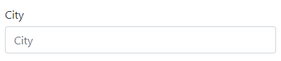
Placeholder
The text entered here is displayed in the input field when the page is loaded. This can serve as a short hint to the expected value of the input field.
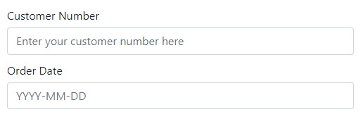
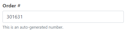
HelpText
The text entered here is displayed in a muted style below the input and can serve as a short description to the expected value of the input field.
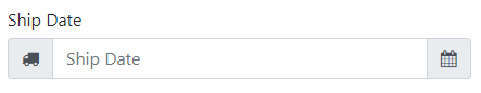
Icon Left/Right
Using the question-mark lookup, find a font-awesome icon to be appended to the left or right of the input box.
Note: Filter inputs already use the left side icon. Any that are added via m-Painter will be ignored.
Copy Value From Other Input
When the form is submitted, the value from field A will be written to field B sight unseen.
Inline
Sets the field's label and input box on a single line as opposed to vertically.
Default (block styling):
Inline styling:

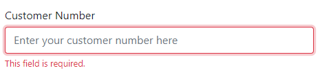
Required
Forces the input field as required by adding the "required' HTML attribute.
Autofocus
If checked, this field will be automatically selected when the page loads. Only use one autofocus field per page.
Read-Only
Sets the input field as not-editable by adding the "readonly' HTML attribute.