Overview
mrc is proud to announce the rollout of the latest edition to m-Power: The Bootstrap templates. These templates were designed to not only look fantastic on a PC, but also be fully responsive down to mobile devices. We’ve also chocked these templates full of many new features (the notable ones are listed below). Finally, these templates were built off of the Bootstrap 4.0 standards — which should allow developers to easily customize these using many of the numerous classes pre-built into the framework. This documentation will break down these key features based on the following perspectives:
End-User Benefits of Bootstrap Features
Video Overview
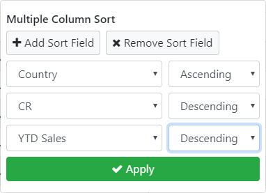
Multi-column sort
Users can now sort by multiple columns at one time via this user interface. However, users can continue, so long as it has been enabled, to reorder by clicking on the column heading.
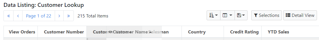
Column Selection/Re-order
Disabled by default (via application properties). Once enabled, users can use this interface in one of two ways. First they can drag any column of their choosing by clicking and dragging on the horizontal arrows to the left of the column heading. Secondly, they can open the dialog to choose columns as hidden or shown. All preferences are saved in the browser via a cookie.
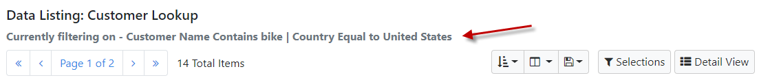
Filtering Visibility
Any run-time filters that haves been specified will be on display directly between the navigation panel and the application title. This allows end-users to always have visibility to their current search parameters. Further, developers can choose a 3rd option (available via the compile options) that will automatically include the filter boxes directly above the data table. This may be optimal for applications where only a few filtering options exist.
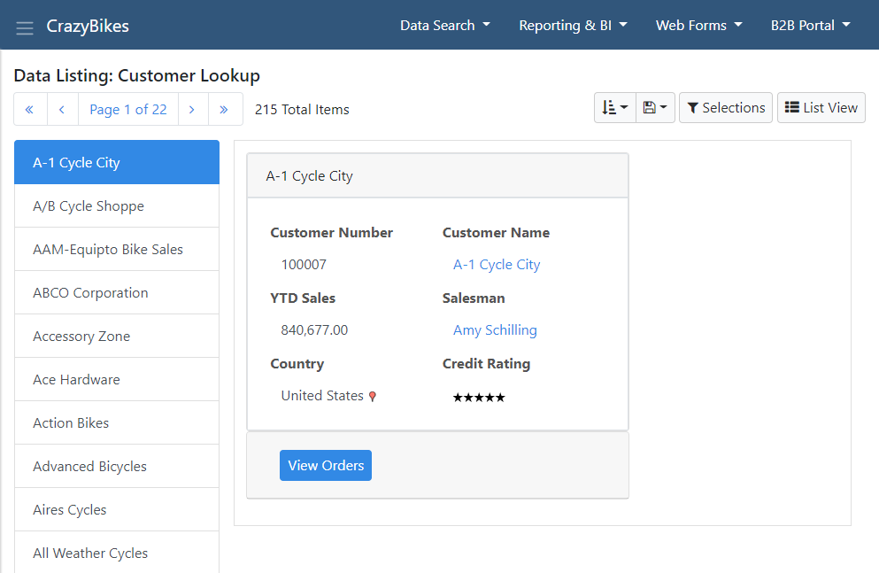
List/Detail View
There is a button on all grid based Bootstrap templates that allow users to toggle between a traditional grid based view and a Detail view. The detail view consists of a data listing on the left. When one is clicked, the pertinent details will be displayed on the right. Developers can choose if the grid or the detail view should be the default view (via application properties).
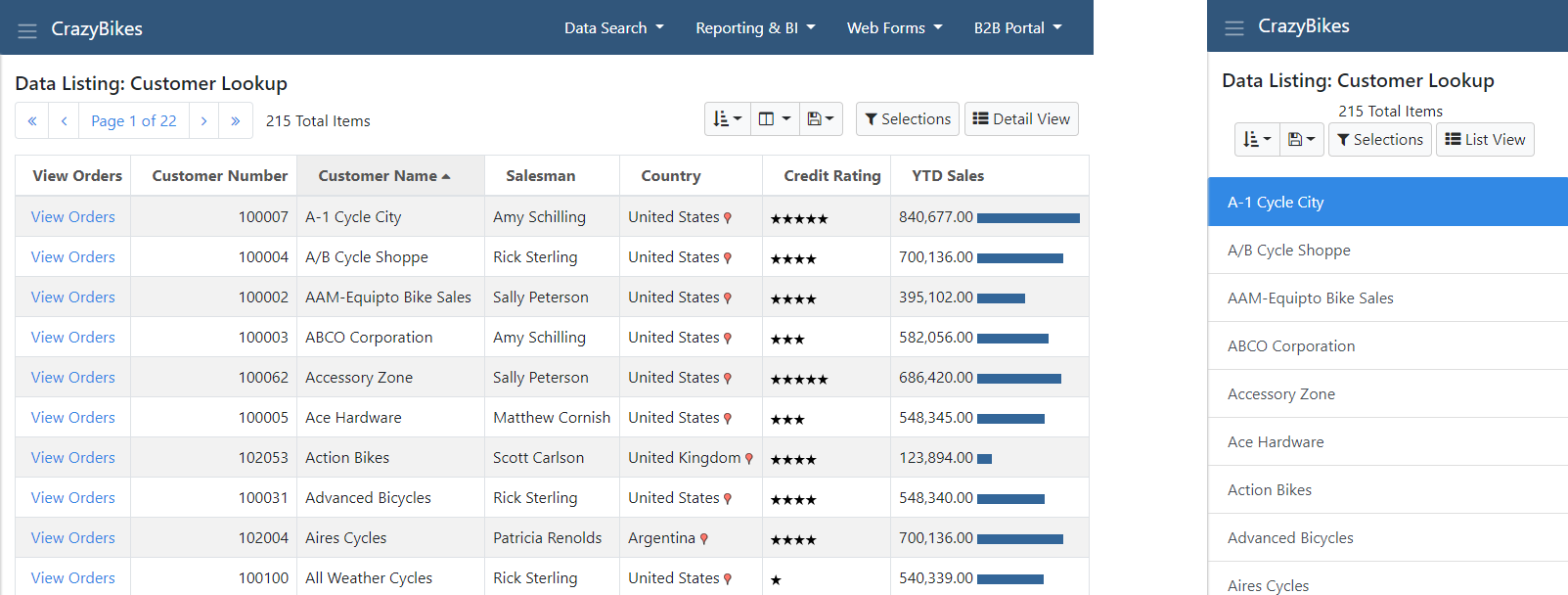
Responsiveness
Mobile support comes in the way of responsive design. Responsive design, by definition, allows the application layout to change on-the-fly based on the end-user’s device. These templates will always use 100% of the screen real estate by default and then reorganize the on-screen elements based on available space. For a traditional grid based template, developers can edit the grid based design as well as either side the detail view.
Placeholder Text
By default, all input boxes utilize default placeholder text that is in place to guide end-users with suggestions. These can be edited via the Input properties window. More information here.
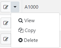
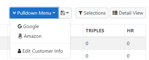
Pulldown Menus
End-users who utilize our Data Listing with Web Form template will see a new pulldown menu that separates the available action modes. This means allowing end-users to interact with larger buttons that should reduce in any end-user confusion.
Sticky Headers
Disabled by default, sticky headers allow the end-user to always see the column heading on-screen no matter how far they may have scrolled down the page.
Note: This feature is not intended to be used in conjunction with the column re-order feature.
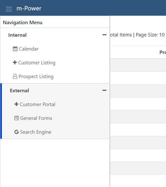
Menu Navigation
Additional navigation options, such as left or right side navigation is available for Bootstrap Data Dictionaries via the Servlet Properties. Look for the following properties to modify: “Left Side Navigation Menu” and “Header Menu Display Type.” Below is a screen shot of the left side navigation option.
Developer Benefits of Bootstrap Features
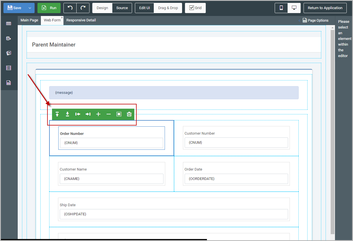
Form Layout
Developers can now rearrange elements on any single row template directly within m-Painter’s graphical interface. This includes adding new rows/columns as well as rearranging existing elements. More information can be found here.
Pulldowns
We use pulldown menus throughout the m-Power interface (think of the cogwheel on the Manage application screen) — it allows you to put several menu items in one space — accessible when clicking on a button/element. More information can be found here.
Edit Element Dialog
The edit element dialog was added as it gives developers the chance to tinker with any HTML element by only looking at a specific section at a time. Better still, new navigation has been added to let developers travel the element’s parent, children, or siblings. We’ve even added the ability to add several dozen common elements to the page (such as progress bars, cards, buttons, alerts, and badges, to name a few.
Conditional Rendering
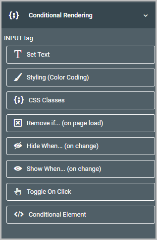
You probably already know that m-Power comes with a bunch of features already available to plug into your apps to help you secure what a user can see at run-time (role based menuing and user privileges to name two).
This feature lets you harness these two features more easily by giving you a button to click on to implement in your app without having to delve into specific syntax.
Imagine you have a scenario where only salesman should see customers’ contact information. You could use this feature to ensure that anyone outside of the salesman group would not have access to this information. Additionally, this feature also includes an additional feature that will conditionally hide or show elements based on a user’s input. So for an example, if a user specifies that an order has been closed, you can automatically show the “Date Closed” input. Otherwise, this element will remain hidden. More information can be found here.
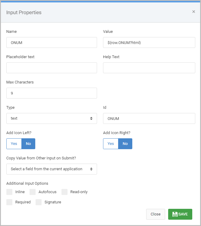
Text Input Dialog
Developers want to do all sorts of interesting things with inputs; From making them required, to setting auto focus, to wanting to customize it in ways we haven’t yet considered.
To help facilitate this need, we’ve updated our “Input Properties” input to be able to add these types of features in without having to dive into the source code. More information can be found here.
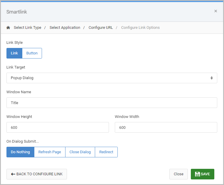
Popup Dialog Options
Occasionally, developers create maintenance applications within Popup Dialogs. The trouble then becomes what to do with that popup dialog once the record is submitted? Sometimes the need is to just close the window, other times it might be to refresh the page, while others you may want to redirect elsewhere. We’ve improved this process by giving developers a simple UI to make these selections within m-Painter. More information can be found here.