Overview
m-Painter offers several options in terms of conditional rendering. These options let you do a variety of things, from setting text, controlling styles, to removing/hiding elements on a page. At present, m-Painter supports these methods:
- Set Text — Allows you, as the developer, to conditionally show text based on data found in the row.
- Styling and CSS Control — Control the color or font of data or cells within your application. For example, data with high values could be green, where low value data could be red.
- Hide when….(on change) — See the next bullet point for more details
- Show when….(on change) — Hide or Show when works exactly the same from a UX standpoint. As a developer you are just deciding, based on a user’s action, whether an element on the page should be hidden or shown.
- Remove if….(on page load) — Checks values when the page is open to control whether to hide an element or not. The user has no control in what is shown or hidden.
- Toggle On Click — Hide or show an element when an end-user clicks a button
- Conditional Element — This catch-all feature allows you to add multiple conditions to the same element.
Set Text
Similar to what you could do via a conditional calculation, this feature allows you to show text on the page based on any rules you have chosen. For example, in the video below, the m-Power application will flag certain rows if their value is too high and their status is Back Ordered.
Styling and CSS Control
The ability of how to conditionally control the look/aesthetics of your data is covered, in-depth, in separate documentation, found here.
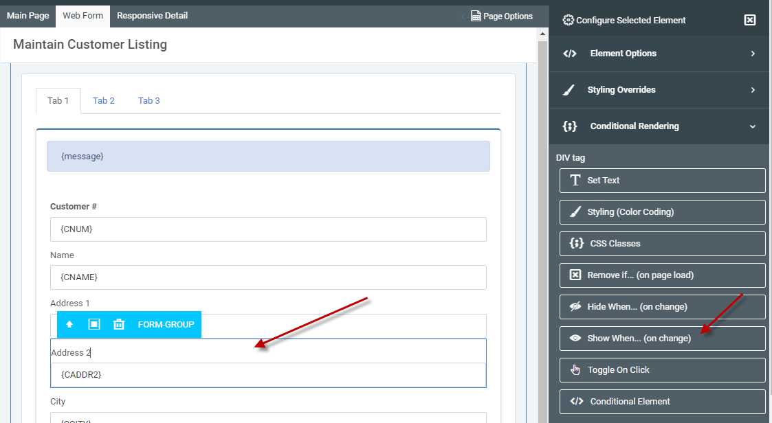
Hide/Show Elements (on change)
For this example, I am going to conditionally show the “Address Line 2” input only when the user enters in a value for “Address Line 1”. Click on the form group for address line 2, then click “Conditional Rendering” and “Show When…(on change)” in the element panel.
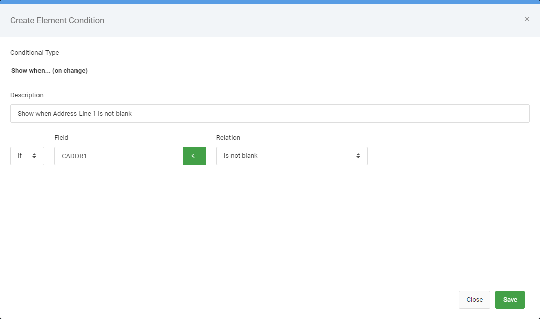
Enter in the information as it is seen in the image below:
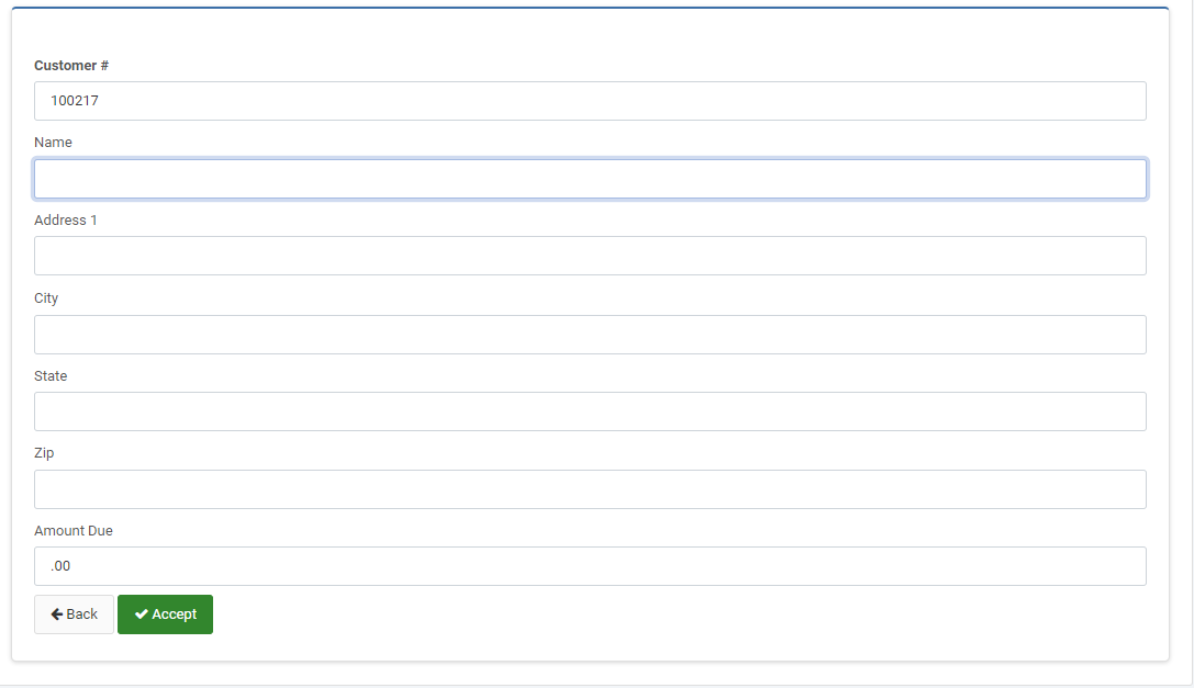
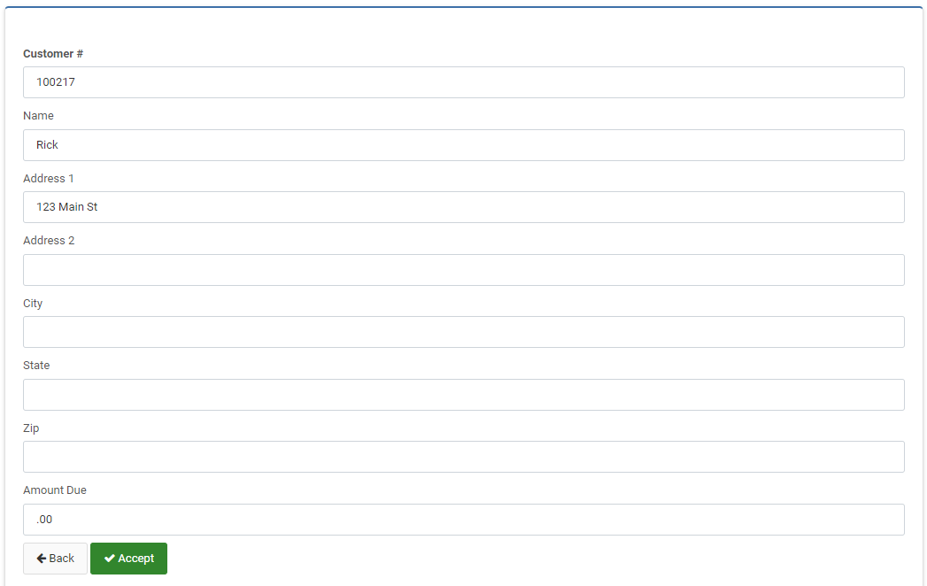
Here is what the application looks like at runtime. Notice in the first image, the address line 1 field is blank, so address line 2 is not displayed. The second image illustrates that once a value has been entered for Address Line 1, Address Line 2 now appears.
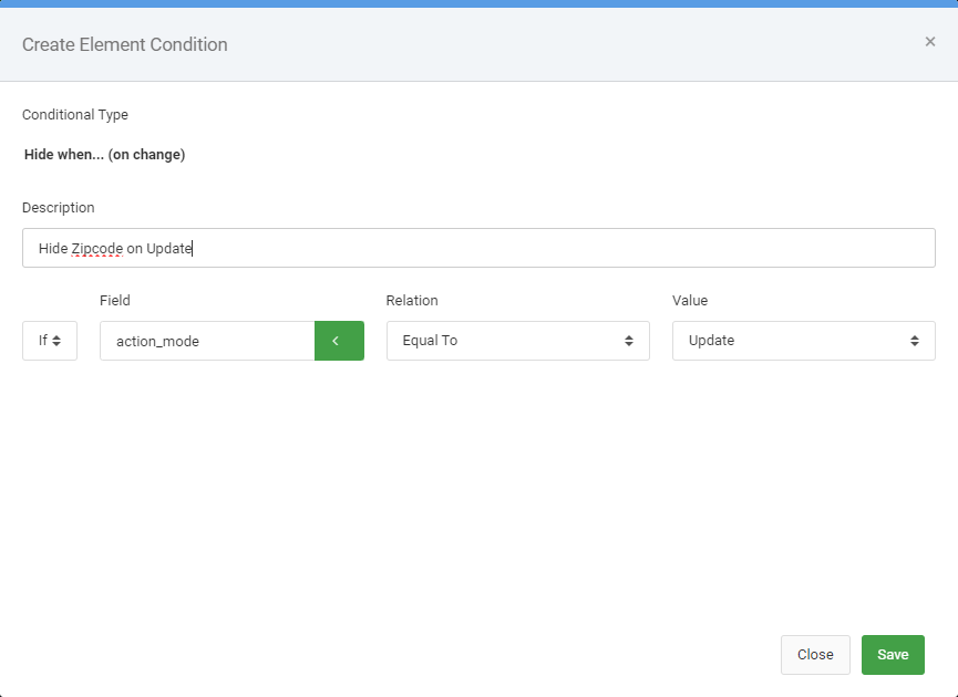
Based on Action Mode
Conditional Visibility also allows you to control whether an element is shown or not based on what action mode your maintainer is currently in. For instance, you can remove a field from the screen in the event you are in update mode.
Once you have selected the form group (input and label) of your choice, choose “Hide when…(on change)” from the right side element panel.
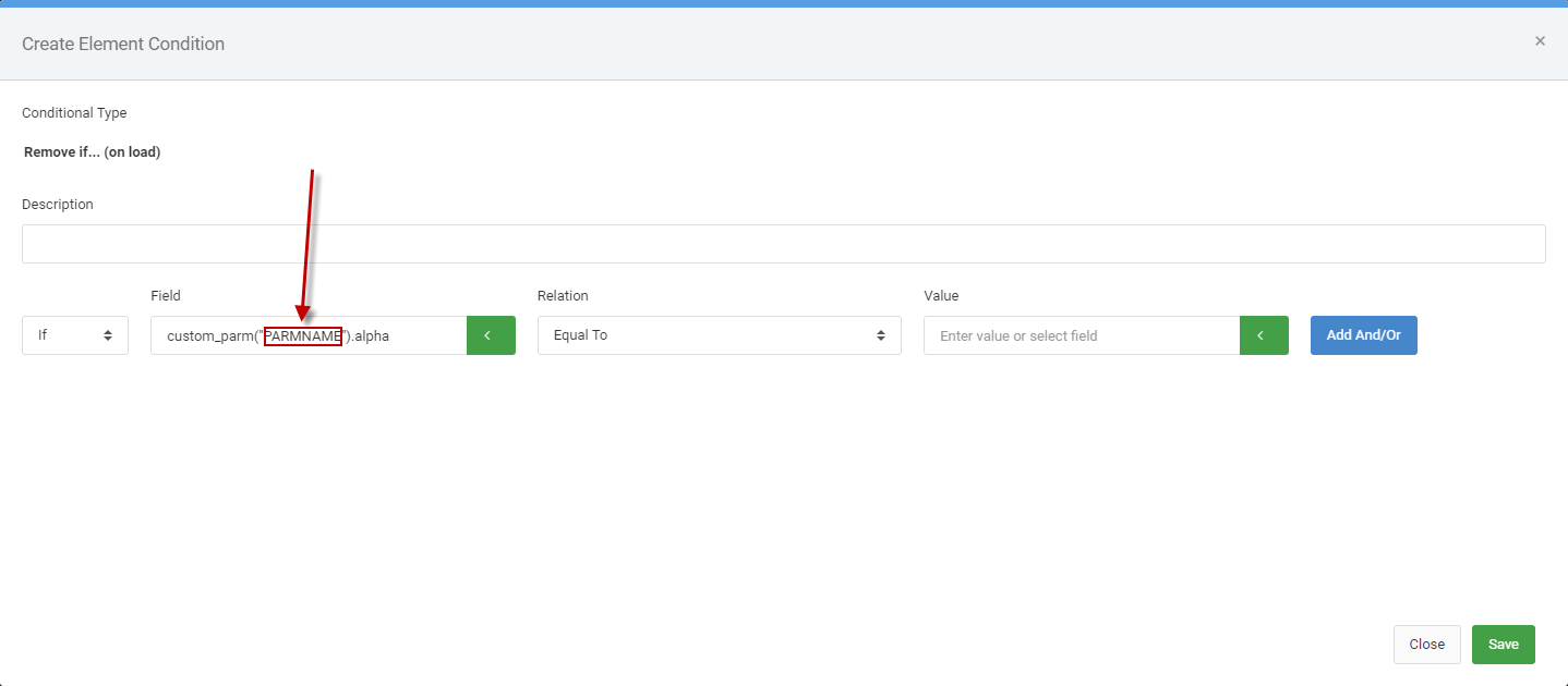
Remove Elements (Based on Load Behavior)
The section above focused on specific user actions controlling whether elements are hidden or visible. By contrast, you can use the “Remove Element….(on page load)” to control whether an element should be hidden or shown NOT based on user decision.
Options to select from for this feature include:
- Seeing if a field equals a certain value For instance, if status is “Closed” don’t show an edit button.
- A user role (Assuming you have Sign-on Security enabled and you have users and roles entered in the system. This is helpful if you want to restrict showing certain buttons for specific user types.
- Checking to see what the action mode is of the page. For instance, perhaps you want to hide certain fields from display in the event you are in delete mode.
- You can check a specific username and see if the current user matches the rule, certain elements would be omitted from the page.
- You can also check against advanced features like Custom Parms, User Privileges, and Session Properties. In the event you choose any of these three options, be sure to replace the placeholder parameter name with that of your actual parameter/privilege/property.
Toggle on Click
The Toggle on Click feature allows your end-user to click a button that will hide or show an element on the page. In the example covered in the following video, a user can click a button to toggle an address panel from being in view or hidden.
Conditional Element
There may be scenarios where you wish to add two separate conditional rendering rules to the same element. In those cases, you are advised to use the Conditional Element option as it allows you to have more flexibility than the other built-in options. The video below walks you through the scenario where you want to conditionally hide/show two different elements in the same cell.