Overview
A pulldown menu allows you to organize application links/options within a single location on the screen. This is highly useful when you want to give users the option of several links to click on but have limited screen space to accomplish this. We use pulldown menus throughout m-Power. For instance, the “Action” cog wheel on the manage application screen is a good example of a pulldown menu. There are three types of pulldown options:
- Pulldown Menu
- Button Menu
- Split Button Menu
Pulldown Types
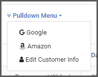
Pulldown Menu
The pulldown menu adds a text based menu option. When selected, the user then sees all menu options beneath the original text based link.
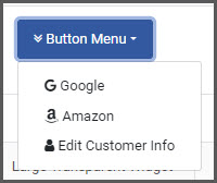
Button Menu
The button menu adds a button based menu option. When the button is clicked, the user then sees all menu options beneath the original button.
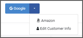
Split Button Menu
The split button menu adds a button based menu option, however the button is now split. If the user clicks on the larger left side of the button they will be sent to the first link specified. However, they can also click on the right side of the button, with the arrow to see the other options available within the menu.
How to add Pulldown Menus
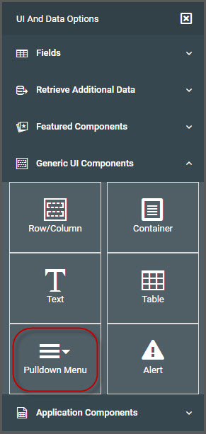
To begin, open m-Painter and place your cursor where you want your pulldown menu added. From the left-side Component Panel -> Generic UI Components, select “Pulldown Menu”.
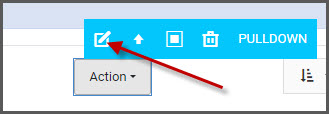
Once clicked, the default pulldown button menu will appear at the location of the cursor. You can then select the button menu and either click the quick edit icon from the blue navigation bar or click the “Edit Pulldown Menu” option from the right-side Element Panel.
Edit Pulldown Menu
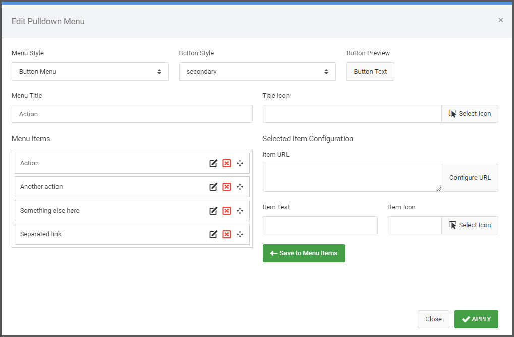
Menu Style
This dropdown controls which pulldown menu type you would like to use. If a Button Menu or Split Button Menu is selected, you have the option to set the Button Style as well.
Menu Title/Title Icon
This text will be what the user will click on to activate the pulldown. You can also add an optional Title Icon.
Menu Items
This is where you can configure your individual menu items. Feel free to edit/add/remove or reorder the options as needed.
Item URL
You can hardcode a URL or use the “Configure URL” button to have m-Painter’s wizard guide you through constructing a URL to an existing m-Power application.
Item Text/Icon
Set the text that appears in the pulldown menu. Optionally, add an icon that will appear to the left of the text.