While inputs typically default to traditional input boxes, developers can convert these to other inputs. Most m-Power users are familiar with converting inputs to a drop-down list or a combobox, m-Painter now supports two new input options: Toggle Switches and Bootstrap Radio buttons.
Toggle Switches
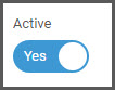
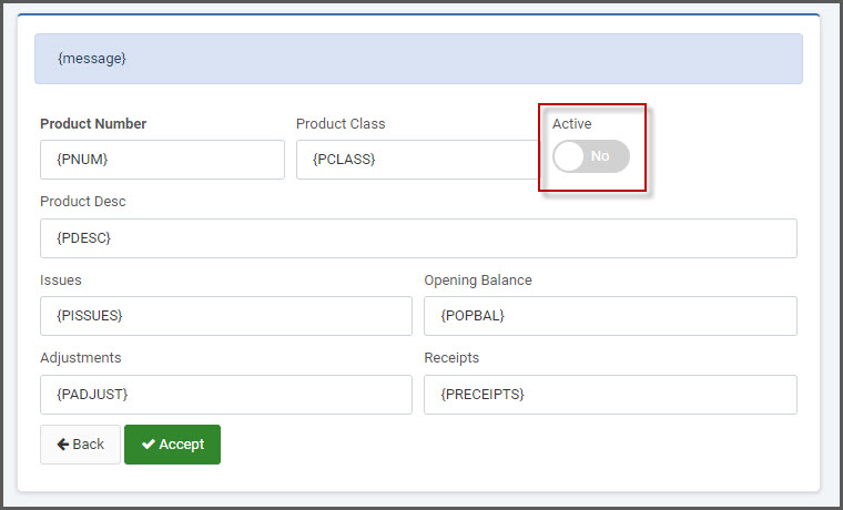
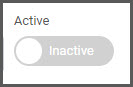
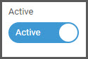
Toggle switches are an alternative option to a checkbox input. Clicking the switch will slide the toggle to the “enabled” option. This input option works best when there is a single value to submit to the database, such as ‘Y’, ‘N’, ‘Active’, ‘Inactive’, etc.

To implement a toggle switch, you must be using a Maintainer application.
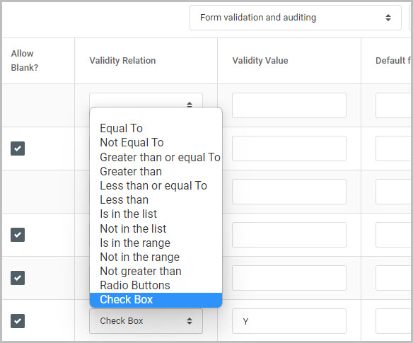
In the Field Settings tab of your maintenance application, change the “Basic field attributes” dropdown to “Form validation and auditing”. Find the field that you would like to create a toggle switch over.
In the Validity Relation column, select the “Check box” option. In the Validity Value column, enter the value you want to write to the database when the switch is toggled on.
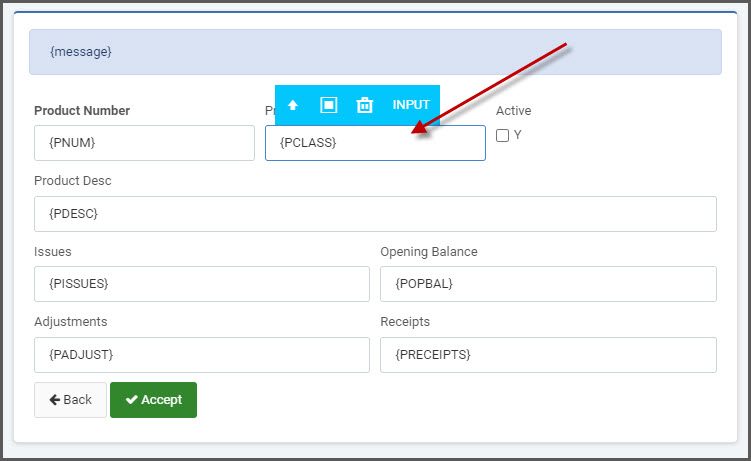
After compiling the maintainer, open m-Painter and locate your checkbox field in your maintainer form page.
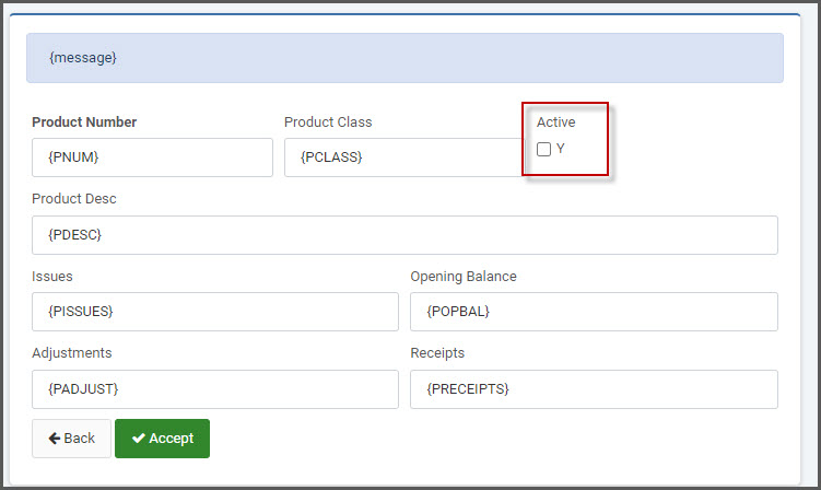
Select to highlight the checkbox element. On the right-side Element Panel, select the “Convert Input to…’ dropdown and select “Toggle Switch”
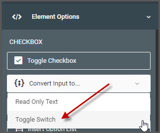
Selecting this will immediately convert the checkbox to a toggle switch.
Toggle Switch Options
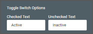
The default text for the enabled/disabled toggle are ‘Yes’ and ‘No’. You have the option of customizing the text for these different statuses.
Select the toggle switch in m-Painter and from the Element Panel -> Element Options, scroll down to the “Toggle Switch Options” section. Here you can set the desired “Checked Text” and the “Unchecked Text”.
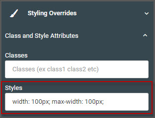
Note: If changing the toggle text options, you will also need to override the width and max-width styles of the toggle switch in order to accommodate the longer text. To do this, select the “Styling Overrides” section from the Element Panel and click “Class and Style Attributes”.
Set the following style and change the px size to best suit your needs: width: 100px; max-width: 100px;
Save and run your maintainer.
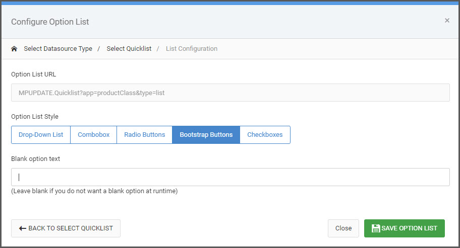
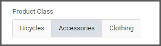
Bootstrap Radio Buttons
An alternative display option for radio buttons, you can choose to render Bootstrap themed buttons.
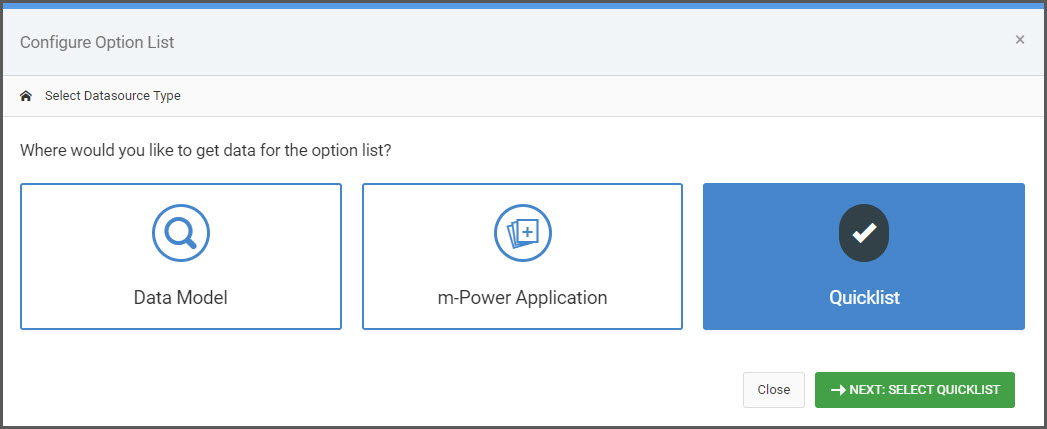
To implement, select the input you wish to add the button group. Then from the Element Panel, select “Insert Option List”.
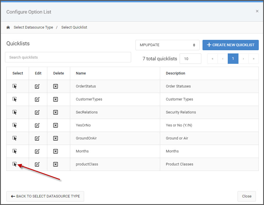
Select which datasource type will be used to populate the button group: Data Model, m-Power Application, or Quicklist.
Next, choose the specific dataset to available buttons items from.
Finally, in the List Configuration screen select the “Bootstrap Buttons” from the Option List Style.