Overview
m-Painter, via the Styling Overrides panel, allows developers the ability to add styles to individual elements on the page, without having to know any CSS or editing any code. This means that with just a few clicks via m-Painter, a developer could transform text color, add pre-existing CSS classes, adjust borders, and even change text alignment.
Accessing the Feature
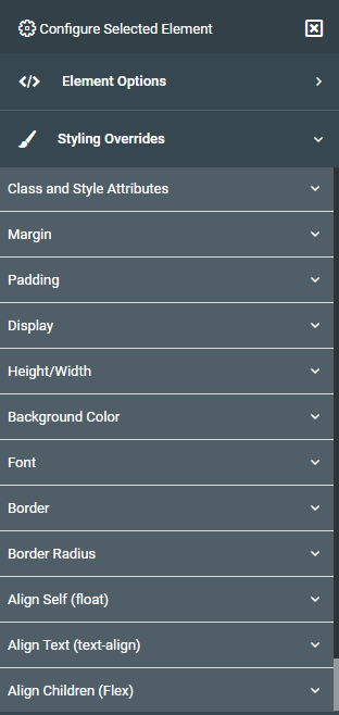
In m-Painter, click on the element you which to adjust, then within the right-side element panel, look for “Styling Overrides” and click on it. This will expand the accordion, showing you all of the different ways you can adjust the look and feel of the selected element.
Key Features
‘Key Features’ are options that will always appear in the ‘Styling Overrides’ menu for any element selected in the m-Painter editor .
Class and Style Attributes
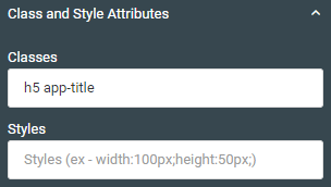
Depending on what element you have selected, any classes that are already applied to that element will be listed here. You can additional classes, so long as they are separated by a space with any other classes listed.
You can also apply styles directly into the second box if you prefer. For instance if you wanted to set the width to 50, you would type:
width:50px;.
Margin
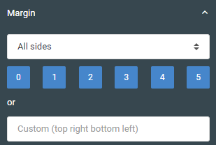
Margin, also known as the space between this element and the one adjacent to it, can be set here. You can use the dropdown list to say where to apply the margin, where all side is the default option. Setting the margin from 0 – 5 is not adjusting the amount of pixels of margin, but rather 6 pre-built bootstrap margin settings.
If that option does not work for you, you can provide your own custom margin rule such as:
10px 20px 30px 50px;
This tells the system, per traditional CSS rules to set a top margin of 10px, a right margin of 20px, a bottom margin of 30px and a left margin of 50px.
Padding
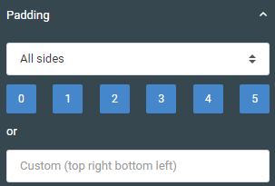
Padding, also known as the space between this element and its outer container, can be set here. You can use the dropdown list to say where to apply the padding, where all side is the default option. Setting the padding from 0 – 5 is not adjusting the amount of pixels of padding, but rather 6 pre-built bootstrap padding settings.
If that option does not work for you, you can provide your own custom padding rule such as:
10px 20px 30px 50px;
This tells the system, per traditional CSS rules to set a top padding of 10px, a right padding of 20px, a bottom padding of 30px and a left padding of 50px.
Display
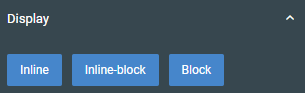
You can change the display type of the selected element between inline, inline-block, and block.
Differentiation between these 3 display types is beyond the scope of this document but this CSS topic is covered at length in various websites. For example, the MDN Web Doc provides a great introduction into the ‘display’ property here.
Height/Width
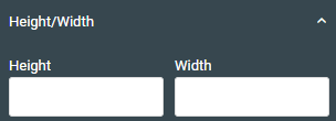
Specify the height and width, with proper unit of measure. For instance 20px.
Background Color
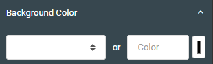
Use the dropdown list to choose one of the default bootstrap colors or choose your own by clicking on the button on the right. This will open a color palette for you to pick the exact color shade of your preference.
Note that any valid color hex code value may be typed directly into the custom ‘Color’ input.
Font
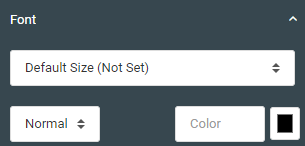
Use the top dropdown to select the size of the selected element. The dropdown in the bottom left corner lets you specify if you would like your font to be bolded. Finally, click the button in the bottom right corner to open a color palette to pick a specific shade to color your font.
Border
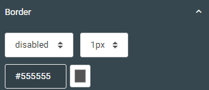
Specify the border type, thickness, and color here for your selected element
Border Radius
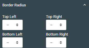
This option allows you to round corners for selected elements. This also applies to input boxes.
Align Self (float)
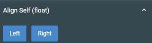
This option allows you to either float your element to the left, to the right, or if you click an element again, it returns the element to no float at all. The concept of CSS float goes beyond the scope of this document but the topic is covered at length at any site that covers CSS floating.
Alight Text (text-align)
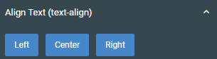
Choose either one of the buttons to align text within its container. You can click any selected button again to unselect it, returning the element to its default text alignment.
Align Children (Flex)
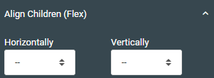
You can control either the horizontal or vertical alignment of child elements within a flex container. More information about this CSS topic can be found at any CSS Website of your choosing.
Shadow
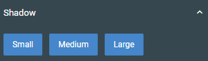
Click either of the three button to turn on a shadow for the selected element. Click on any selected button to remove shadowing from the selected element.
Special Features
‘Special Features’ are options that will only appear in the ‘Styling Overrides’ menu when a particular element is selected in the m-Painter editor.
Table Layout Options
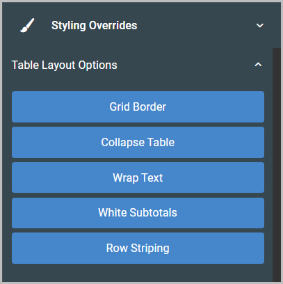
Use these options to control the appearance and layout of your data table.
- Grid Border – Select this option to add a visible border to every cell in the table.
- Collapse Table – Select this option to significantly reduce the width and padding of the table.
- Wrap Text – Select this option to indicate whether text should wrap (selected) or not (not selected) within the cells.
- White Subtotals (report only) – Select this option to set the background color of any total lines to white.
- Row Striping – select this option to format the table rows with an alternating background color, to improve readability.