The Component Selector includes many predesigned element templates that can be added to the page in order to make the UI more helpful. These predesigned elements include cards, tabs, buttons, statistical widgets, etc.
Once an element template has been selected and added to your page, you can customize the look/style of the element by changing background colors, font colors, icons, etc. Additionally, you can further customize the element by changing content to hard-coded text or even import data values from another application.
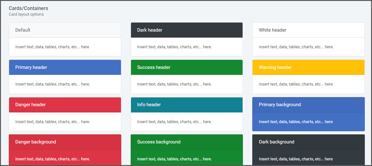
Cards
Card elements offer a content container and includes options for headers and footers, a wide variety of content, contextual background colors, and powerful display options.
Once selected, any of the placeholder text can be substituted for hard-coded text, data values from the current app or importing data values from a different application.
Card/Containers
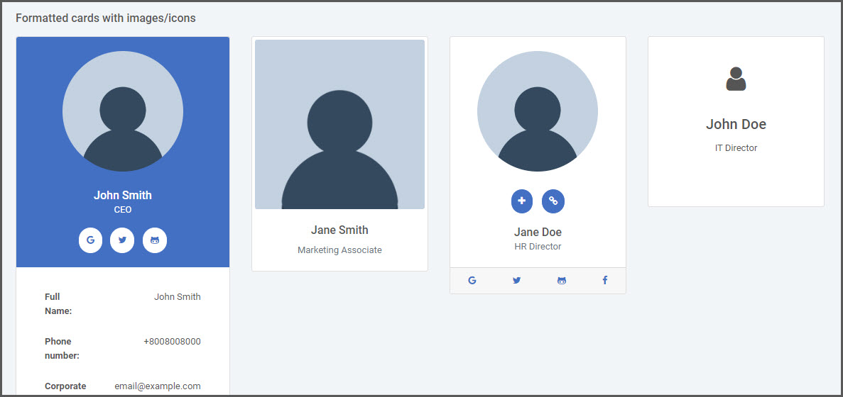
Formatted Cards with Images/Icons
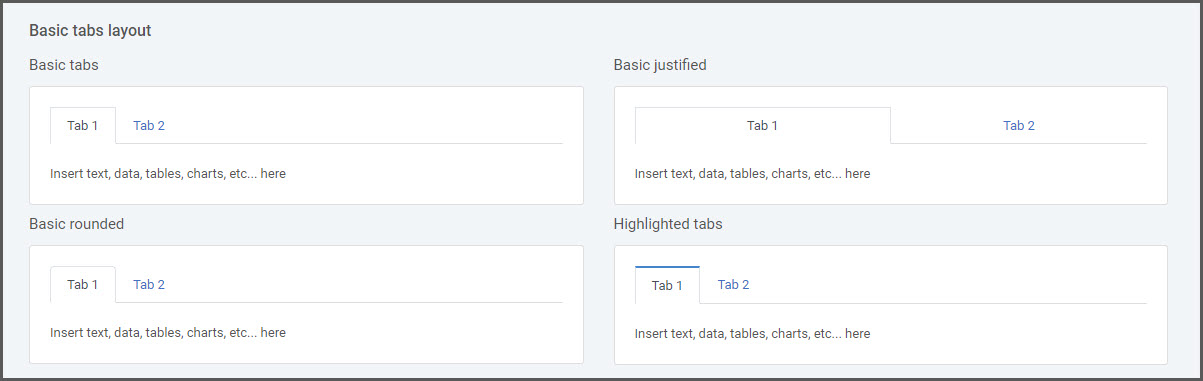
Tabs
Tabbed panels offer a polished navigation container that can include different content on a single page separated by tabbed groups.
After inserting a tab panel, you are able to change the header tab text and the main content inside the tab body. Additionally, once the tabbed element is selected in m-Painter, you can add additional tabs from the Element Panel.
Basic Tabs
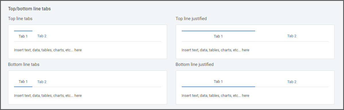
Lined Tabs
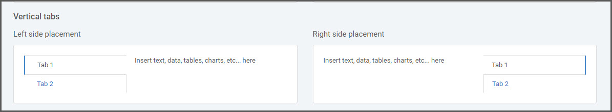
Vertical Tabs
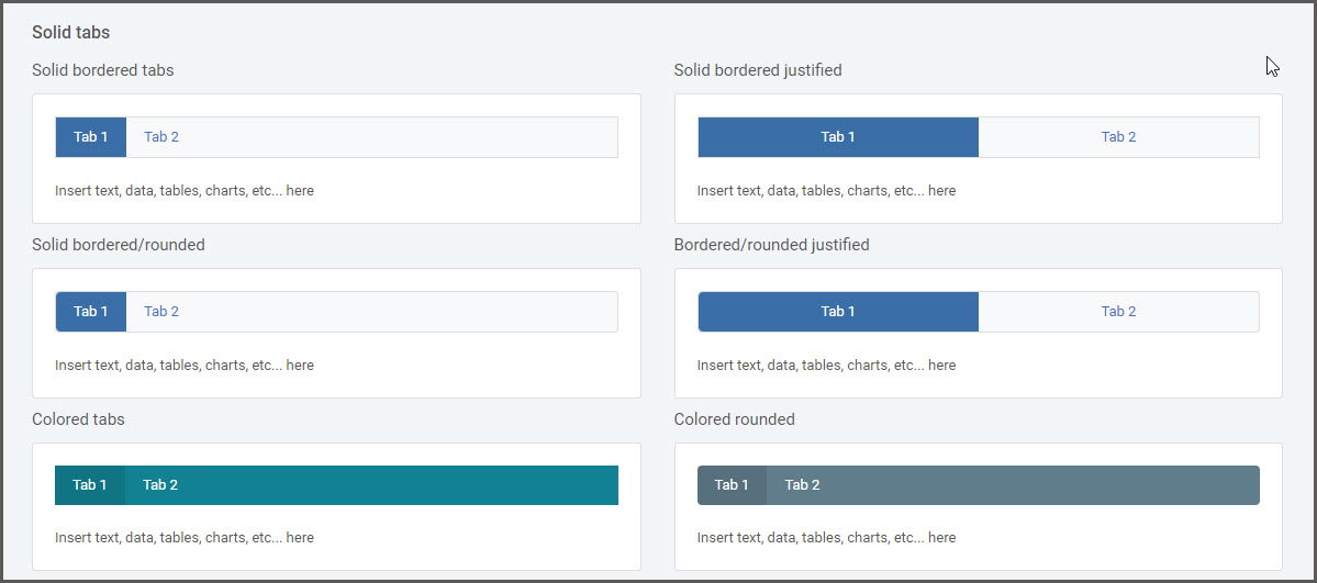
Solid Tabs
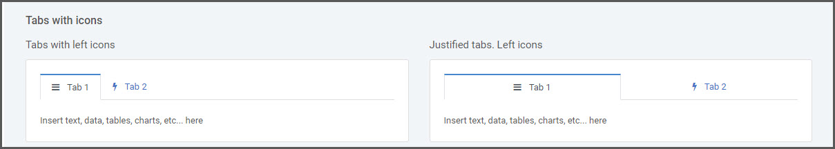
Tabs with Icons
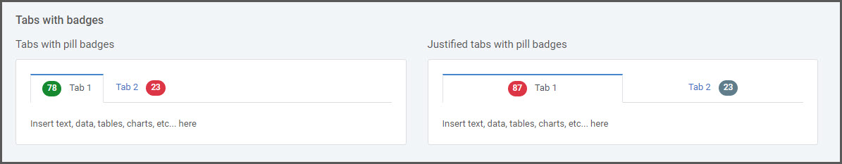
Tabs with Badges
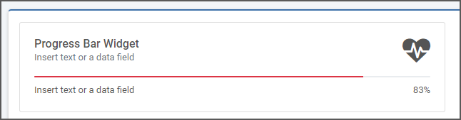
Statistical Widgets
These elements allow you to display data points along with an icon for a quick and visually appealing graphical representation of total values.
After inserting a stat widget, you can change the icon used, any accompanying text, and the data total value.
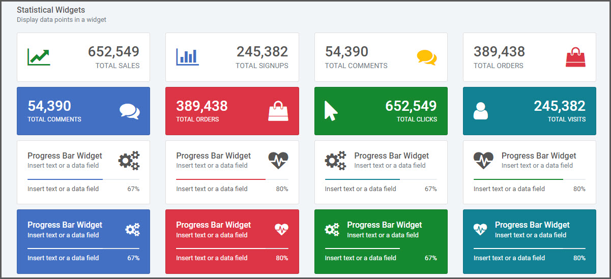
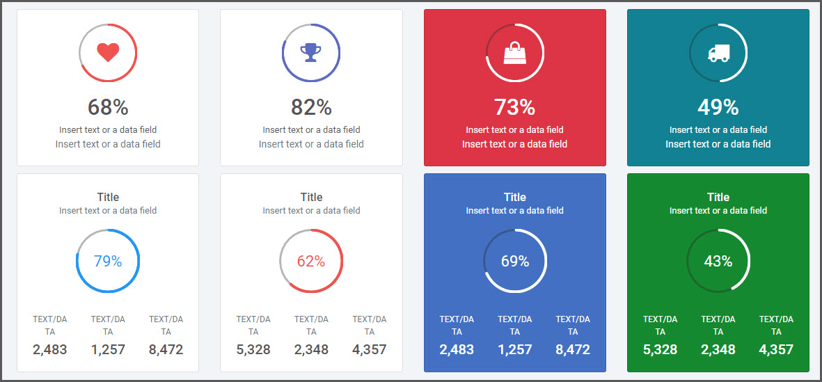
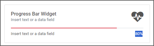
Progress Bar/Doughnut Value
If utilizing a widget with a progress bar or doughnut circle, the widget can dynamically render the completed portion of the line.
Built-in Data Value
Once the widget is inserted into the page, click on the highlight the numeric value placeholder in the stat widget.
Once highlighted, use the left-hand component panel to select Insert Totals & Percentages in order pull in the data value you wish to plot in the widget.
Alternative Data Value
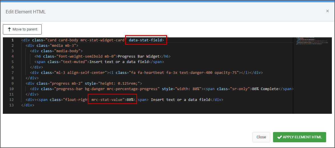
If you wish to pull the data value from an alternative location (i.e. Current app data field, Custom Freemarker variables, import, etc) you can do so by selecting the “STAT CARD”.
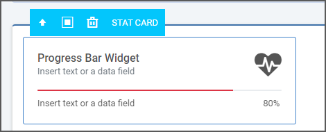
Once the STAT CARD is selected, from the right-side Element Panel, select “Edit HTML”. In the source, find the top level element with the ‘mrc-stat-widget-card’ class and within this <div> find the attribute for “data-stat-field”. Configure this by inserting the substitution value or variable. Additionally, find the “mrc-stat-value” <span> element. Change this placeholder value to ‘{val}’ (without the quotes).
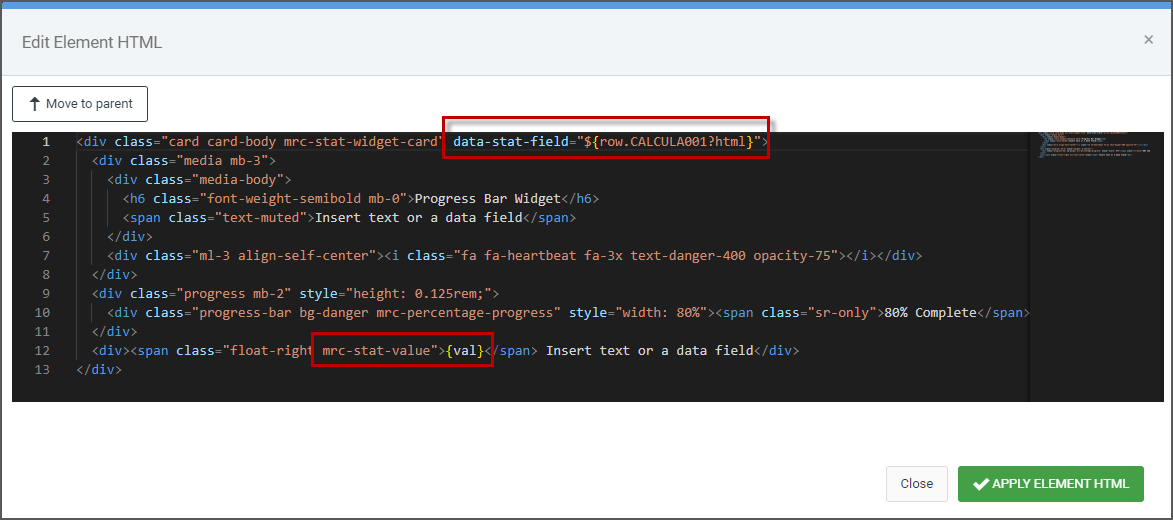
At runtime, the line and value will render with the appropriate data value.
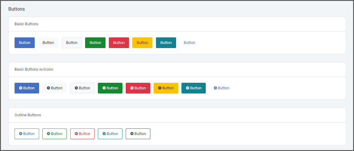
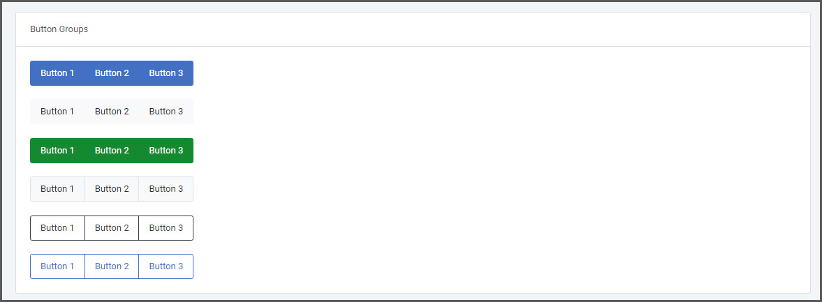
Buttons
Insert a button as a clickable element to serve as a hyperlink to another page or application. Alternatively, use a button in combination with the Toggle Conditional Rendering feature to show/hide other elements on the page.
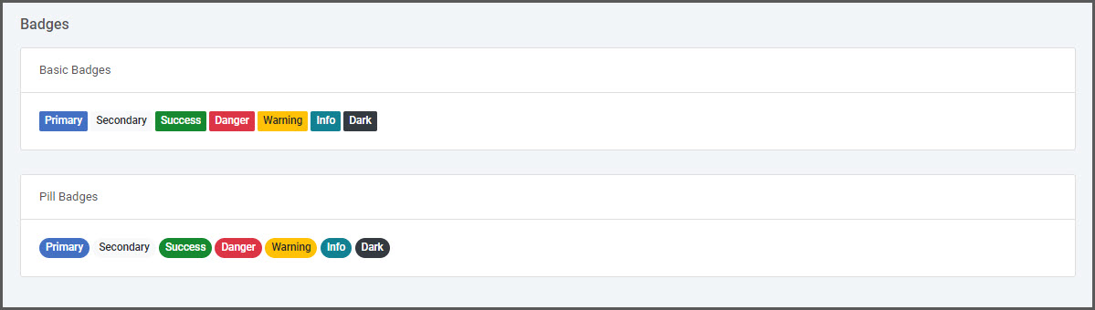
Badges
Badge elements are a great way to place emphasis on a counter value or labeling component. A common use case is implementing a Notification Badge.
Data Lists
A Data List component allows you to retrieve and render data from an external application or data model and apply this to a presentation element within the current application. The selected Data List element will repeat itself for each record found in a retrieved data set.
More on using Data Lists can be found here.
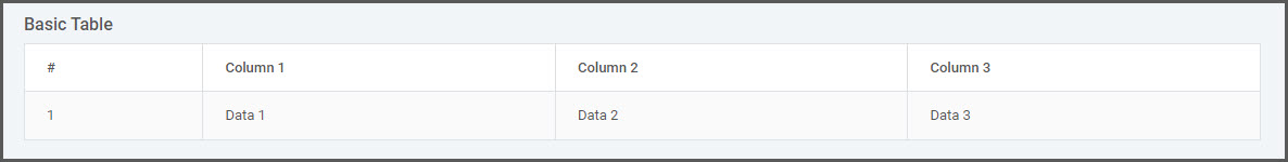
Basic Table List
Basic Unordered List

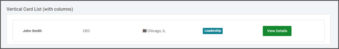
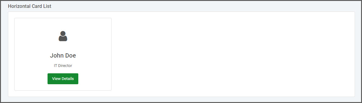
Basic Vertical Card List
Horizontal Card List
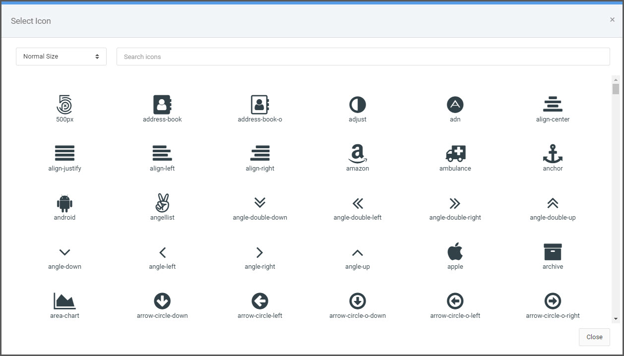
Icon
A variety of Font Awesome icons are available to add to your application. You can style this element to change its size, color, etc.
The selected icon will be placed at the position of your cursor in m-painter.
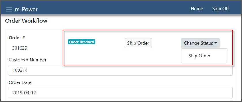
Status
Statues are tied to workflow objects within Maintenance applications. However, adding a status field allows you to utilize status workflows built within other applications.
Click here to learn more about the Workflow Status feature.
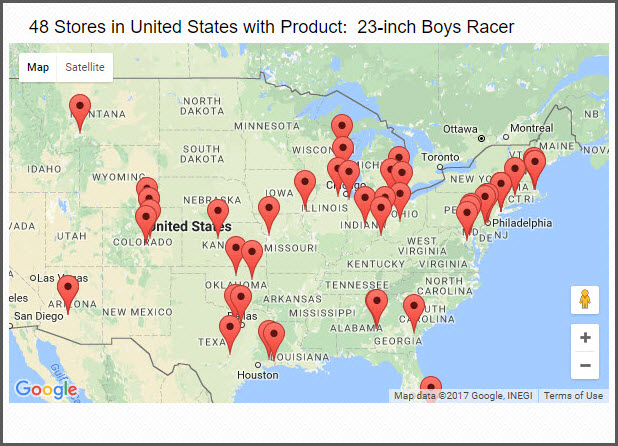
Map
Insert a Google map to your page while customizing plot point locations as well as marker text for each plot point.
Click here to learn more about inserting Google Maps.
Image
This feature allows you to insert an image to the page from an image file on the m-Power server or a web address. Substitute the filename in the image path with a data field from your application to create an image that will dynamically display to your end user based on the record displayed.
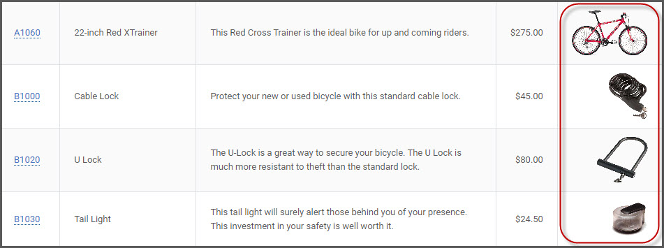
Image Path on the Server
Enter the directory path to find the image file on the server. Include the file name in the path. Use the “Append Fields to Path” pulldown to append data field substitutions into your path.
For example, /mrcjava/images/products/A1060.jpg. Alternatively, if using a dynamic substitution as the file name, the path might look like this; /mrcjava/images/products/${row.PRODNUM?url}.jpg
Height/Width
Optionally, set the height and width of your image. If a size is not set, the image will render as it appears directly in the image file.
Alt Text
This attribute provides alternative text/information for an image if a user for some reason cannot view it (because of slow connection, an error in the source path, or if the user uses a screen reader).