Summary: As business data explodes at a surprising pace, many companies still struggle with reporting. They create reports that confuse or overwhelm their executives–hampering their ability to make decisions. What do your executives think about their reports? Do you make any of these reporting mistakes?
Here’s a surprising fact: Did you know that the volume of business data worldwide doubles every 1.2 years? Think about that. In a little over a year, your business will have twice as much data as it does now.
The big question: What is your company doing with that data? When used properly, this data can give you a massive competitive advantage over your competition. Businesses who quickly turn their data into meaningful management information will make faster, more informed decisions than those who don’t.
The problem: Most businesses still don’t know what to do with this data. Creating reports over their data requires days or even weeks. The reports they do create are confusing or overwhelming–offering no real insight. Not only does this frustrate executives, it hampers their ability to make fast, informed business decisions.
Today, let’s explore a few ways to improve your reporting–by focusing on reasons an executive might dislike a report or find it frustrating. Your reports will most likely frustrate your company’s executives, if you…
1. Give them what they ask for (not what they need)
Henry Ford famously said, “If I had asked people what they wanted, they would have said ‘faster horses.’” Does that mean you shouldn’t ask your users what they want in their reports? No–though many people misinterpret this quote in that way. It means you must get beyond what they’re asking for, and truly understand what they need. This goes beyond a simple criteria list. This requires a deep understanding of their goals.
“To ensure that your report is hated, give the executives exactly what they ask for, instead of what they need,” says Steven Lowe, Founder/CEO at Innovator, LLC. “End-users tend to ask for things that are familiar, so they’ll ask for a report just like another report that they already hate, but with different data. And of course, then they’ll hate the new report, too. Surprise!
Instead, work with the executives to determine what decisions the report is intended to support. Try to make the critical information obvious at a glance or a quick skim – highlight the truly relevant portions, and separate out the details in different sections or drill-downs (if interactive).
Understanding how the information is to be used is critical to creating a useful report.”
“As someone who was thrust into providing reports for directors and managers one day to the C-Suite almost overnight, I learned through a baptism of fire how to turn a CxO’s grin into a grimace,” says Rob Patey, Director of Marketing at WorkZone. “When dealing with the C-Suite it’s important to remember their chief concern – performance. Not performance of individual project steps or other in the weeds metrics, but true performance driving bottom line growth.”
The true challenge of creating reports: presenting an overwhelming amount of data in an easily digestible form. Too many people make the mistake of cramming all of the data into a report, and assuming that’s a good thing. As Patey explains below, executives don’t care about every bit of data. They care about the data that drives action.
“For years I needed to examine each subtle nuance of every campaign in the grand marketing mix: clicks, opens, engagement of each step through the funnel,” he says. “This insight was essential to ensure the following campaign repeated successes and avoided pitfalls. When I first showed this report inside the ivory tower, it was met with utter silence. I had thought for a second I misunderstood the very definition of the word “report.” After my performance to a slew of stone walls, one executive kindly stated, “you need to go back to the drawing board and show us exactly how this grew our customer base and revenue without all the steps to get there. We simply don’t have time to sift through all of this to get the fast answers we need.” It was an appreciated lesson that has served me well ever since.”
3. Offer no context
Taking the previous point one step further–displaying too little data creates problems as well. Most notably, reports or dashboards with too little data lack context. For instance, suppose you view a report that indicates customer support requests have plummeted. That’s great news, right? It is…until you add the context that you’re losing record amounts of customers to the competition. As you see, data without context can be very misleading, and result in misinformed decisions.
“Data reporting dashboards should be designed to incorporate business nuances, not just report on data-driven facts,” says Gina Miller, VP, Director of Customer Experience and Demand Management at CBD Marketing. “A downward trending line on a chart is not actionable. Similarly an upward trending line on one chart could indicate a positive business result, say for the sales of a new flavor version of a product. But if you overlay other flavor versions of that product and year-over-year comp store sales data, you might see that the new product is only cannibalizing your other products, not driving real growth. It’s the context that counts, not the data. Charts cannot explain the whys, and the whys are the reason the executives exist – to correct the course of business.”
4. Make it available in just one format
Another common reporting mistake: creating a report that looks great on a computer screen, but not on paper. Many executives prefer to print their reports, but without a well-formatted print version, the report will be nearly unreadable.
“Many top-skilled analysts, IT specialists and project managers are unable to get their point across (or proper credit for their work) when their one page year-long data report prints out on 16 partially inked up pages,” says Amethyst Polk, Senior Associate (Development) at the American Red Cross. “1 minute of manipulating data in “Print Preview” can help save several dollars in ink toner and paper, labor hours in print services, and stress in that last 5 minute hustle before an annual meeting.”
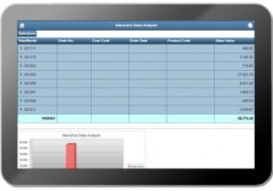
How well do your reports work on mobile devices?
Going one step further, modern web-based reports must be available across all devices. After all, you don’t know how an executive will access your report. Maybe they’ll view it on a PC. Maybe they’ll view it on a tablet. Maybe they’ll view it on a smartphone. Modern web applications (including reports) must adapt to any device.
5. Use text bullets to explain complex ideas
A picture is worth a thousand words–and that’s especially true with reports. Many make the mistake of using too much text in their reports, rather than a single chart or image which would have easily conveyed the message.
“I’ve had meetings where we spend 20 minutes trying to explain new marketing ideas that could have been explained in less than 5 minutes with a screenshot or diagram (instead of a text bullet in a Word document),” says Neena de Leon, Marketing Lead for Anywhere Pad. “Needless to say, executives dislike spending more time than necessary.”
6. Give them old data
“Executives and end-users quickly become frustrated trying to work with data that is not real time,” says Kreg Decker, President and CEO of One Vision Solutions. “It is like driving a car with a gas gauge that shows them how much gas they had last week. Executives can’t make effective decisions when looking at financial or project performance metrics as they stood days (or sometimes weeks) ago.”
Of course, if you’re creating monthly, quarterly, or yearly reports for review, this point doesn’t apply. However, if you’re creating web reports that your executives or users will access when needed, real-time data is essential. As the pace of business quickens, real-time data at your fingertips becomes more important than ever before.
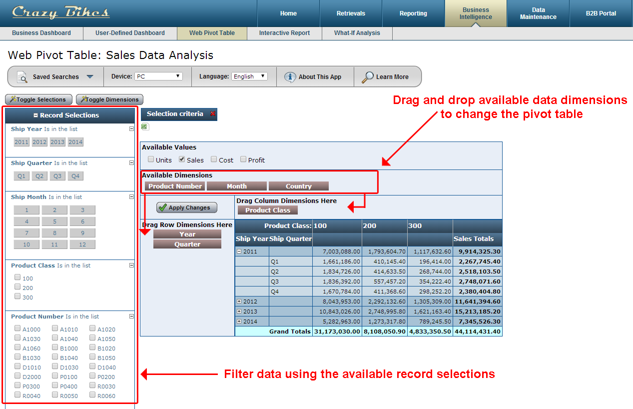
7. Give them static reports
In the past, many IT departments delivered unalterable, static reports to executives. If executives needed to see that data in a different way, filter or sort that data, or just drill down into more details, they made another request to the IT department. These days, static reports will frustrate your executives. Modern reports must allow for filtering, sorting, and drill-downs–letting your executives view the data from multiple angles without going back to the IT department for changes.
An example of a report with sorting/filtering options.
“Dependence on someone to create reports ensures a disconnect between when someone needs information and when it is available,” says Decker. “For years, “ad-hoc” reporting was a part of most every company we worked with. With tools and reporting, self-service reporting frameworks can be built that allow the user to drill-down to the data they need without the need to halt their workflow and request another report. This streamlines the reporting process saving money and allowing for faster decision making.”
So, what do you think? Is there anything you would add to this list? If so, please share your thoughts in the comments.
 Summary: As business data explodes at a surprising pace, many companies still struggle with reporting. They create reports that confuse or overwhelm their executives–hampering their ability to make decisions. What do your executives think about their reports? Do you make any of these reporting mistakes?