 In his book, “The Tipping Point,” Malcolm Gladwell explains how it’s often the little things that make the biggest difference. We might assume that big results come from big changes, but that’s not always the case.
I think the same holds true for web application usability. Sometimes it’s the small UI elements that make the biggest impact. If your web applications frustrate or confuse users, or if you just want to improve usability, you might just need a few small changes.
Today, let’s take a closer look at web application usability–specifically focusing on those small user interface elements or concepts that make a big difference. I’ve compiled 7 simple ways to improve your web application’s usability, without performing a major overhaul.
1. Font selection/styling
While obvious for designers, font selection is often an afterthought for web developers. Many don’t realize that font selection, size, spacing, and color all have a profound effect on a web application’s overall usability. How much of an effect? It’s been said that typography is 95% of design. Your treatment of text elements can play a major role in the user’s opinion of your application.
“If your content is unreadable, from a visual standpoint, users will just move along,” says Rui Da Costa, Digital Specialist and Web Developer at Catalyst. “Studies have shown that there are variety of ‘optimal’ reading conditions for content and that when you make adjustments to any one of these characteristics, you should make changes to all of them.”
Now, am I saying you should become an expert in typography? Not at all. I’m simply saying that developers should be aware of its importance. Coming from a developer’s perspective, it’s easy to gloss over the importance of font selection without realizing its true impact on usability. If you’d like to read more on the topic, here’s a great article on typography basics for those unfamiliar with best practices.
2. White space
In my experience, many poorly designed web applications share a common problem: a lack of white space. The developer tries to cram a bunch of features and data into the application without considering that it might overwhelm the user. Proper use of padding and white space is often the difference between a clean or a cluttered interface.
“Recently sites like exposure.so and medium.com have been praised for their use of whitespace,” explains Da Costa. “A clean design is easy to navigate, keeps users engaged and, once again, is readable.”
What do I mean by “white space?” White space is the area between elements on a page. When applied correctly, it can turn a cluttered interface into a clean interface. For example, the image below shows the difference white space makes in a simple data table. Which one of these seems simpler and less overwhelming?

3. User Feedback
The difference between a frustrated user and a happy user often comes down to communication. Does the web application provide the user with feedback? If a user clicks a button, does the application make it clear that it received the command? If an error occurs, how clearly does the application relay the error and steps to resolve it? These simple messages make all the difference in the world.
“One thing I have to make sure to cover is immediate feedback to users,” says Avi Zuber, UX Director at WizeHive. “The world runs on different internet speeds and servers tend to burp more often than people would like to admit. It’s become almost standard that users will click on an item and visually nothing will happen. Users need to know that their action has an actual reaction otherwise they grow impatient. That reaction might be an error message, but *something* needs to change on the screen. If an app is not working, that might be understandable, but never leave users in the dark or they’ll get frustrated and walk away.”
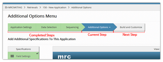
4. Context
You don’t realize the importance of context until you visit a web application that offers none. For instance, have you ever completed a multi-screen registration form without a progress meter? You feel lost–like you’re blindly stumbling through a dark cave, unsure of where you are or where you’re going. Are there 2 more steps or 10 more steps?
“If you’re expecting a user to navigate or progress through a multipage experience, make sure they understand where they are in the process,” explains Pete Shea, Director of Strategy at Tank Design. “Use clear progress bars to give the user context.”
Proper use of context gives the user three important pieces of information: Where they are, where they were, and where they are going. The image below gives a great example of context in a web app.
5. Consistency
I’m always surprised by the sheer amount of inconsistent web applications I encounter. Consistency–a supposedly fundamental UI principal–is often ignored. Navigation elements, buttons, and color schemes frequently vary from screen to screen, creating frustrating and confusing interfaces.
“If you have an interface where things are consistently in specific places it makes it easy for your users to interact without fear of getting lost,” explains Da Costa. “When a user gets lost they get frustrated and a frustrated user isn’t going to continue to use your site or app or whatever product you’re trying to give them.”
For web developers, this should be a simple fix. Keep your navigation elements in the same place. Don’t vary your color scheme from screen to screen. For instance, if an “action” button is green on one screen, don’t make it blue on another.
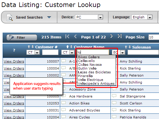
6. Autocomplete (or auto-suggest)
Making the user’s life as simple as possible is one of the foundations of good web application usability. As Shea explains below, providing suggestions based on user input is a great way to make your application just a little bit easier.
“If there is stored information that can be returned based on the first few keystrokes, let the user scroll down to select rather than typing in the entire field set,” he explains.
Besides the slight time savings this offers to the user, it also offers another benefit: spelling error reduction. This alone will save users plenty of time and frustration. As an example, take a look at the image below. If the user was searching for “Lojas das Bicicletas,” don’t you see how much time the auto-suggest feature saves in this instance?
7. Appropriate keyboard selection on touch devices
Have you ever completed a form on a mobile device? Unless the developer accounted for the limited keyboards found on touch devices, you were forced to keep switching between the text and numeric keyboard options. While not a huge problem, it sure is inconvenient.
“Present users with the numeric keyboard on touch devices for numeric form input fields,” says Shea. “If you expect a user to input a telephone number, save them the time and inconvenience of having to switch to the numeric keyboard themselves.”
How can an application automatically switch keyboards on the users device to account for varying input field types? HTML5 introduces some new form input types for that purpose, such as “tel” and “number.” We won’t get into each tag here, but this article provides a little more information on HTML5 input types.
So, what do you think? Can you think of any other small UI elements that play a big role in usability? If so, I’d love to hear them in the comments.
Pingback: Rui Da Costa | Web App Usability Tips