Summary: Building a mobile app is an expensive and time-consuming task. The problem is, if you can’t give your users a great user experience, no one will use it…and all of that time and money will be wasted. This article will help you avoid that fate.
The user interface is one of the most important aspects of a successful mobile app or mobile web app, but it’s just a small part of a much larger picture: The user experience. The user experience encompasses the user’s perceptions and feelings during their interaction with your app.
In other words, how does your app make the user feel? When you boil it down, that’s the only thing that matters.
photo credit: William Hook via photopin ccFor instance, have you ever used a mobile app or a mobile web app that frustrated you? Maybe it was slow or confusing. Maybe it frequently crashed. Whatever the reason, you probably don’t use that app anymore.
The question is, how can you avoid this fate with your own apps? If your business is creating (or has created) mobile apps, how can you avoid frustrating your users? How can you give them a great mobile user experience?
To help you answer that question, we’ve gathered input from a variety of experts in the area and have listed their advice (along with some of my own) below. Here are 10 keys to a great mobile user experience.
1. Provide a true mobile experience
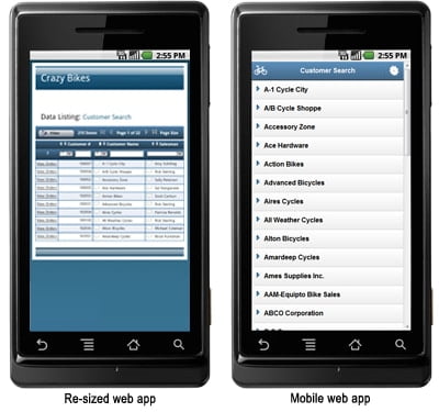
It’s a problem I still see all too often: Companies try to take existing web applications and cram everything into a mobile web application. This is a mistake. Don’t try to give your users a desktop experience on a mobile device. The result is a cluttered mess that nobody wants to use. As explained below, focus on your app’s main purpose, and leave everything else out.
“Designing and building a native mobile experience is not like building for only the web,” says Matthew Ausonio, a Mobile Developer at High Gear Media. “You can’t simply shrink down a website and hope for the best. In my experience, it is best to take some time and boil down your app to its main purposes. Then craft the whole experience to enable quick access to the main tasks you want it to perform. This aligns your experience with how most mobile users use their devices; seeking to complete a specific task as quickly as possible.”
On the left: A web app shrunk down to fit on a mobile device. On the right: a mobile web app designed for a mobile device.
2. Understand your user’s context
Understanding your user is arguably the most important key to good web application development. In mobile app (or mobile web app) development, it goes a step further: Understand your user’s context.
Where is the user accessing your app? What are they trying to accomplish? Are they in a hurry? All of these questions help you understand the user’s context. Once you understand how, why, and where they’re using your app, you must design everything around that information.
3. Speed is king
Have you ever used a slow app? Here’s a better question: Have you ever used a slow app more than once? Probably not (unless you had to). Mobile users don’t have much time (or patience), and have no tolerance for slow apps. How much does a slow app hurt user adoption? Google once found that just a half-second delay in load time resulted in a 20% drop in traffic.
photo credit: Nathan E Photography via photopin cc“The biggest inhibiting factor to a good mobile experience is speed,” says Sam Jackson, Marketing coordinator at Mojo Motors. “When a smartphone user clicks through to your website from an email, the website better load instantly with a 4G connection. Lots of sites look good on mobile, but the whole point of mobile optimization is to be able to access and use a site when you are on the go. If pages take too long to load, it doesn’t matter how good they look.”
Some developers waste their energy trying to come up with new app features, or understand why users abandon their app. The only problem: They don’t ask the users. Opening up lines of communication with your users is one of the most important steps to a great user experience.
“For me, the key to achieving [a great user experience] was to enable a Q&A feature on the apps so that I could answer questions that my users had,” says Alex Genadinik, an app developer and the creator of the GlowingStart.com business apps. “And I got to discuss with them how the app could be better. And over time, I was able to add just the features my app needed.”
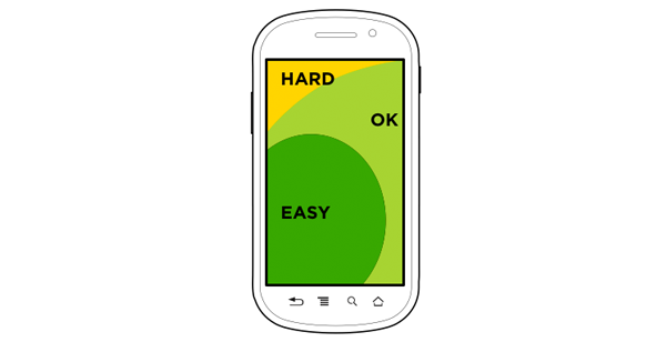
5. Make buttons reachable
As phones get larger, designing great mobile user experiences becomes more complex.We’re now dealing with mobile devices with screen sizes that range from 3.5 inches to 5.5 inches. The larger the phone, the more difficult it is to operate with one hand.
“Remember, users tend to use their phones primarily with one hand, so design the user interface to allow for that,” says Dilip Dand, Co-Founder and Mobile Product Management Expert at Lighthouse3.com. “For example, common tasks and activities should be in the bottom half of the screen for easy access. Less frequently or tasks that require deliberation on users’ part should be near the top.”
Here’s a great article that goes into more detail on this issue, and even outlines “reach zones” across different device sizes. As mentioned in the article, keep your important buttons within the “easy” reach zone.
Keep important buttons in the “reach zone”
6. Keep buttons around 72px wide
One big difference between mouse-based and touch-based interfaces: Touch-based interfaces are less precise. If you’ve ever tried to press a small button or a text link on a mobile device, you know what I mean. Small buttons lead to mistakes. Mistakes lead to user frustration.
So, how big should you make a button on a mobile app?
Fortunately, MIT conducted a study on the matter. They found that the width of an average adult index finger converts to roughly 45 – 57 pixels, while the average thumb width converts to a width of 72px.
Considering most people use their smartphones with one hand, it’s good practice to create buttons for easy thumb-pressing–at least 72px wide.
7. Be careful with “destructive” buttons
Even if you include large buttons in your mobile app, a touch-based interface is much less precise than its mouse-based counterpart. Users are bound to accidentally press a button, or hit the wrong button by mistake. Unless properly accounted for, this could cause major problems for the user.
“When you’re dealing with a set of buttons that could cause a destructive and/or permanent consequence for the user, (such as cancel and delete), make sure that you allow enough space between the buttons so that the user doesn’t accidentally hit the wrong one,” says Kishore Khandavalli, CEO of SevenTablets. “It’s a good practice to include a confirmation popup or message before any destructive action takes place. Similarly, don’t make the user deal with a popup if you’re just confirming something. (i.e. “Your work has been saved.”) You may want to notify the user of a successful action, but don’t throw a popup message that the user has to click through.”
8. Simple animations go a long way
“While designing for function is of the utmost importance, small design choices can have a large impact in creating a memorable user experience,” says Tray Ailshie, senior consultant at Twentyseven Global. “Animated transitions between elements and other animated UI behaviors such as parallax scrolling can increase user engagement in your app or website. When used sparingly and seamlessly in your app or on your site, these small touches can convey a greater sense of polish while providing some “eye candy” for the user. When paired with a minimalist or flat interface, these animation can provide some visual interest that may be absent in the layout.”
While simple animations and transitions provide a more polished look and feel (as evidenced in the iOS interface), simple animations can provide another valuable benefit: They improve perceived performance. For instance, displaying a simple animation while an app loads will distract the user from the load time, making the app appear faster than it actually is.
9. Follow platform-specific design patterns
“The companies behind the mobile platforms (Apple, Google, etc) spend a lot of time crafting the general experience of mobile devices,” explains Ausonio. “By understanding how a user interacts with their mobile device on a daily basis, you can ensure your app isn’t a ‘shock to the system’ by breaking common conventions. Or even worse, you may have some functionality designed for one platform, that simply won’t work as intended on another. And as a result will need to be tailored for each platform.”
While that’s sound advice for building native apps, what about mobile web apps? Here’s my advice: Use standard design conventions, rather than trying to create something new and revolutionary. Chances are, your “new and revolutionary” interface will only confuse your users.
10. Reduce input form pain
While forms in mobile apps should be avoided as much as possible, sometimes they’re necessary. In these cases, reduce the pain of completing the form as much as possible. How? Here are a few tips:
1. Only require the bare essentials
As Luke Wroblewski says in his book Mobile First, “When it comes to mobile forms, be brutally efficient and trim, trim, trim.” Limit registration forms to the absolute minimum fields required.
2. Switch the keyboard
For numeric fields, automatically give users a numeric keyboard. This is as simple as adding ‘type=”number”’ to your input field.
3. Auto-format the fields for the user
“Don’t force the user to input data in a specific format,” says Khandavalli. “If, for example, you have a SSN or phone number field, allow the user to input the information any way they want to, instead of throwing an error if they put in hyphens when you didn’t want them. Put the responsibility on the computer to figure out that xxxxxxxxx and xxx xxx xxx and xxx-xx-xxxx are all valid ways of entering a phone number.”
4. Design input fields for mobile devices
“Let the form span 100% of the width when you’re dealing with mobile phones,” says Khandavalli. “You also want to make sure the input fields are tall enough for larger fingers to tap. Finally, make sure that the label for each input field is appropriately spaced so that they look “grouped” together, and not haphazardly placed. The user will get frustrated quickly if they can’t manage to tap the right field or button and then can’t easily visually decipher which label goes with which input field.”
So, what do you think? Would you add anything else to that list? If so, I’d love to hear your thoughts in the comments.
3 thoughts on “10 keys to a great mobile user experience”
Thanks for this blog. We’re doing a lot more mobile work these days and this will help our team .I could feel some difference after getting into this, Its not the same as everybody write and everybody else reading it. But it make sense taking the major points into consideration. This will be very helpful for the developers and we as learners:-)
 Summary: Building a mobile app is an expensive and time-consuming task. The problem is, if you can’t give your users a great user experience, no one will use it…and all of that time and money will be wasted. This article will help you avoid that fate.


Great points, developers should really put much more effort into UX as many, if not the majority of apps struggle to retain users.
Thanks for this blog. We’re doing a lot more mobile work these days and this will help our team .I could feel some difference after getting into this, Its not the same as everybody write and everybody else reading it. But it make sense taking the major points into consideration. This will be very helpful for the developers and we as learners:-)
Great Post. really appreciate this information, very helpful. Thank you for sharing!