 Summary: A business dashboard helps organizations get a clear view of their business at a glance. However, some dashboards are more effective than others. In this article, we explore actionable tips that your business could apply immediately to improve your dashboard’s value or effectiveness.
Dashboard adoption has grown dramatically over the past few years. As data volumes grow, dashboards help businesses turn this data into meaningful information.
If your company uses business/executive dashboards, here’s a question for you: Are you getting the most possible value out of your dashboards?
It’s an important question for a simple reason: Not all dashboards are very effective. Sure, some businesses have mastered the art of the dashboard. But, others still use dashboards that aren’t delivering maximum value.
The big question: How can you get more value out of your dashboards?
Today, let’s explore some simple ways that you can accomplish that goal. Here are a few small tweaks you can make today that will improve your dashboards.
1. Make it visible

There’s an old saying: “You can lead a horse to water, but you can’t make him drink.” The same is true for dashboards. You can roll out a business dashboard across your entire organization, but you can’t make your employees actually use it on a daily basis.
It’s a frustration I’ve heard from many a business leader. Their users aren’t using the dashboard, or are only checking them every once in awhile.
If you want to make your dashboards more effective, make them visible. Don’t limit dashboards to the end user’s computer screens. Put the dashboards in front of your employees. How? Here’s one great idea:
“Print your dashboard on one large sheet for employees and managers to see,” says Mark Alves, Digital Strategist at Mark Alves Consulting. “Post it in the breakroom or an area where staff will be reminded of what’s most important to the company and their contribution to the bottom line.”
Now, what if you don’t have a typical office setting like that? What if you’re a manufacturing company, where employees work on a shop floor? Here’s a similar tip that I’ve seen other manufacturers use, with great results:
“Post your dashboard on a monitor in your shop so that your employees and your customers can see what’s most important to you,” says Alves. “Your customers will value your transparency and your employees will have a prominent reminder of their accountability.”
2. Remove the fluff
What’s the simplest (and fastest) way to improve your dashboard today? Trim it down.
It’s the most common problem of ineffective dashboards. There’s just too much data. Dashboard creators often include data just because they have it. This creates overwhelming and confusing dashboards.
How can you make your dashboard more effective? Go through each element on your dashboard and ask one simple question: “What question does this help us answer?” If you don’t know, it’s probably not something you need.
“Don’t display data just because you have it,” says Julie Stanford, Principal at Sliced Bread Design. “Data should only be displayed on a dashboard if it answering a real question that a person in your organization has. Tailor that data or combine data streams to be providing the answer to a specific pressing question that people have on a daily basis.”
3. Examine your dashboard organization

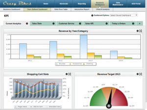
Any good dashboard tool will provide organizational features to help you create clear dashboards. For instance, what if you need to separate different types of data in your dashboard? Or, what if your users demand more data than can comfortably fit on one screen?
In these cases, break up your dashboard into multiple tabs. A tabbed dashboard lets you segment different data categories into separate screens. It helps you create organized dashboards that don’t overwhelm the users.
Then, examine the organization on each tab. Are your charts and graphs placed randomly, or is there a clear order? As explained below, this organization can help paint a clearer picture of your business data.
“Remember the purpose of the dashboard is to help management understand the scenario and make a decision,” says Sumit Bansal, Founder of TrumpExcel. “Arrange your data/charts in a way that one leads to the next one. One good practice is to number the sections/charts on the dashboard. That way, you can easily guide your audience from one section to the other.”
4. Add context
Many dashboards lack one powerful element: Context. Without context, your dashboard is less effective.
Let me explain. Suppose you have a chart that lists website conversion rates. It tells you what percentage of website visitors purchased your product.
You open your dashboard and check your conversion rate. It’s 10%. Is that good? Is that an abnormally high conversion rate, or a low one? Can it be better? Without context in your dashboard, you can’t answer those questions.
So, how can you provide context in your charts? Here are three ways:
Compare your numbers with industry standard. If available, track down the industry standard for that metric, and list it on your chart. This gives you a good sense as to how well you’re doing in that area. For instance, the industry standard conversion rate might be 1%–meaning your conversion rate is great by comparison.
Compare your numbers with your business goal. One of the most common ways to provide context involves listing the goal on the chart. This not only lets you know how you’re doing, it gives you something to shoot for.
Compare your numbers to year-over-year results. Every business strives to at least improve on the last year’s performance. Listing your statistics from the last year (or month) at the same time, helps you understand if your business is moving forward or falling behind.
5. Automate it
The problem with most dashboards: They’re only effective if you’re physically looking at it. As soon as you step away from your dashboard, it’s not very useful.
Wouldn’t you rather have a dashboard that’s useful 100% of the time? Of course!
You can make that happen with automation. Any dashboard tool worth its salt should offer some type of automation options. These options let your dashboard respond to changes in data automatically, or perform tasks based on pre-determined events.
“If your dashboard supports automation, then use it,” says Freddy Mini, CEO of Netvibes. “By automating your business logic to respond to changing conditions, you can act faster to address crises and seize opportunities. Even if all you do is configure your dashboard to send alerts to you when something happens, that solves the issue of a dashboard’s value vanishing as soon as you step away from it. For example, you can program the dashboard to text you if your company stock changes by 10% in the last hour – you certainly don’t want to miss that. You can also configure more advanced setups like initiating an SEM campaign or automatically rebooting the website when it goes down.”
6. Add toggles
I hesitate to add this tip, because it’s slightly more involved than a “simple tweak”, unless your dashboard tool offers this feature. But, I mention it because of the value it will add to your dashboard.
Many dashboards are static. They display the data, and do little else. Some might let you drill down on the data. Others might let you adjust the layout. But, far too few dashboards let you toggle the data.
What does that mean? For instance, suppose your executive dashboard displays sales. Adding toggles to this dashboard would let you filter these sales by region, salesperson, customer, and more. Just click a button, and the data changes.
“Everything in the chart should be able to toggle,” says Darin Herle, Co-Founder of Trackmeet. “Execs like to play with these to gain a better understanding of what’s going on.”
Now, some dashboard tools offer this feature out of the box. If your dashboard has this ability, make sure you take advantage of it. This one change will dramatically improve your dashboard’s usefulness.
Summary
These are just a few small changes you can make to improve your dashboards, but the list could certainly be longer. Would you add anything to this list? If you would like to add anything to this list, I’d love to hear it. Feel free to share in the comments.
There were indeed some good tips here. In addition, organizations may wish to provide a visual of the “customer journey” or “path to purchase.” Examples could include a store layout, an airport terminal or online vs. offline purchases decisions. Then they should place relevant data next to the corresponding image. This enables C-level execs to easily and quickly see what is working and what is not.
That’s really helping Joe. This needs some more explanation as you said “the industry standard conversion rate might be 1%–meaning your conversion rate is great by comparison”. Waiting for reply.
Very helpful article, I learned many new things, thank you!
Pingback: How Do I Make My Dashboard Actionable? – Fallsgardencafe
Pingback: Can You Email A Salesforce Dashboard? – Pietroortolani