![]() If end-user reporting is a burden on your IT department, you’re certainly not alone. The question is…how can you reduce the amount of time your IT department spends creating end-user reports?
If end-user reporting is a burden on your IT department, you’re certainly not alone. The question is…how can you reduce the amount of time your IT department spends creating end-user reports?
One way to fix the problem: Create canned reports with run-time options for end users. This lets your users quickly access the data they need, while reducing the time your IT department spends creating reports.
Here’s how it works: Your IT department creates the initial reports with run-time filters for the users. The users can select which data to display, or filter their data however they wish when they run the report. With the right run-time filters, users can use a single report in many different ways.
The best part: If you give end users a good variety of canned reports, it will significantly reduce the reporting burden on your IT department. So, what types of canned reports should you build? Here’s a list of 5 reports that will let your end users access and analyze data in a number of different ways:
1. Prompted report
This is a pretty straightforward report with a ton of options. It lets users select from a number of different criteria at run-time, and even lets them export or email the reports straight from the browser. Want to see what this looks like? Try this prompted report demo.
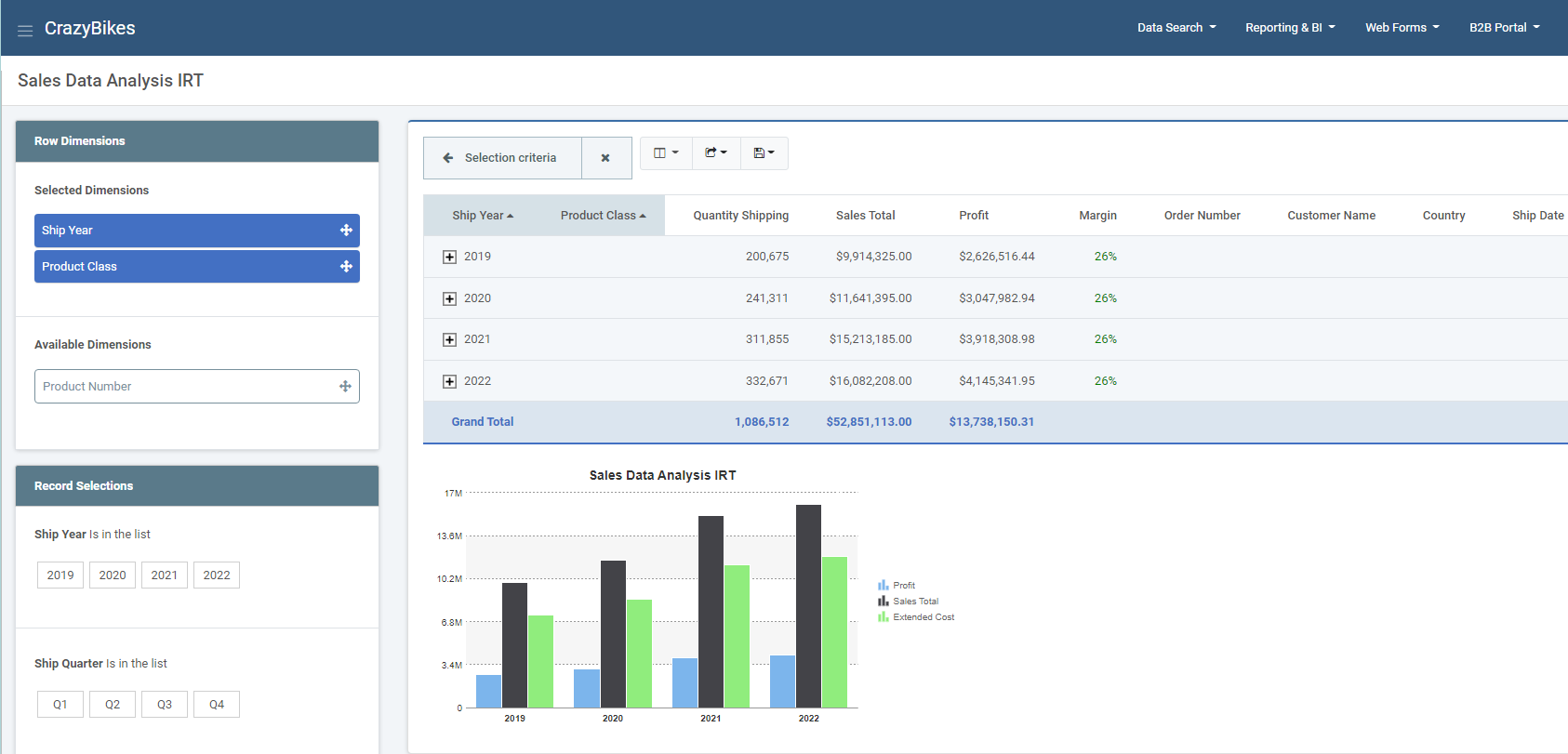
2. Drill Down Report
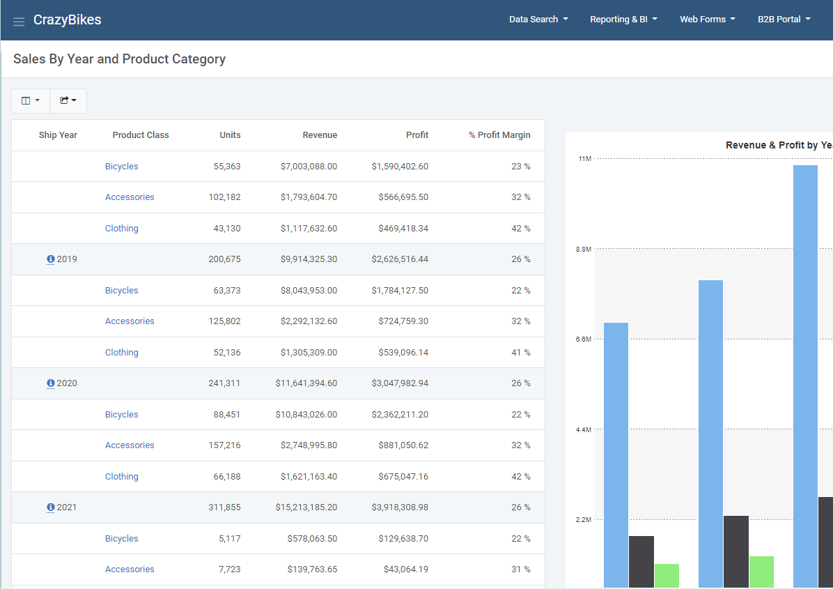 This is a business analytics tool that gives users a summary of their data (complete with graphs) and lets them drill down into more information. The great thing about the graphs: They are interactive. Users can also drill down to more information when they click on graph values. You can try a
drill-down report demo right here.
3. Ranking Report
This lets users create top/bottom rankings over any aspect of your data. They choose from a number of different criteria at run-time, and the report delivers top/bottom rankings complete with a graph. It’s a great way to see the best or worst of any aspect of your business. Here’s a nice ranking report demo if you’d like to give it a try.
4. Web-based Pivot Table
This gives your users a great alternative to the ever-popular spreadsheet-based pivot table. The best part: Web-based pivot tables are more accessible, more secure, and provide more options than the spreadsheet version. Check out a web-based pivot table demo here.
5. Interactive Report
Interactive reports are great for data analysis. It starts out with a high level view of business data and lets users filter/sort/drill down to the most minute details within the same report. Interactive reports let end users analyze any aspect of your data within the same report. It’s truly a powerful and flexible reporting option to have at your disposal. You can try an interactive report demo for yourself right here to see for yourself.