Controlling Responsive Design in Bootstrap Templates
Users who will be creating content for multiple devices (PC and mobile, for instance) may want to add additional logic to better handle how an application responds based on the device accessing the application. This documentation will explain how this works within the m-Power bootstrap templates in two steps. The first step will be creating an example that uses the m-Power layout feature. Step 2 will add in the responsive configuration.
For those users who prefer video documentation, this topic is also covered below:
Step 1: Creating Side by Side Layout
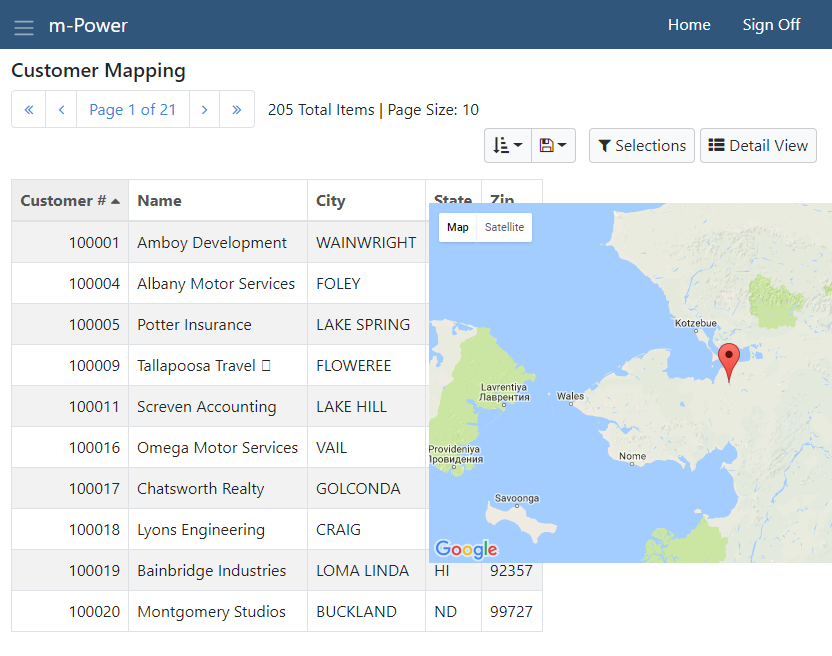
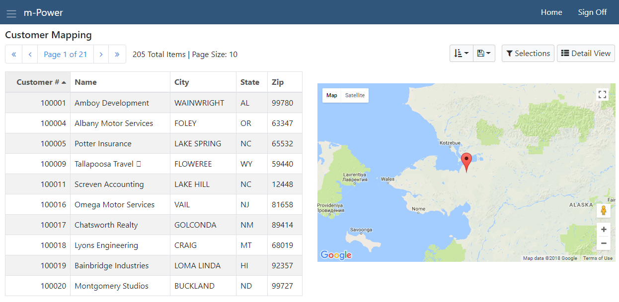
For the example here, I am going to configure m-Power to show 2 panels on my application — a data listing and a map. As you may know, the bootstrap templates are divided into 12 sections (12 sections would equal the width of the entire page). So my data-grid will get half the screen (6 columns) and my map will get the other half (6 columns). More information about the grid layout can be found here.
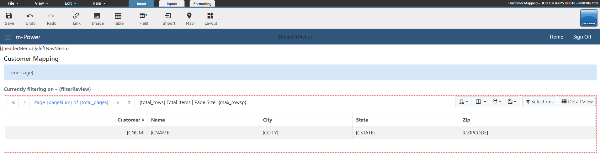
After compile my base application looks like this:
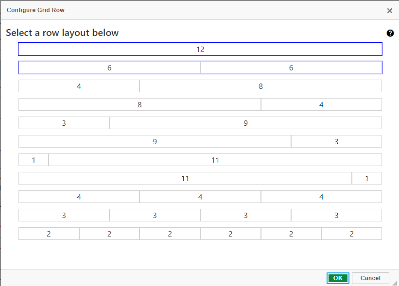
The first step is to configure m-Power to be laid out in 2 columns of 6. Click the Layout button, then click "Toggle Grid" mode.
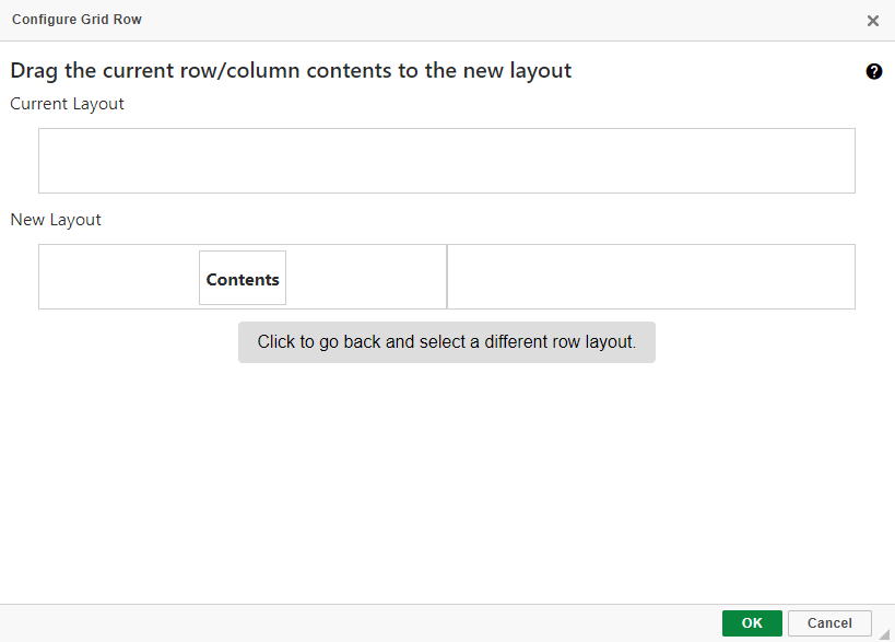
Right click in the div with the main table and select "Configure Row Layout" then select the dual column layout of 6.
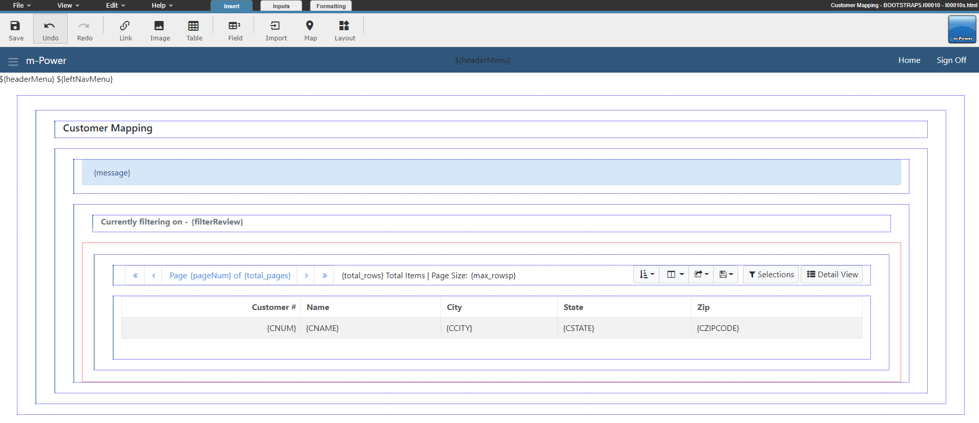
Complete the layout by dragging your current content into one of the cells:
After clicking OK, m-Painter should resemble this:
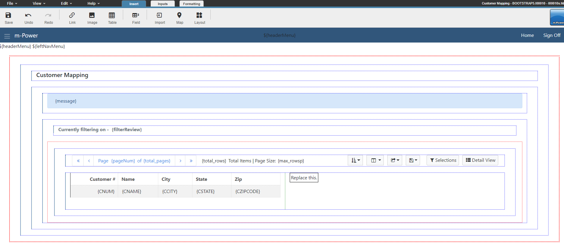
After adding content to the right side (in my case, a map), m-Painter now looks like this:
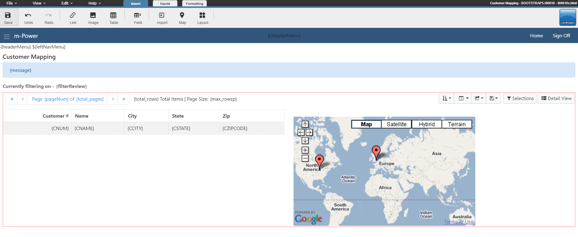
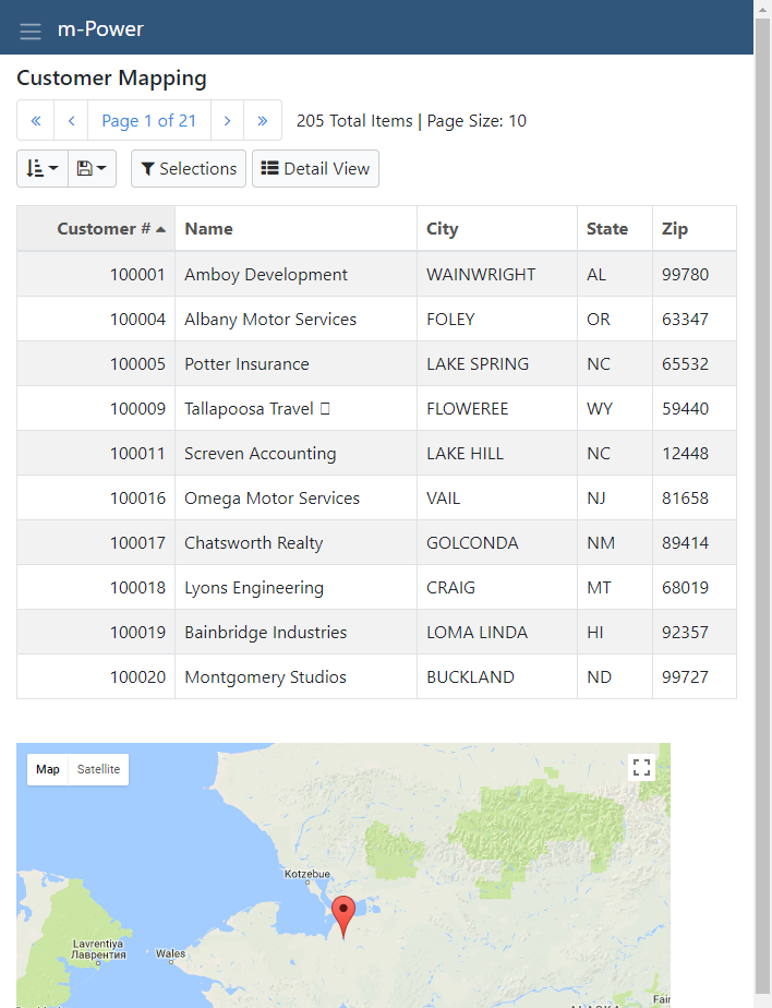
After saving, my run-time content on a PC looks like this:
Step 2: Adding Responsive Configuration
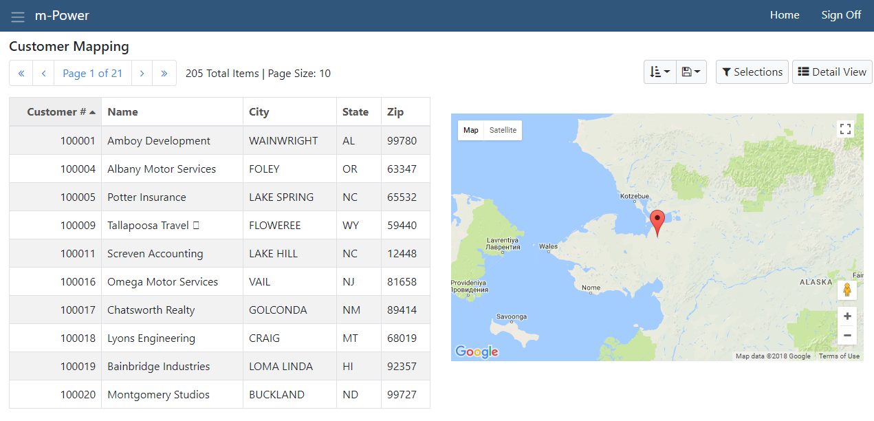
So far, I've created an application that is optimized nicely for a PC. However, this same application looks poor on a smaller device, as the content doesn't fit the device optimally and is cut off:
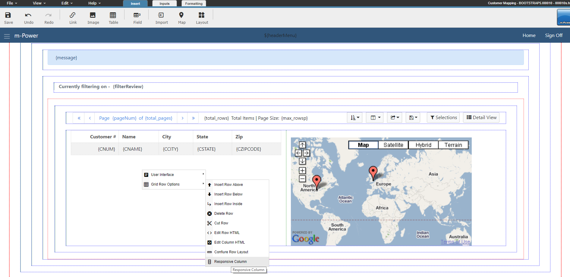
To fix this, head back to m-Painter and right click inside one of the cells, and select "Grid Row Options" -> "Responsive Column":
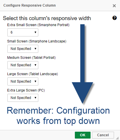
You will then be presented with the following screen which lets you control how the selected element should render based on the device. Here we are using standard Bootstrap logic to control the layout. Specifically, the logic always defers to the lowest level then works up. So in our case, the base configuration is to show our data table using 6 of the 12 columns on a small device. Since no other configurations are specified, this applies to all device types.
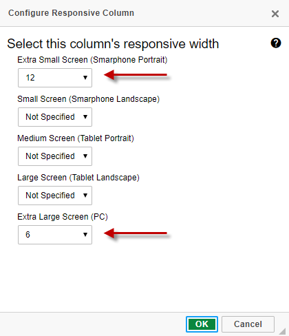
In our case, we want our data listing and map to be split screen on a PC (where there is enough screen real-estate to fit both elements side by side). On all other devices, we want the map to display under the data table. To do this, we will change the "Extra Small" value to 12 and the "Extra Large" value to 6. This tells m-Power that when this page is opened on a small device use the entire width of the device (12 of 12 columns) to display the element.
I don't need to configure the other options because they will always default to the smaller size configuration if a value hasn't been specified. For instance, on a Tablet, since no value is specified it will revert back to the last available value (that of the extra small). Working our way down, you'll notice that the "Extra Large" value is set at 6. Keep in mind, you can have more than 2 elements or choose other layouts beyond this example! However, please note that at no time should you ever configure a single row to be larger than 12 columns. Ideally, you will want to configure your rows to always equal 12 columns to use the most of your screen real-estate.
Upon pressing OK, you will need to do the same for the other element (the one containing the map).
After saving, the PC view of my application looks like this:
While this application now is fully responsive and looks like this on a smaller device: