Widget Panel
Jump to:
Grid Widget
Tabbed Widget
Accordion Widget
Release Notes
The m-Painter Widget panel allows developers to add additional structure to their application by adding layouts that better organize the output. Available options are:
- Grid Widget — The most popular dashboard layout. Users can see all sections at one time.
- Tabbed Widget — The tabbed layout allows users to see one section at a time. All other sections are hidden behind the active section.
- Accordion Widget — Similar to the Tabbed Widget, only one section can be seen at a time. However, with an accordion layout, selecting a different section causes the active session to be collapsed, similar to a musical accordion.
Each of these options organize the output of your application differently. Each option and how you can utilize them will be discussed below.
The widget option can be accessed directly from the m-Painter toolbar. Simply click on the "Insert Layout Widget" button.
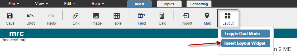
Grid Widget
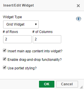
Select the "Grid Widget" from the "Widget Type" drop-down list. Select the number of rows & the number of columns you would like to see in your grid. Next, you have the following three options:
- Insert main app content into widget? — Checked by default, causes your current application's main table to be placed inside the first section of your grid. Unchecking this option causes your grid widget to be placed outside of your application's main table.
- Enable drag and drop for widget items? — Checked by default, this option allows your end user to move the sections at runtime.
- Use portlet styling? — Checked by default, adds an additional look to each section of the grid, adding in a customizable Title tag and allows the ability of minimizing and maximizing the porlet.
Click OK and your grid widget will be created.
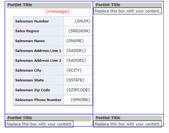
Next, we need to begin inserting content into our grid. Click on the "Replace this text with your content" area and press the delete key.
Note: Be sure that you only click on the text, not the title. If not, you may accidentally corrupt your grid widget.
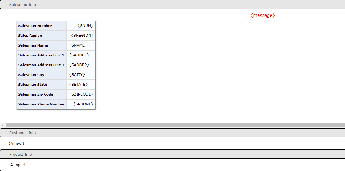
With your cursor in the same location, feel free to use the Import Panel to bring content from another application into this grid. More information about Importing can be found here.
Note: While most developers will use the Grid Widget to import in content, you are not required to do so. You can fill your grid with content from the current application or even type in content manually!
After you have added in all of your custom content, be sure to modify the "Portlet Title" by double clicking on "Portlet Title", then changing the text to include a more appropriate title.
Once completed, be sure to save your changes, then run your application! Be sure to experiment at run-time by dragging & dropping and minimizing/maximizing your grid sections.
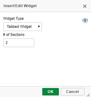
Tabbed Widget
Select the "Tabbed Widget" from the "Widget Type" drop-down list. Select the number of tabs you wish to include with your widget.
- Insert main app content into widget? — Checked by default, causes your current application's main table to be placed inside the first section of your tab. Unchecking this option causes your Tabbed Widget to be placed outside of your application's main table.
Click OK.
Click the "Replace this text with your content" area and press the delete key. Use the Import feature or free-form text to add content to this tab area. Lastly, change the Tab title text by double clicking on the individual tab and modifying the text as necessary.
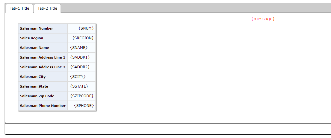
To add or remove an additional Tab, right click into any tabbed section and select Insert/Delete Tab.
Once completed, be sure to Save your application.
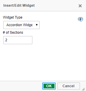
Accordion Widget
Select the "Accordion Widget" from the "Widget Type" drop-down list. Select the number of sections you wish to include with your widget.
- Insert main app content into widget? — Checked by default, causes your current application's main table to be placed inside the first section of your accordion. Unchecking this option causes your Accordion Widget to be placed outside of your application's main table.
Click OK.
Click the "Replace this text with your content" area and press the delete key. Use the Import feature or free-form text to add content to this tab area. Lastly, change the Tab title text by double clicking on the individual section and modifying the text as necessary.
Once completed, be sure to Save your application.

Release Notes
- Widgets can only be added to applications that have been generated with the September 28th, 2010 m-Power update (or later).
- If you decide you no longer which to have a widget within your application, simply click on the "Insert Widget" icon and select "Remove Widget" from the Widget Type drop-down list.
- Developers can easily switch between different Widget types by clicking on the "Insert Widget" icon and selecting a different Widget Type from the drop-down list. Widget section content will be retained when changing between Widget types.
- Only one widget type can be used per application.
- End-users who take advantage of the Portlet Drag and Drop Functionality are not able, at the present time, to save their changes for future use.