Create Actionable Business Intelligence in 10 Minutes
Full Transcript of Video
Today, I’ll show you how to create actionable business intelligence in just a few minutes. Now...what is actionable business intelligence and how does it differ from traditional BI? Let me show you an example.
Here I have the report that I’m going to build in this video, and it lets me analyze the performance of a fictional helpdesk. At first glance, it might look just like a typical report or BI application. Up here are charts with important data about our support tickets. Down here, I have a list of open tickets sorted by the number of days they’ve been opened so I can see the most urgent ones first. The difference between this and a typical BI app is I can take action on these tickets from this report. My goal with this application is to be able to take action when performance falls below a certain threshold. For example, let’s say that we want all tickets closed within 2 days. Here, I can see that we have a few tickets that have been opened too long. I can escalate these tickets directly from this report so we can get this resolved faster. I can also click the ticket ID to see more information about each ticket and make changes if needed. As you can see, this report not only displays data, it also lets me take action on that data.
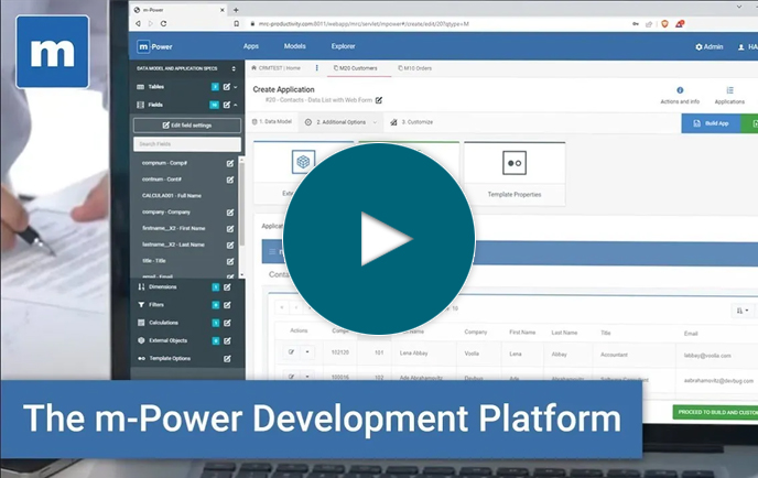
Okay, so that’s just a quick look at what we’re building. Now let me show you how it’s done. I’ll be using our m-Power development platform as it simplifies the process. m-Power is a low-code platform that builds web apps, reports, workflow, and any other type of business app...all without coding.
Now, to build the report you just saw, the first thing I need to do here is build that data table that lists out all of our open support tickets. So, I’ll select this template which lets me list data, and give it a name.Now, I have to choose my data. I’ll build over my support ticket database table, but I don’t need all of the fields for this report. I’ll just choose the fields I want to include, and click done.
Next, I need to tell m-Power how to sort this data. I want to sort my data by the number of days the ticket has been opened and by the ticket ID. Now, this app includes all tickets but I only need to see the open ones, so I’ll add a filter to make sure that I’m only viewing open tickets in this application. Okay, so we’re almost done already. So here in this screen I have a few more options and a preview of my application.
I just need to do one more thing before I build. If you remember back to the application demo, it had links that let me view the ticket data and escalate a ticket. Both of these options are separate applications that I need to link to this one through a handy little feature called smartlinks. Smartlinks let me connect different applications together and pass key data automatically. So, for example if I click the ticket ID for one of my tickets in this app, it knows which record to pull up in the smartlinked app.
Okay, so once I’ve added those two smartlinks, I can build the application. I’ll just need to press build and wait while m-Power puts everything together for me. m-Power is taking all of the specs I’ve entered and turns that into a web application. Now that it’s done, let’s check it out.
I have my data table, but you’ll notice it doesn’t look like the application I showed you yet. That’s because I need to customize it in m-Painter, which is m-Power’s visual editor.
Now, I can do all types of things in m-Painter and I’ll show you a few here. The first thing I want to do is change these smartlinks. Rather than have them off in their own columns, it would make more sense if I moved the escalation link over to the assigned employee. That way, users can just click on the assigned employee to escalate it to a different employee. Now, m-Painter knows which smartlinks I created in the build process, so I’ll just select the correct one for this link.
Also, lets move the ticket application link over to the ticket ID. That way users can just click the ticket ID to pull up the ticket information. Now, I’d like this app to display in a popup dialog rather than a new page, so I’ll set that up in here. Once I’ve moved these smartlinks, I can just remove the columns.
Also, let’s add some color to make more important tickets stand out. First, let’s add a status badge in place of the status field. This will add some color to make the status of each ticket more pronounced.
Then, let’s add some conditional formatting to the days open field. I’d like older tickets to stand out more. Let’s say that if a ticket is 1 day old, it should be orange. If it’s 2 or 3 days old, it should be red. And if it’s over 4 days old, it should be bright red with a bigger font. Once I set that up, it will help emphasize the most important tickets.
So...I’ve done quite a bit here so far, let’s check it out. It looks a lot better now, right? If I click the ticket ID, I get a popup box with more info that I can change. The days open are nicely color coded and the status badge makes the status stand out. Finally, I can escalate a ticket by clicking on the name of the assigned employee. Okay, so I’ve added the actionable component...now I need to add my charts and graphs.
Now, I’ll take you through one report build process just to show you how it’s done with m-Power, but it’s basically the same thing that you saw before. I just need to choose a template and name my report. Then, I’ll select my ticket data. I don’t need much for this, as it’s just a report showing a breakdown of ticket statuses. So I’ll just need the status field. Here in dimensions, I’ll sort by my one field--status.
Finally, I need to create a field using m-Power’s calculations option. Calculations are just what they sound like. You can create all types of calculations and then use them as database fields in your application. For instance, I could create calcs based on other fields, I could use all types of functions, or even use SQL statements in here. In this case, I just want to create a field that returns a value of 1. This is important to help me count the number of statuses in my application so I can create a chart. So, that’s all I need. I’ll click build and wait while m-Power puts this together. You’ll notice that this was the same process as before. All m-Power applications use the exact same build process. Of course, you can customize them in m-Painter afterwards, but the initial process is the same.
Okay, so it’s ready to go. Before we check it out, let’s dive into m-Painter and tweak the chart a bit. So I need to go down to the graph and select graph properties. Now I want this to display as a 2D doughnut chart. For fields I’m using my calculated ticket count field, and I want it to use the subtotal level of data here. Okay, one more thing to do. I only care about the chart in this application, so I will hide this table.
Now that I’m done, let’s save this and execute the report. If I run this report, you’ll see that I have a chart that gives a breakdown of my ticket statuses. I’m now ready to import this chart and a couple others into my main application. So let’s do that now.
I’ll get back into my main application and open up m-Painter again. If you remember from the demo application, I want to add 3 charts above these data tables. So, I’ll open up the grid layout mode and add a new row. Then, let’s break that row into 3 columns. And finally, I’ll add a card layout to each column. Now, these aren’t necessary steps in my application, but they will make it look a lot better. m-Power makes it really easy to create any type of layout you want. Okay, so I have my cards but I don’t need the content inside, so I’ll delete that. Now, I’m ready to add some charts.
Let’s start with the chart I just created. I want to import it into the middle card here, so I’ll just find that application and make sure that I’m only importing the chart. Next, I’ll import a couple of other charts that I already have created. I didn’t take you through the build process for all of these charts since it’s the same every time. Okay, so now I have all of the charts in there. Let’s save this and check it out.
Now, it looks like it should. I get a quick view of my data with these charts up here. I can drill down into my data too. For instance, I see there are a few open tickets on this day. I’ll click that and it filters my data. So these tickets have been open for too long and I want to move them along. I’ll escalate them from within my report. This process automatically notifies the Tier 2 technician that a ticket has been assigned to them. Or, I can go into this option and add notes or change the status of a ticket if necessary.
One really nice part here is that I can change these charts however I want since m-Power takes a building block approach. For instance, if I want to see...the number of new tickets opened today or if I want this graph to be a speedometer chart instead of a bar chart, I can do that. It’s all flexible. But, most importantly, I now have a reporting application that also lets me act on my data. If you want to learn more about m-Power or set up a demo, visit us on the web at mrc-productivity.com.
Learn how m-Power can help you
Sign up for a free trial
More Videos
Sort videos by category using the options below